First impressions, not too bad if you have only been at it for 4 months...
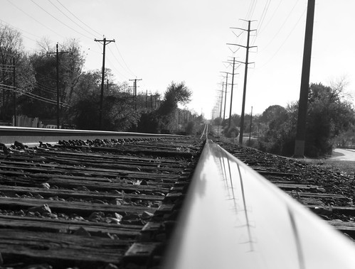
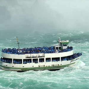
#1. I like this one for the most part, except the rail on the right tends to dominate the picture and it is out of focus at the start or front of the image. Did you take one lying in the middle of the tracks? Also the sky appears to be blown out.
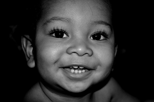
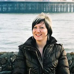
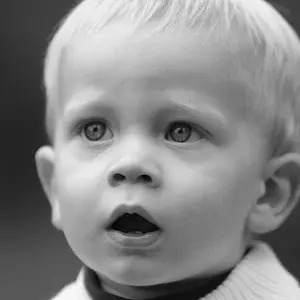
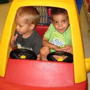
#2. Appears to be underexposed and full facial shots are hard to pull off, particularly when you cropped off the top of the head.
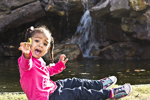
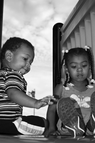
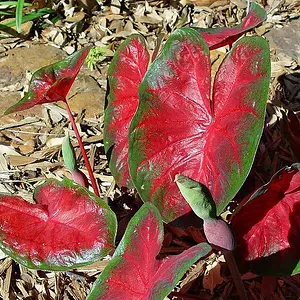
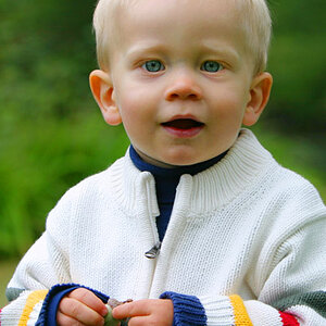
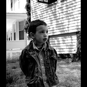
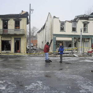
#3 and 4. Similar problem in both - they are too closely cropped.
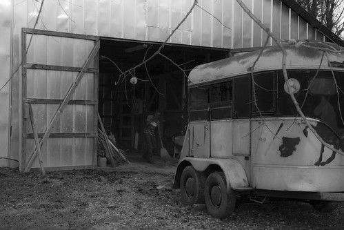
#5. It took me a minute or so to determine that there was a person in the barn, so the main subject of your image is badly underexposed. If you are going to include the "trailer" in the picture, then it might be better to include the whole trailer - having only part of the trailer in the picture is distracting because it is in the foreground and is quite lighter than the subject area. In B&W conversion like this, the viewer's eye will go right to the very light or very dark parts of the image, usually the lighter one first. That is just the way our brains react to tonal variations in a B&W image.
I am very interested in B&W conversions myself and would be interested to know how you did yours. You should realize that not every colour image is a candidate for B&W conversion. The compositional aspects that may make a good colour image are not all the same as those that make a good black and white image. I do mostly landscapes and nature photography, and what I look for when I do conversions, is an image that will have a high tonal range when converted, i.e., the histogram is spread from one side of the graph to the other. If the values are all concentrated in the centre, or at one side then there is very little tonal range and the image will be flat when concentrated in the middle and very dark or very light when concentrated at the left or right side of the histogram. There are a lot of other things that I do consider, but it often depends on the image itself - whole books have been written on the subject and there are a lot of websites dedicated to it as well -
Black and White Conversion: The Best Ways to Turn Color Digital Photos Into Beautiful B&W | Photojojo
I think that you might benefit from doing some reading on compostion and I would encourage you to surf the web, but you could start with -
Advanced Composition -- Part I - there are two following web sites with the links at the end of the site. As well, have a look at this one -
Photography Composition Articles Library as there are a number of links to sites on composition. If you are going to photograph kids, then there are lots of sites with tips on "how-tos" such as this one -
The Complete Guide to Children Photography - Part I | DIYPhotography.net - the link to Part 2 is at the bottom. As with B&W imaging, there are a number of books that have been written on composition - you might want to look at one by Bryan Peterson called
Learning to See Creatively -
Amazon.com: Learning to See Creatively: Design, Color & Composition in Photography (Updated Edition) (9780817441814): Bryan Peterson: Books. There are lots of others.
Hope this helps.
Cheers,
WesternGuy