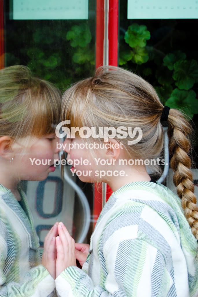
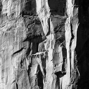
#1's a bit too bright (at least for the subject) and not the greatest composition.
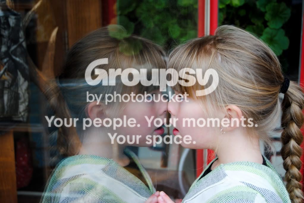
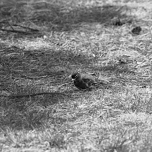
#2's ok, but it needs a crop so you have symmetry I think - take some off the left so it matches the right side and see how you like it..
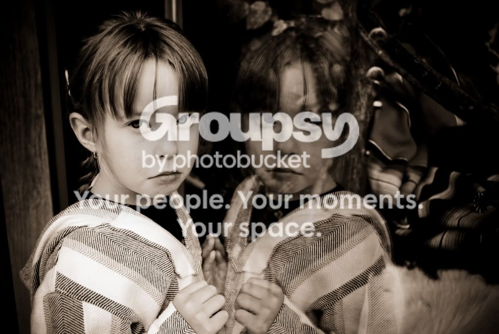
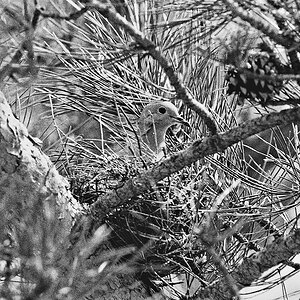
#3's your stand-out shot from this set. What makes it the best is the eye contact and the girl's position in the frame. You were right to leave some 'dead space' to the right.. if you had pointed the camera more to the left it would have hurt the composition.
The black and white works well on that shot because she stays very bright and the background is dark, causing her to really pop out. A good rule I picked up here (from KmH and Bitter Jeweler) was that light colors pop out at you in a photo while darker tones don't. Here's a good thread on it from a few months back if you want to check it out: http://www.thephotoforum.com/forum/beyond-basics/202999-light-advances-dark-recedes.html
^ Well, that's a bit more geared toward things in color.. but I think it applies to luminosity just the same.