C & C Miss Teen Utah USA

twocolor

No longer a newbie, moving up!
Joined
Feb 26, 2008
Messages
1,044
Reaction score
227
Location
Utah
Website
www.twocolorphotography.com
Can others edit my Photos
Photos NOT OK to edit
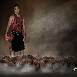
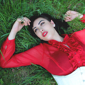
I had the opportunity to be the sponsor photographer for Miss Teen Utah USA!

Wanna feel homely and unkempt?? Photograph beauty pageant contestants!!

It's out of my norm but it was a blast!

Things I would do differently next time:

Hair light on the darker backdrop
Edit out the window showing in the background of one image
Some more dramatic lighting on a few - maybe...

Sarah%20Dinsdale%20026-L.jpg

Sarah%20Dinsdale%20036-L.jpg

pics%20a067-L.jpg

Brielle%20Reimann%20021-L.jpg
 
I forgot to post the techy stuff.

Canon 5D Mark IV
Strobe Camera right.
70-200mm 2.8
f3.2
1/160
 
Great images. This must have been an interesting shoot.

The only real thing I see that you haven't mentioned is a minor bit of vignetting in the first image and I'm not sure what the yellow thing is (chair?).
A personal preference I would have lost the earrings in image one.
Another plus, not one set of claw hands.

Overall I think these are well done.

Thank you! Good points on all! Yellow thing is a chair...maybe crop in to lose it? There are some where you can see the whole chair (picked out by her stylist)
Vignetting - I can fix that right quick. Technical question - do some lenses vignette more than others and maybe it's more noticeable on the stark white than it is outdoors? I know the more you zoom in has something to do with vignetting.
Earrings....oh there are so many parts of the styling I'd like to ditch. They came in with hairstyles that were all unique to them and the hairstylist gave them pretty much the exact same hairstyle. And the earrings.... she literally had a case of earrings. I figured it was pageant norm. I personally don't like that much jewelry!
Sarah%20Dinsdale%20018-L.jpg
 
The one thing that is driving me nuts, is the wall corner.
It frames them and draws attention away from their face.

The shots otherwise look good. on No. 1 her hair falls out of frame so something to work that might help a bit.
Otherwise well done.
 
The one thing that is driving me nuts, is the wall corner.
It frames them and draws attention away from their face.

The shots otherwise look good. on No. 1 her hair falls out of frame so something to work that might help a bit.
Otherwise well done.

Great! Thank you! I will keep that in mind next time!
 
Vignetting - I can fix that right quick. Technical question - do some lenses vignette more than others and maybe it's more noticeable on the stark white than it is outdoors?

Yes every lens will have it's own amount of vignetting. It will be more noticeable on lighter backgrounds.
Your lens only has a mild one so post is the easiest way to clean it up.
 
Note - I'm not a portrait person

A few thoughts:

1) There's a lot of hair frizz going on. I appreciate that it sounds like you had very little/no control over the hair, but there's a LOT of frizz. I think it stands out because the faces are very controlled, very modelled and then the air is just sort of mad. Shot 2 it really stands out in, even though the background is darker; you can still see a lot of stray hairs around. It might be worth breaking out the heal and clone tools and seeing if you can't at least tame some of them. If you've worked on the skin (or they have or both) then working on the hair might be worth it, but it could become quite a long and involved process to remove the hairs and have it look natural; but it "should" be doable.

3 and 4 the pose/style/face actually work ok with the hair somewhat frizzed up, its much more an issue (in my view) with 2 and a bit with 1.


2) Most lenses will have some edge darkening, how much varies and will vary depending on the aperture of the lens as well as the focal length, for zooms. In Lightroom I tend to use lens corrections on most shots, it removes a bit of the distortion and also some edge darkening.
A lot of the time its a slight element and often vanishes into a more busy background; whilst in a shot with a brighter background, but very central subject its not always an issue - sometimes its even a feature people find desirable. So its not a huge crime to have some, but its your choice so do experiment with removing it and seeing which version you prefer. Sometimes having a nice subtle boarder helps, esp for web display where a photo might have a white or bright background to it.

3) The yellow chair bit I'd either crop, or if you like the crop you can easily clone it out in shot 1.

4) Every shot is very central, which for a formal portrait is perfectly fine. This isn't an area I do much in so I'll leave it to others to suggest if perhaps a shoot like this might work with some more alternative angles or shots. I'm also aware that if you're posing there are a lot of subtle tricks with changing the angle of the shoulders relative to the head; the rise or fall of a shoulder and tilt of the head etc.... Like I said I'm aware of this stuff, but its not an area of photography I'm into so I can't really give any constructive feedback on it .
 
Note - I'm not a portrait person

A few thoughts:

1) There's a lot of hair frizz going on.

I couldn't agree more! I'll try and go in and fix it in photoshop. They had a hair stylist that literally "ratted" their hair up. Each of the girls arrived with more modern, smooth hair styles. Then on top of the "ratting" of the hair they requested a fan be brought in to give movement to the hair.

On the centered images I've got a few that follow a more traditional rule of thirds but it cropped all that blowing hair. Really truly something I'm just not used to dealing with.

I was the one posing, but because of their age as Miss Teen Utah USA my instructions were a lot of personality and movement. So I suppose I went with anti posing - more of giving them instructions "run your fingers through your hair" or "giggle". Things to show different personalities for each girl. However I am definitely not the pro on the fine tune posing for headshots. I do know some shoulder heights can be feminine vs masculine and I probably should spend some time reading up on it. But even business headshots are so much more casual than they used to be - still a good thing to learn though.

I have to add that you don't have to be a portrait photographer to give critique on a portrait image! And you did really constructive and informative critique which I really appreciate!
 
Really like the shot with the dark grey background and the wider shot with the yellow chair. I like the window in the background, adds context to the light, but I'd clone out the heater under the window.

Great light on the eyes in all shots too.

I find the grey shades on the white background a little distracting.

I guess it's because they are young plus make-up, but was their skin really that smooth? Not sure if there's a bit too much skin smoothing in post?

Nothing to do with your work - but is that what teenagers look like in Utah? The hair and styling makes me think of The Queen. Given the choice I'd rather photograph teenagers in their normal clothes and in a more natural setting like a skate park or coffee shop - but I guess that's not the aim here.
 
It sounds like your brief was to present formal portraits with high energy and wildness that equally balances maturity, sexuality, femininity and action. All in one photo. It's hard being a new person on a site especially when its likely that those running this event have a set process that they do each year. It leaves you in a position where its hard to take charge of the situation and you almost end up following orders, which makes it much harder to follow your creativity because you've lost control over a situation that you, in theory, should be in control of. Throw on some time pressure (there's always time pressure) and such and its harder still.
 
First kudos on excellent set. One of the turn offs I have for teen's (especially girls) is the kitschy poses they tend to do. You've done an excellent job with the poses here, with tasteful flow throughout. Great tone mapping.

As to critique, here's what I see:

Image 1-
Such a classic pose that's been well executed. She seems relaxed, as if it's a natural expression. I would have liked to see the eyes just a scrunch higher in the frame. I'm ambivalent about the hair being cut off on the left, sometimes it happens. I don't think it necessarily detracts from the image.
You've been hammered about the frizzy hair, so I won't go into a lot of detail about it, other then to say that sometimes the difference between a good image and great are the tiniest of details. I make it a practice to carry a brush, makeup, hair spray, etc., in my kit. I understand you were dealing with outside influence but at the same time, you need to understand that when the final shot is presented, those people won't be blamed for a bad shot. As the comment above, when you step on the set, you need to maintain control of the final product.
Like the others, I'd probably clone out the chair. I don't think most casual viewers would find it all that distracting but it doesn't really add anything either.
On the vignetting, it seems that you like many others like to shoot wide open. I'm not being critical of that but you should also realize that doing so is likely going to result in vignetting. Coincidentally I found this which specifically addresses Canon, Canon Lens Vignetting (Light Fall-off) but I've encountered the same issue with Pentax. Shooting ambient sometimes I don't have a choice to shoot wide open, in which case I'll shoot wide to give myself some crop room, but in studio, I tend to use f/5.6-8.
Image 2-
Same comment on hair, as above.
Processing, skin, looks nice, not overly plastic. However, I would likely try to work the smile wrinkles down, as they tend to contrast with the rest of the complexion.
I always struggle with landscape mode on portraits with headroom, do I have enough, do I need more, less???? Do I use the rule of thirds and put the eyes on the top line, or center the face??? In this case I probably would have gone with portrait mode for better space management.
The light to dark gradient on background to me suggests you needed additional lighting unless that was your intent? The vignetting isn't as noticeable on this one but still there, same comment as above. The addition of a kicker on the hair would have helped with separation and been a nice addition.
Image 3-
By far this is my favorite of the set, just beautiful. The expression, the pose this could easily grace the cover of a magazine.
Same comments on hair and vignetting as above. As others have mentioned, the corner in the background needs attention.
I'm not sure about the space management, I might suggest looking at a 4x5 crop to get the left elbow closer to the left edge, providing a leading line into the face, and decrease in headroom to raise the eyes in the frame slightly, or go with portrait mode and crop in tighter. This really is a great shot with many
different potentials.
Image 4-
This difference between this and #3 as my favorite is only a hair apart. Fabulous look for this young lady. The only thing turning me off is the cutoff elbow. I follow the personal preference of either go all the way, or don't on crops, having the tips of anything cropped is a turnoff.
Same comments on hair and vignetting as above.
 
Last edited:
Really like the shot with the dark grey background and the wider shot with the yellow chair. I like the window in the background, adds context to the light, but I'd clone out the heater under the window.

Great light on the eyes in all shots too.

I find the grey shades on the white background a little distracting.

I guess it's because they are young plus make-up, but was their skin really that smooth? Not sure if there's a bit too much skin smoothing in post?

Nothing to do with your work - but is that what teenagers look like in Utah? The hair and styling makes me think of The Queen. Given the choice I'd rather photograph teenagers in their normal clothes and in a more natural setting like a skate park or coffee shop - but I guess that's not the aim here.

This is definitely NOT how teenagers look in Utah lol! But like I mentioned I had no choice in their style. They each had a stylist hired by the pageants! I did some skin smoothing at request from the pageant. These weren't just senior portraits, they are each running to be Miss Teen Utah. So it's like prepping them for a magazine - extra styling, extra smoothing etc.

Here's a "normal" Utah teen! Just like any other teen I'd guess!
Scott%20Cousins%20049-M.jpg
 
First kudos on excellent set. One of the turn offs I have for teen's (especially girls) is the kitschy poses they tend to do. You've done an excellent job with the poses here, with tasteful flow throughout. Great tone mapping.

As to critique, here's what I see:

Image 1-
Such a classic pose that's been well executed. She seems relaxed, as if it's a natural expression. I would have liked to see the eyes just a scrunch higher in the frame. I'm ambivalent about the hair being cut off on the left, sometimes it happens. I don't think it necessarily detracts from the image.
You've been hammered about the frizzy hair, so I won't go into a lot of detail about it, other then to say that sometimes the difference between a good image and great are the tiniest of details. I make it a practice to carry a brush, makeup, hair spray, etc., in my kit. I understand you were dealing with outside influence but at the same time, you need to understand that when the final shot is presented, those people won't be blamed for a bad shot. As the comment above, when you step on the set, you need to maintain control of the final product.
Like the others, I'd probably clone out the chair. I don't think most casual viewers would find it all that distracting but it doesn't really add anything either.
On the vignetting, it seems that you like many others like to shoot wide open. I'm not being critical of that but you should also realize that doing so is likely going to result in vignetting. Coincidentally I found this which specifically addresses Canon, Canon Lens Vignetting (Light Fall-off) but I've encountered the same issue with Pentax. Shooting ambient sometimes I don't have a choice to shoot wide open, in which case I'll shoot wide to give myself some crop room, but in studio, I tend to use f/5.6-8.
Image 2-
Same comment on hair, as above.
Processing, skin, looks nice, not overly plastic. However, I would likely try to work the smile wrinkles down, as they tend to contrast with the rest of the complexion.
I always struggle with landscape mode on portraits with headroom, do I have enough, do I need more, less???? Do I use the rule of thirds and put the eyes on the top line, or center the face??? In this case I probably would have gone with portrait mode for better space management.
The light to dark gradient on background to me suggests you needed additional lighting unless that was your intent? The vignetting isn't as noticeable on this one but still there, same comment as above. The addition of a kicker on the hair would have helped with separation and been a nice addition.
Image 3-
By far this is my favorite of the set, just beautiful. The expression, the pose this could easily grace the cover of a magazine.
Same comments on hair and vignetting as above. As others have mentioned, the corner in the background needs attention.
I'm not sure about the space management, I might suggest looking at a 4x5 crop to get the left elbow closer to the left edge, providing a leading line into the face, and decrease in headroom to raise the eyes in the frame slightly, or go with portrait mode and crop in tighter. This really is a great shot with many
different potentials.
Image 4-
This difference between this and #3 as my favorite is only a hair apart. Fabulous look for this young lady. The only thing turning me off is the cutoff elbow. I follow the personal presence to either go all the way or don't on crops, having tips of anything cropped is a turnoff.
Same comments on hair and vignetting as above.

INCREDIBLE critique!! Really, thank you!

Usually I would completely agree with you on taking control of a session. I've been in business for almost 20 years. I have never in my life shot a situation like this. The stylists had hairspray and brushes. Everytime they felt the hair was too flat they stepped right in and started ratting it like that. It's exactly what they wanted out of the image. However, I do see a few instances in each image that I could clean up without losing the look they were going for. I think my position in this session was lighting, posing and shooting. And as much as I hate that, it was what they paid me for and it did get my name in every program and on every image throughout their entire social media campaign. I truly think in this session I did all I could on the styling.

Love the fresh eyes on the cropping of elbows and headroom. I do have vertical shots of almost each pose.

Image 2 - I was going for that gradiant look but I could minimize it if you think it would look better... now that you mention her smile wrinkles they are driving me nuts lol! I'll go edit that!

Thank you for your well thought out critique!!
Image 3 - She was the winner of the competition! So meet Miss Teen Utah!
 
I've been in business for almost 20 years. I have never in my life shot a situation like this.

It's a tough spot to be in. 48 years in business, there have been several times when I've had to tell the customer they were wrong, it isn't easy, and it's something that has to be thought out carefully. Sometimes they will view you as really knowing what you're doing, and appreciative, sometimes it will p**** them off. Being at point in your life where you can walk if you need to makes it much easier to do the later.:biggrin-93: No further criticism from me on the direction you took.

Food for thought on next time, either supply your own stylist for the shoot, or require a meeting beforehand to discuss styles and document the reasons why you want things the way you do. That way they can't come back and claim it was your mistake, it helps guide you in meeting their requirements, and provides documentation for billable hours if you have to correct mistakes because of the their mistakes. Another tip for the future you mentioned they wanted some with a fan. Forget the fan, hair goes everywhere. Instead use a large piece of foam board, and have a assistant use it to "lift" up. It will move a lot of air in the same direction, giving the illusion of blowing hair, but the hair stays together better, doesn't turn into a rat's nest in the process.

I was going for that gradiant look but I could minimize it if you think it would look better
I'm not a fan of the horizontal gradient, I prefer dark on bottom, rising to light on top, but that's just me. I don't find it overly objectionable as presented, other then the earlier comment about the kicker for separation on the hair.

Image 3 - She was the winner of the competition! So meet Miss Teen Utah!

Winner, winner chicken dinner!!! I knew there was something special about her, it showed in the image!!
 

Most reactions

Back
Top