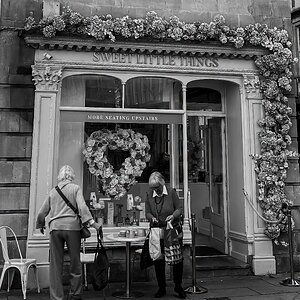
#3 is the only one I really like. The composition is really interesting and his position in the frame creates some tension whilst the kind-of 'Z' shape of the ceiling, column and wall lead the eye nicely through the frame. The lighting also looks really nice - it lights the important part of him; his face, and falls away further down his body to leave the face undistracted.
Nicely done.
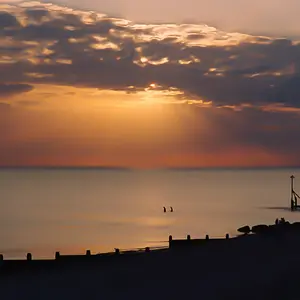
#1 is a bit of a nothing shot. A snapshot, as someone else said.
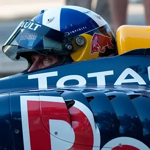
#2 is far too tight - he looks like he's crammed into a box, plus there's a weird distracting white haze in the top right corner.
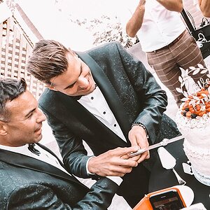
#4 I can see what you were going for, but it hasn't quite worked out. However, this one is recoverable with a bit of 'Shoppery - a bit of a contrast boost, a more interesting crop and getting rid of that hazy white line across his face should do the trick. If you can't get rid of it, try exaggerating it. Maybe a fully fledged, J.J. Abrams lens flare will give it a kick up the backside ;-)