What's new

c & C on these 3 please.

Beautiful! All of them.
 
1 and 2 are superb. 3 doesn't do much for me, sorry.
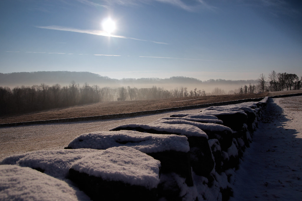
2 is the bread and butter of the bunch. I love the mysical look to it. Nice job!
 
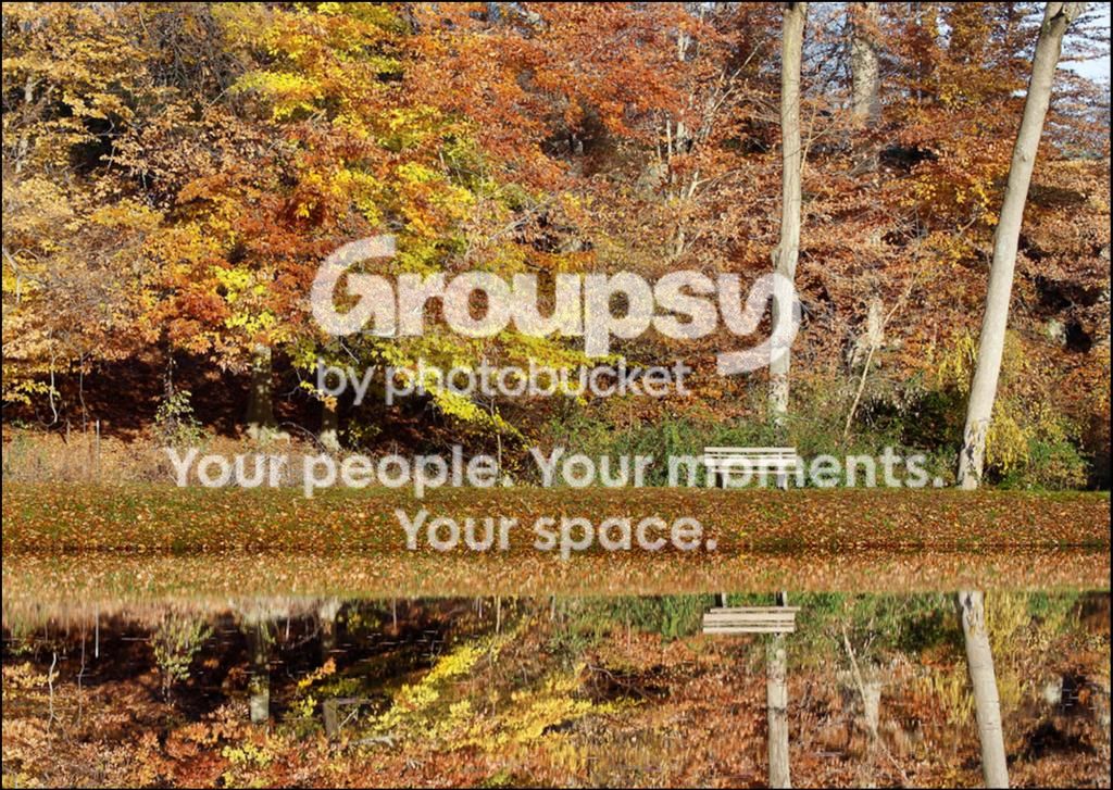
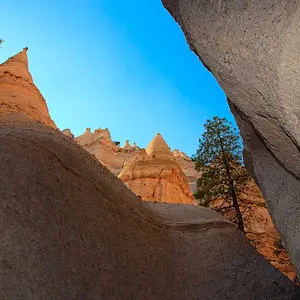
Nice autumn reflection in the first, but it seems a bit bright.

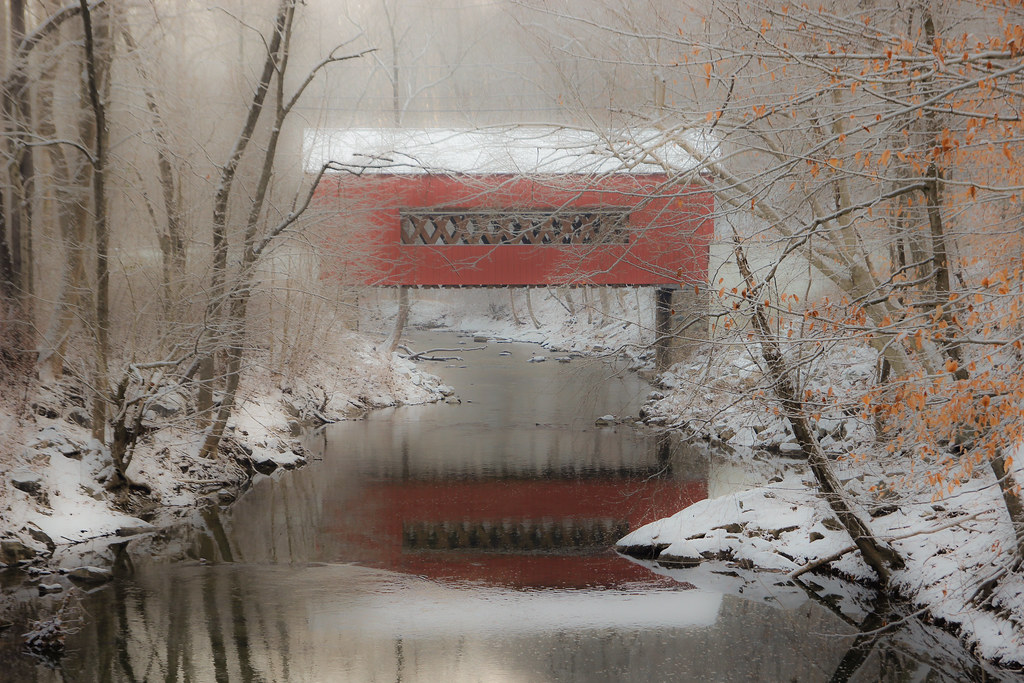
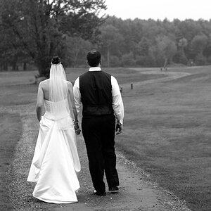
You have a scenic winter subject in number two, but the dreaminess is a bit much, perhaps too muddy.

I like the capture of the valley fog in the awesome morning photo but it is hurt by the blurry foreground subject. I can't view what aperature you shot this at.
 
#2 is my favorite.. very nice!
 
Typical of when more than one photo is posted for C&C, you have gotten comments but no critique.

Comments are nice, but critique is what makes you a better photographer.

I will critique #1.

The lighting is flat, which diminishes a sense of depth in the image.
The light is flat because the light comes from almost directly behind you.

If you burn the part of the photo that is between the waters edge back to the fence and bench it will add a sense of depth. Also burning the reflection of that portion of the photo will add to that.
Crop off the top or the bottom so the image frame is not split 50/50 on the horizontal by that same area of the photo.
Some other local burning would also be helpful. (Burning is making part of an image darker. Making part of an image lighter is called dodging.)

Ideally, the bench would be centered on one of the 2 right side rule of thirds power points.

I would illustrate how those changes would look, but your edit preference is My Photos Are NOT OK to Edit
 
Last edited:
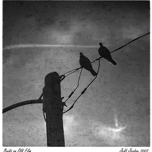
3 1/4000 f5.6 17mm

2 1/45 f5.6 44mm

1 1/125 f8 70mm

Thanks for the comments!

Should I tone down the bridge photo?
 
KmH said:
Typical of when more than one photo is posted for C&C, you have gotten comments but no critique.

Comments are nice, but critique is what makes you a better photographer.

I will critique #1.

The lighting is flat, which diminishes a sense of depth in the image.
The light is flat because the light comes from almost directly behind you.

If you burn the part of the photo that is between the waters edge back to the fence and bench it will add a sense of depth. Also burning the reflection of that portion of the photo will add to that.
Crop off the top or the bottom so the image frame is not split 50/50 on the horizontal by that same area of the photo.
Some other local burning would also be helpful. (Burning is making part of an image darker. Making part of an image lighter is called dodging.)

Ideally, the bench would be centered on one of the 2 right side rule of thirds power points.

I would illustrate how those changes would look, but your edit preference is My Photos Are NOT OK to Edit

Changed that setting and would like to see what can be done.

I am using lightroom 4 and am only on the surface of using the program
 
I don't care for #1 much but #2 is outstanding...the color the softness it is right on....#3 i like but not as much as 2
 

Here you go, quick and dirty with Photoshop. Lighroom doesn't have precision selection tools, and doing burn/dodge in Lightroom is considerable more crude than doing dodge/burn in Photoshop.

83Edit73441166_5bf01a3278_b_zpsa1565734.jpg
 
It's good, deosnt seem as vibrant. You may actually like the original I had before a small amount of things done to my image.

Idk, of those 2 I like mine better but am willing to hear what everyone else has to say.
 
Landscape photographers usually shot during the 'golden hours'.

Mid-day light (3 hours before and 3 hours after local noon) in the spring, summer, and fall is some of the worst light we can use for outdoor photography.

You and I are far enough north that the winter mid-day light isn't to bad, because around mid-day the Sun is low in the southern part of the sky.
 
I like KmH's edit on #1 but still find it too warm in all the wrong places..and still not enough to hold my interest for more than a glance. #2 is quite nice. As to the reds in the covered bridge: if you added red, I would tend to take it back out, at least a little..the reds are almost too bright for the light, but then again, so is the roof...I wasn't there, so can't comment to how it looked. #3..doesn't do it for me either. Too much sun!
 

Create an account or login to comment

You must be a member in order to leave a comment

Create account

Create an account on our community. It's easy!

Log in

Already have an account? Log in here.

New Topics

Back
Top Bottom