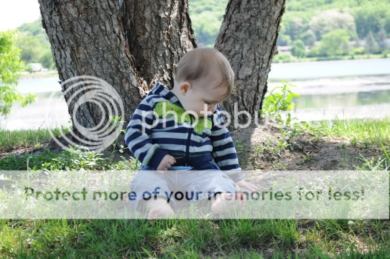
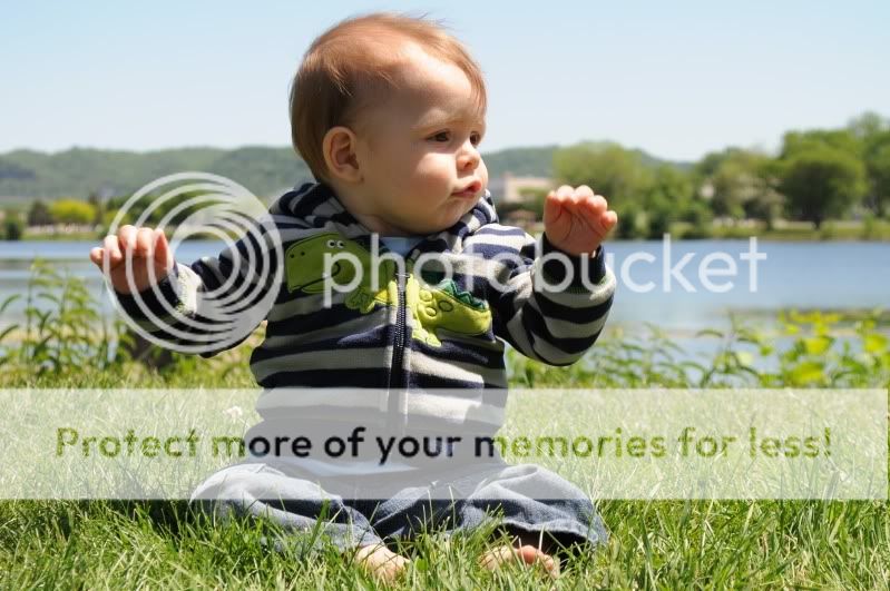
Exposure-wise, 3, 4 and 5 look good. #1 is underexposed (or a bit too dark anyway) and #2 is overexposed.
You're doing lots of things right I think, like getting down nice and low. I like the overall composition of #3, it's my favorite of the set. I like that there's more space to the right side of the photo which is also the direction he's looking in. I also like the sharpness, texture in clothes, depth of field and those big cheeks. #4's a nice moment captured. #2's kind of weak in terms of composition: He's centered, there's a very obvious tilt and one's eyes tend to go to bright areas - which in this case is the lake in the background. #1 might benefit from a crop - I'd take some off the left side and all the way down to the water on top.
The color tones now. #1, #3 and #4 look pretty good. There's a decent amount of warmth, white balance looks natural enough. In the other two, 2 and 5, the skin tones come across overly cool and somewhat pale - because he's in the shade most likely. You can fix that in post but it's a little bit of a PITA. Hard to know when the auto white balance is gonna goof, but in the future experiment with "cloudy" or "shade" if you're taking picture on a sunny day of someone who's under the shade of a tree or something.
I submit all these opinions to you humbly as someone else who's learning.
") I know I know, same subject, but I am practicing!
I know I know, same subject, but I am practicing! ")


![[No title]](/data/xfmg/thumbnail/37/37625-7e132688457d56e50320a8c99a79fe38.jpg?1734170749)


![[No title]](/data/xfmg/thumbnail/38/38740-d1a7721cf77e9309a9b4a4829c65fdd4.jpg?1734172602)
![[No title]](/data/xfmg/thumbnail/38/38742-02271ebbfd9d0efdddfac04f9fde5694.jpg?1734172602)