What's new

C&C Please

rat_1_ca

TPF Noob!
Joined
Jan 6, 2009
Messages
40
Reaction score
0
Location
Halifax NS
Can others edit my Photos
Photos OK to edit
Any good.....
4756268730_6608d89713_b.jpg


4755667221_0755b7ee28_b.jpg


4755662129_3bd15ac68c_b.jpg
 
Last edited:
I'm a beginner myself.

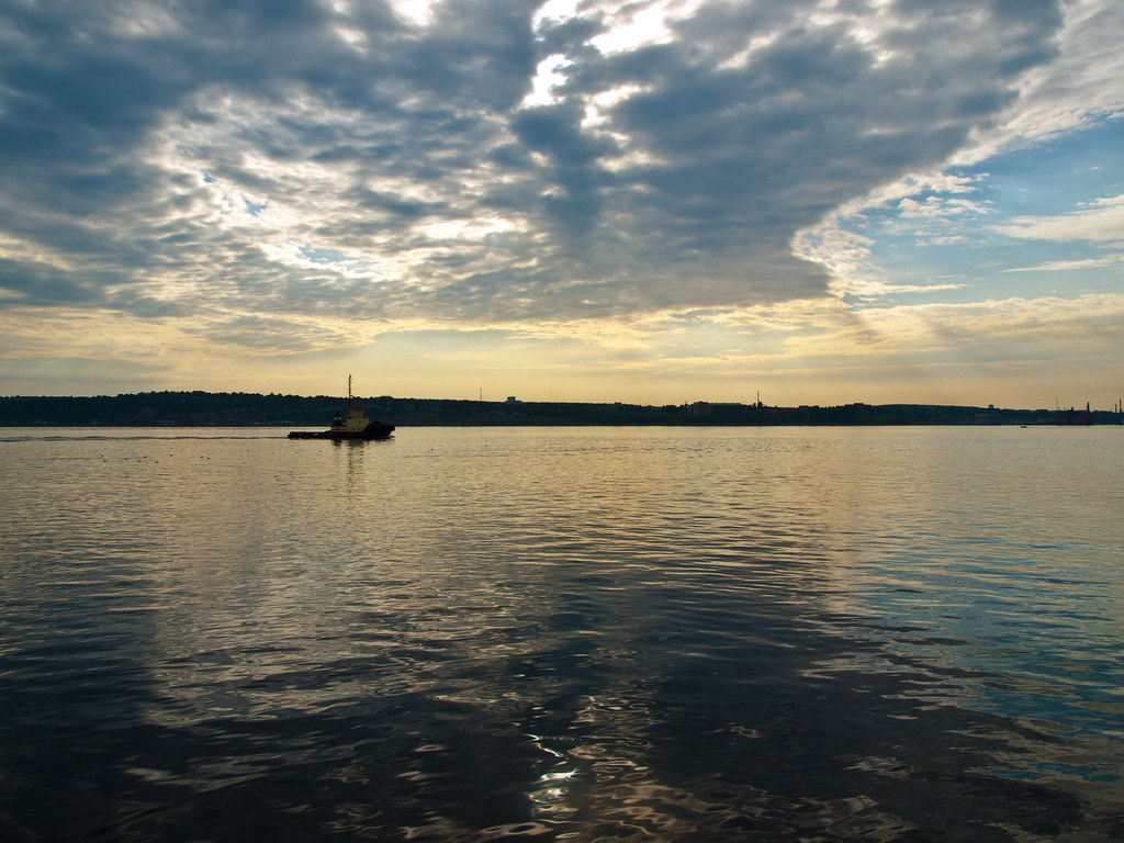
Probably the strongest out of the 3 for me. I think it could have been better if you pointed the camera up more to capture more of the sky.(rule of thirds) Also, do you see the big face with 2 eyes in the water...creepy O_O
 
#1 could use some post processing. Since the sky is the most obvious subject, I would crop most of the water out. It's just distracting and dark. Cropping will force the viewer's eyes up towards the sky. I would also brighten the image some and lower the contrast slightly. The boat is a little distracting. If it was better lit, it would have made a good subject, but since it's so dark, it forces you to strain your eyes to see it.

boat.jpg


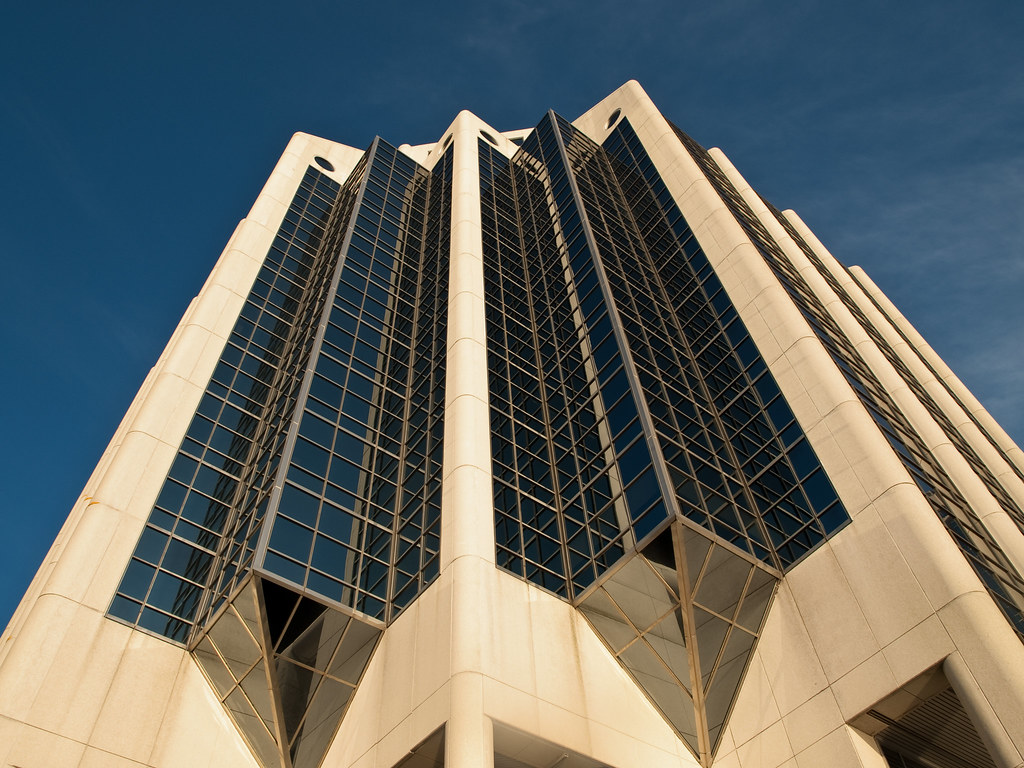
#2 looks good. Nice color, good exposure. Not the most interesting subject, but still a good photo.

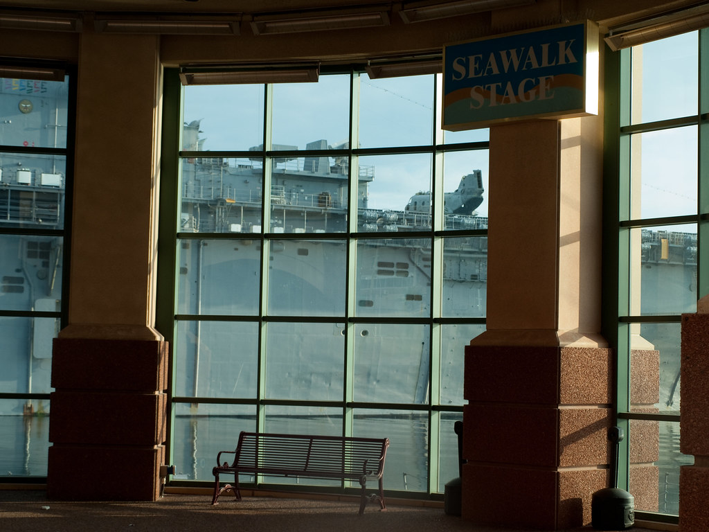
#3 suffers from the room in the foreground being under exposed. Plus the sign is overexposed where the sunlight is hitting it. I don't think there's much you can do with this one. You would have to do an HDR image to make it work.

Just watch your exposure and read up on the "rule of thirds". It's a good start, tho!

-Ray
 
I really like the first one as it is but Ray(my name too!!!) makes a good point, cropping the water lightens it up and really makes the sky jump..

The third photo would be really neat with a sailor as the subject or even a woman in a summer dress holding a sailor's headgear.. that would obviously be staged but would be a fun shot.
 
Having some small highlights like the closer side of the sign in the room is ok.

From a compositional stand point all 3 have issues.

#1 has the horizon across the horizontal center of the photo effectively making it 2 separte but cojoined images. The top half being much brighter than the lower half.

#2 has some perspective problems but is the strongest of the 3 images. The time of day the image was made is not helping and you really should have either moved to the left a little, or more so to the right to better frame the shot which is essentially an abstract.

#3 just doesn't work because not enough of the ship(?) can be seen.


4756268730_6608d89713_b.jpg
 
Last edited:
i think 3 would be much nicer if you got closer to the glass as if to show the world through it,i dunno just my opinion ,try it if you ever get to reshoot it.
 

Create an account or login to comment

You must be a member in order to leave a comment

Create account

Create an account on our community. It's easy!

Log in

Already have an account? Log in here.

New Topics

Back
Top Bottom