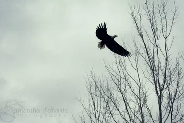
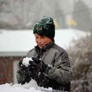
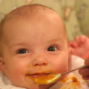
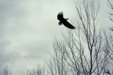
I feel like a different crop may do the first one some good. I feel as if it is not well balanced. Maybe getting rid of some negative space would help?
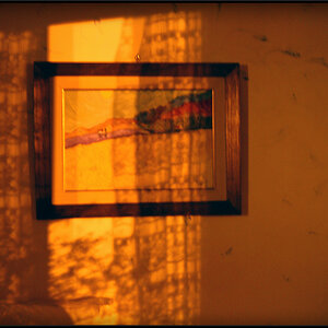
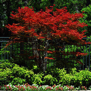
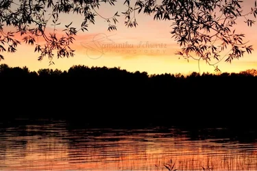
Great colors/exposure in number two! Love how the tree branches frame it.
I thought the same in #1 but however this is the original picture and I couldn't seem to find a better crop or better lighting to make it pop. Thank you for the comment. appreciate it
Nah #1 crop is fine makes it more interesting though you do need to crop off those stray branches on the top right dunno why they're there it just doesn't go



 appreciate it