What's new

C&C please

now I'm confused... what did I do right and what did i do wrong!? not necessarily asking you guys, but myself >(

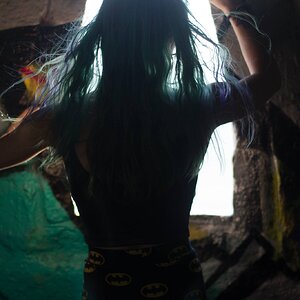
I think they are good shots, don't get me wrong, with the first being the weakest of the batch.

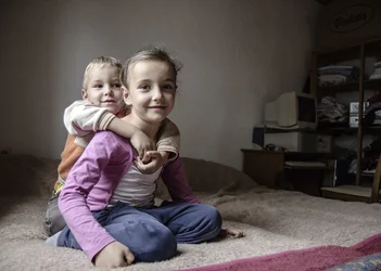
I just don't think they match the vibe you were going for, but the socks picture would be the closest. I just don't like the processing to out so much structure. I think it makes skin looks splotchy and clothes/texture look unrealistic.

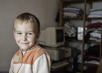
I think the last photo of your first batch is the winner, with socks being a close second.
 
I get the whole processing thing you were saying, and I agree with it.
I was editing some happy photos for a few hours before editing some of these and I guess I went far with unhappyness. When I tought they were fine, they seemed to me too good looking :) :( so I went far with the structure

With fresh eyes I'll edit them again.

But again, how will I then achieve this?

"Upload high-resolution photos. Upload a photo with dimensions of at least 1,024 x 768 pixels. The larger the photo, the higher the resolution. Make sure your photos are vibrant and engaging! This compels donors to click on the picture and find out more about our project.
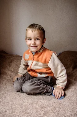
Also, Organisation has learned from experience that people are more encouraged to donate to projects with positive, uplifting photos. Posting photos of the beneficiaries is a great idea but we encourage you to show the people in need in an uplifting environment-smiles are always great."

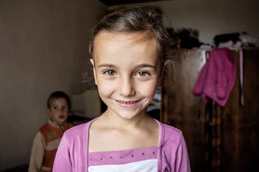
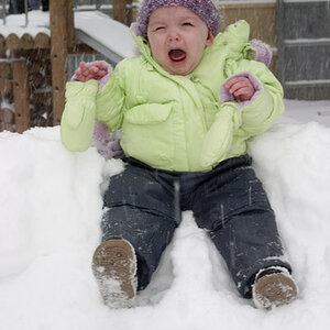
and they want some happy close ups with smiling child, to be the main, at the front of the project photograph.
 
better?

$fap_081013_0068 (Large).webp

$fap_081013_0094.webp

$fap_081013_0103.webp

$fap_081013_0120.webp

$fap_081013_0110 (Large).webp


thank you all for helping!
 
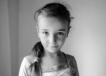
Note that the violation of 'no subject in the center' rule isn't a problem because the symmetry of her face makes it all work. That little bit of window at the left just adds the touch that completes this.

50% is taking the image
75% is recognizing the minor problems with the image and correcting them to draw the beautiful inner image out.

original
too contrasty, dark side too dark, light side too light, noisy

fap_081013_009411111.jpg~original


removed noise, used curves to make the dark a bit lighter, the light side a bit darker.
this is not the lighting for a standard portrait but the lighting to show a lovely young girl in a room by the window.

Keep this picture.

fap_081013_009433333.jpg~original
 
Last edited:
Thank you Lew!

You save the photo :)
 

Create an account or login to comment

You must be a member in order to leave a comment

Create account

Create an account on our community. It's easy!

Log in

Already have an account? Log in here.

Back
Top Bottom