What's new

C&C Please

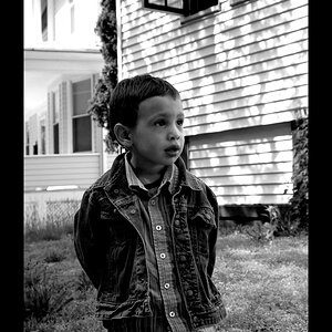
This is a very difficult image to critique; that is: It could be meant as a specialty advertising image, in which case it might be perfect, or it could be just a happy snap, in which case it's a nice keepsake image. In general a couple of things strike me: One is that the highlights on his skin look a bit too hot, he has serious racoon eyes, and he's pretty much perfectly centered in the frame. Consider adding a bit of fill, either flash or reflected to bring light & life into the eyes as well as to knock down the highlights a little, and also move your subject at least a bit off to one side or the other as centered subjects tend to have less visual appeal than non-centered ones.

 
I think the main thing about your subject being centered is; the effect is amplified due to the extra space on either side of him.

If you had framed this in vertical format, then centering him would not seem odd at all.
 
It doesn't matter how you crop, there is no light in the eyes or eye sockets.

I could have sworn I replied to this comment before. I guess I didn't (its been a crazy morning)

IT was just a shot I took while out with a friend and her kid. Clearly, this is her kid. The lighting is not ideal, nor was the crop.

I am not sure I could get a chance to reproduce this before I leave the town for another 6 months or so, so that makes me kinda upset. I like the premise of the shot, but the shot needed work.

Thank you for the input folks. If anyone else has anything else to add, please feel free. I am constantly learning, I am just glad I didn't make this mistake on a paid shoot.
 
Carry a small flash, and set it for 1/2 or 2/3 stop under. Even if it's on a hotshoe it will be an improvement. it will kill those awful shadows and put a catchlight in the eyes.
Look at my avatar. Even I look pretty with a little light in my baby blues.
 
all shots don't need to be all pro like that. They wont all end up in a magazine somewhere. So, I think this photo is great. The shadow doesn't bother me. if it happens in real life then so be it.
 
all shots don't need to be all pro like that. They wont all end up in a magazine somewhere. So, I think this photo is great. The shadow doesn't bother me. if it happens in real life then so be it.

People post pictures here to learn what they aren't seeing in making their pictures 'all pro.'
 
aside from the fill flash issue, when viewed at full size from Flickr, the whole image seems a bit soft. I also think the DOF here was insufficient. His face and hands are in focus, but his shoulders, ears, and most of his hair are not. I would also take the highlights way down to cut back on some of the glare. As a quick family snapshot, i guess its ok if viewed as a small image on Facebook. As far as portfolio work goes, i would toss it.
 

Create an account or login to comment

You must be a member in order to leave a comment

Create account

Create an account on our community. It's easy!

Log in

Already have an account? Log in here.

Back
Top Bottom