theregoesjb
TPF Noob!
- Joined
- Nov 4, 2011
- Messages
- 158
- Reaction score
- 5
- Location
- boston
- Can others edit my Photos
- Photos OK to edit
Here is the crop I chose:
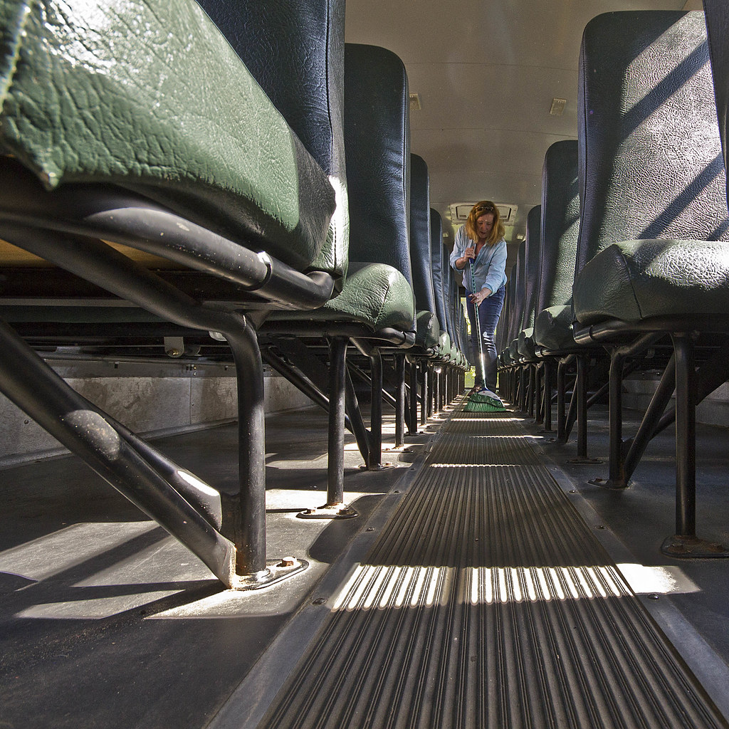 bus cleaning crop by justinbin84, on Flickr
And here is the original:
 bus cleaning full by justinbin84, on Flickr
What do you think? How would you crop it? (or would you?)
bus cleaning crop by justinbin84, on FlickrAnd here is the original:
bus cleaning full by justinbin84, on FlickrWhat do you think? How would you crop it? (or would you?)


![[No title]](/data/xfmg/thumbnail/30/30995-7e48e5498fe9a56ea3d405cf87f3a1ec.jpg?1734159070)


