What's new

C&C

Thanks! My dad was crazy about the first one, but he submitted both. I am really happy with the first, minus some haloing along the treeline. Not a dealbreaker for me though.
 
Great photos. #1 also for me! Pretty sweet ride.
 
I like #1 better but I think if it had a shallower DOF it would be better to isolate your subject from the trees. I think this would make the truck pop more.
 
Maybe a bit more "pop" to the colors. Nice ride though.
 
Both of them are too tight unless the photos on the calendar dont go all the way to the edge. You have to remember they have to cut the calendar so you need to put safe zone or your bumper or rear lights will get cut off.
 
Schwettylens said:
Both of them are too tight unless the photos on the calendar dont go all the way to the edge. You have to remember they have to cut the calendar so you need to put safe zone or your bumper or rear lights will get cut off.

Ah, I did not know this. Either way, they didn't put every picture in the calendar, so if they do well see what happens! Thanks for the tip
 
bogeyguy said:
Maybe a bit more "pop" to the colors. Nice ride though.

Thanks! I actually brought the vibrance down a little, I didn't want the color saturation to be overpowering since it's (#1) HDR.
 
bogeyguy said:
Maybe a bit more "pop" to the colors. Nice ride though.

Thanks! I actually brought the vibrance down a little, I didn't want the color saturation to be overpowering since it's (#1) HDR.

"Holy Oversaturated Reds, Batman!!" I could be wrong, but my impression eees dat bogeyguy's saying to have a bit more pop in colors was, uh, how do you say in Engrish...a, a, a yoke! A funni com-ment.
 
Derrel said:
"Holy Oversaturated Reds, Batman!!" I could be wrong, but my impression eees dat bogeyguy's saying to have a bit more pop in colors was, uh, how do you say in Engrish...a, a, a yoke! A funni com-ment.

butbutbut I didn't touch the saturation on #2 ... and I lowered the saturation in the HDR process of #1. Elaborate, Mr.Derrel
 
bogeyguy said:
Maybe a bit more "pop" to the colors. Nice ride though.

Thanks! I actually brought the vibrance down a little, I didn't want the color saturation to be overpowering since it's (#1) HDR.

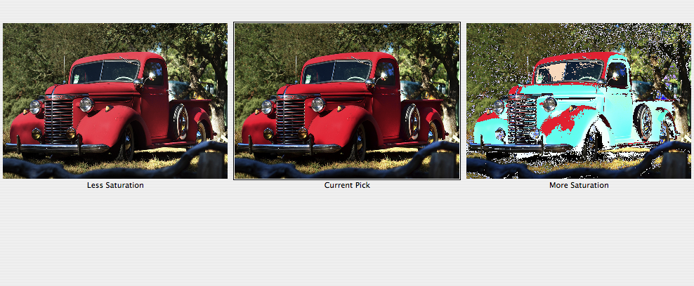
This is the second image, with the Saturation options in Variations shown...I think the image could withstand a little less saturation in the reds...

original.jpg
 

Create an account or login to comment

You must be a member in order to leave a comment

Create account

Create an account on our community. It's easy!

Log in

Already have an account? Log in here.

Back
Top Bottom