
- Joined
- Nov 19, 2010
- Messages
- 2,507
- Reaction score
- 440
- Location
- San Jose, CA
- Can others edit my Photos
- Photos OK to edit
Haven't posted anything for C&C in a while... need to go out and express myself ARTISTICALLY more! (EDIT: Fixed contrast, re-uploaded)
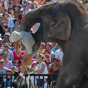
1.

Wasted Youth by theofficialtevo, on Flickr
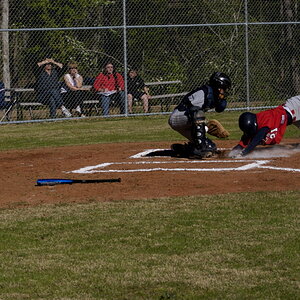
2.

No More Prisons by theofficialtevo, on Flickr
1.
Wasted Youth by theofficialtevo, on Flickr
2.
No More Prisons by theofficialtevo, on Flickr
Last edited:
") (j/k)!
(j/k)!![[No title]](/data/xfmg/thumbnail/37/37126-93feffeca0e9e6ad893962c03a7a341e.jpg?1619737884)
![[No title]](/data/xfmg/thumbnail/41/41800-9fad93555f178073cae2f303c5ef4e23.jpg?1619739897)
![[No title]](/data/xfmg/thumbnail/37/37125-c083e505c2e7d8f15f717a96de782959.jpg?1619737883)
![[No title]](/data/xfmg/thumbnail/38/38724-0b9c26c57726c91c6c504310e4428e55.jpg?1619738702)
![[No title]](/data/xfmg/thumbnail/32/32634-5acd0e44e1d927b93e8723d9184555d9.jpg?1619735554)

![[No title]](/data/xfmg/thumbnail/32/32720-b9edc2f3e7f95d97aa6561cf835b47c8.jpg?1619735626)