What's new

Camero-need some c&c

bluetibby1

TPF Noob!
Joined
Oct 21, 2010
Messages
388
Reaction score
2
Location
Haslet, TX
Can others edit my Photos
Photos OK to edit
Some photos from today, any c&c would be appreciated.

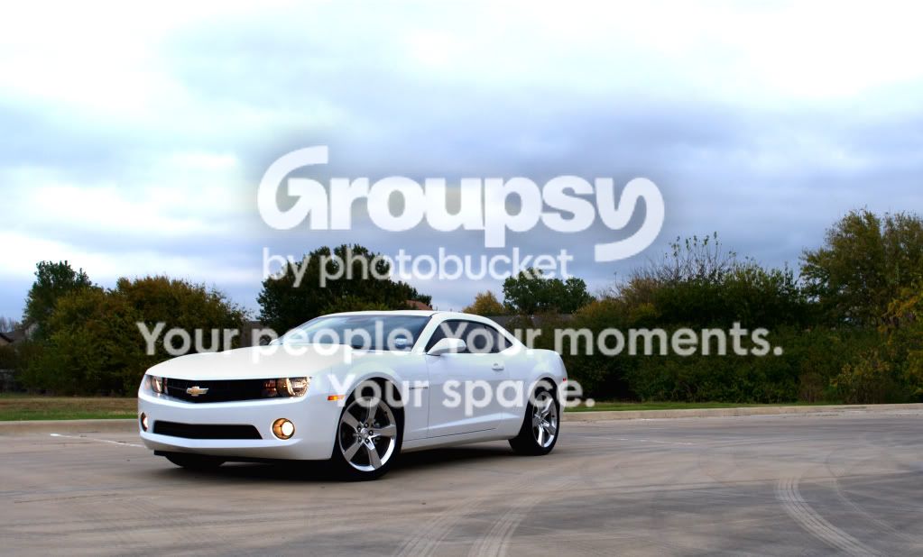
1)
camerodriverside.jpg


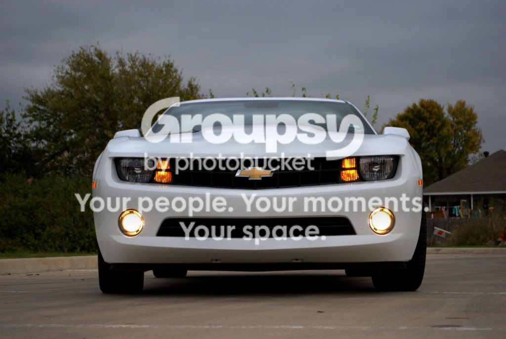
2)
camerofront.jpg


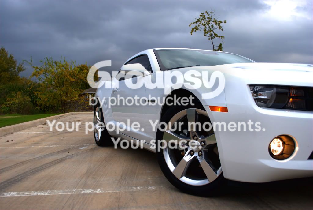
3)
Cameroside.jpg


Thanks in advance,
blue
 
It would be nice if you dont butch the name of an American car legend :)
 
Was just going to say... It's C A M A R O.

Sorry, just a pet peeve of mine, beautiful car. :D
 
At least you didn't spell it "Comero" as I have seen several times. Hell, I've even seen it spelled "Mustang." Having owned one, it always gets to me.


The focus in #2 looks off slightly. Could just be the lighting/color though.
 
Oh yah... that car is BAD! :sexywink: With a car like that you know we might get distracted from the question! But for the record, I like #3,
 
Love the car...looks like magazine layout.

Really? Maybe if he was on a runway or something, but the backgrounds are very distracting, you can see houses in every shot, and the DOF is to much, I dont want to the distractions behind the subject.
 
I didn't realize I spelled it wrong! Wow I have been spelling it wrong for years, lol. Oops. Now I know haha. Thanks for the comments, I agree Tulsa the dof is a little much, didn't think about that till I got to the house and loaded them. Luckily I have the car at anytime.
Blue
 
#1 needs to be cropped tighter, and you have a lot of blown areas, in particular the bonnet of the car.

#2 is off kilter, slightly out of focus and with a distracting background. It's also a pretty boring shot of the car. If you're doing front on it's probably best to get in closer with a wider angle lens and as low as possible to make the car look more intimidating. Also pay attention to how the wheels are turned, they should be either dead straight, or even better aggressively turned - not turned just slightly.

#3 is the best composition although the background is still annoying, and also looks to be oversaturated. It almost looks like HDR although still with some blown highlights.

 
think a tighter crop on 1 and 2 and get the houses out of the pic. 3 isnt bad if you get the house out and get rid of the tree coming out of the roof.
 
think a tighter crop on 1 and 2 and get the houses out of the pic. 3 isnt bad if you get the house out and get rid of the tree coming out of the roof.

DITTO and I love the contrasting dark skies over the car.
 
A real QUICK and CRAPPY edit to remove some distractions...........

Cameroside.jpg
 
Needs a better setting. Parking garage is cliche, but it usually works.
 
Sonoma I do like the edit, still learning the Gimp. I'll play more when I get home. I just love the shots of the CAMARO.

Blue
 
Very nice car! I had one many years ago. Red '71 with all white interior:puke:
Filthy when I got it; I think it was a repo.

Enjoy!
 

Create an account or login to comment

You must be a member in order to leave a comment

Create account

Create an account on our community. It's easy!

Log in

Already have an account? Log in here.

New Topics

Back
Top Bottom