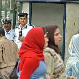
In #2, I think had you taken a few steps to your left, you would have taken the sun out of the photo (Which in my personal taste I find too bright and distracting) and the building you see just between the first two people would possibly be seen much clearer on the left of everyone, giving a better glimpse as to what they are staring at.
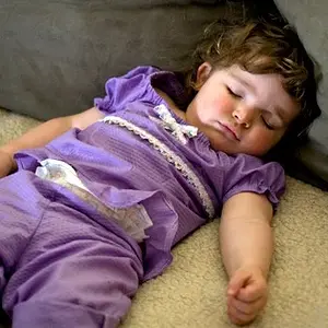
In #3, there's a lot of empty space on their right. Empty space can work but usually works best when the subject is looking into it rather than off the image.
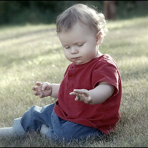
#4, I would have tried to get his feet in the photo (less crop)
#5: I like the three monks? Composition is nice, love the center guy's stare. (Did you edit his eyes? Nice and sharp) The large white object (looks like large water gutter, but obviously not) behind them is a little distracting. (I'm not a PS expert, but if you could clone that out to the background I think it would be great) And although just a matter of timing, but it looks like he was pulling up his pants. (Which once I noticed, changed the overall impression of the photo.)
Just my 2 cents.



![[No title]](/data/xfmg/thumbnail/40/40306-ea393f71adcd88a9abb9fb16dc6af2d5.jpg?1734174714)
![[No title]](/data/xfmg/thumbnail/35/35264-5ade32b7036391926536661aeb7491c3.jpg?1734166921)
![[No title]](/data/xfmg/thumbnail/40/40304-a0ff25efbc1737761e8c4d43e2caa085.jpg?1734174712)
![[No title]](/data/xfmg/thumbnail/35/35263-86f580cf5d28d23109a45984030a79ad.jpg?1734166920)