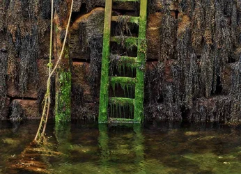
#1 for me. A few comments:
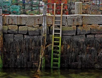
--I'd crop #1 so it accentuates the vertical lines in the ladder and ropes.
--I also wouldn't put the ladder in the exact center....rule of thirds and all that...so a portrait orientation (and crop) can accomplish two objectives with one action (by placing the ladder off-center).
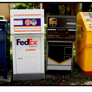
--#2 (to me) looks over saturated b/c it focuses on the algae on the ladder so it looks like paint or overly enhanced green and but you see it in context (i.e.: #1), it fits.
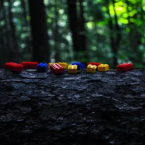
--the lobster pots don't stand out but they're red...and that works very well with the green of the algae in a very subtle, unconscious way that enhances the composition.






![[No title]](/data/xfmg/thumbnail/32/32926-ec27ecead8c80d803404500d8f888dbf.jpg?1734162683)