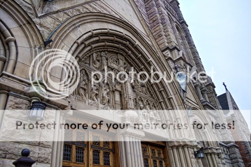
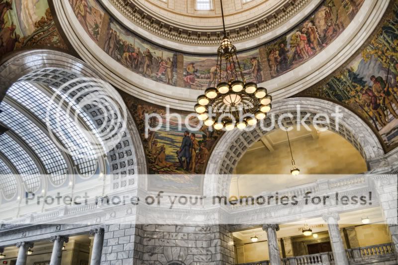
All a great set but some of the images have little flaws the 1st one has a little cyan towards the upper corner of the stones.
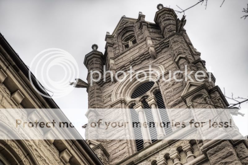
-2nd image has distracting branches and the sky has has grey patch area although I am aware that it looks like a cloudy day it doesn't appear as clouds it appears as color banding.
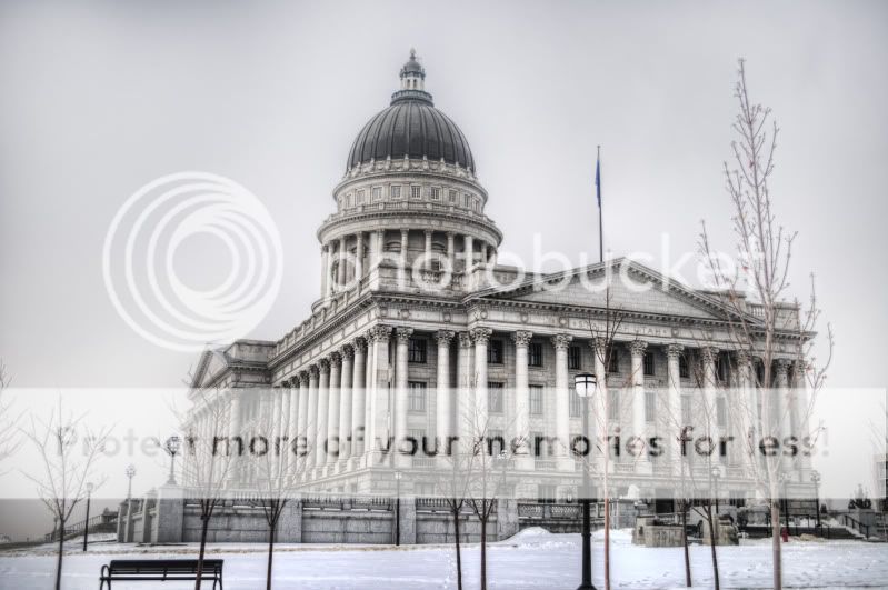
-3rd just the sky has same effect as 2
-4 I can't find anything wrong with this one looks good to me.
I was going to suggested getting rid of the branches but i see Provo has done that for you.
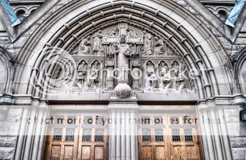
I like the chapel the best, and would agree with changing the direction of the first one. Keeping that black knob out of the image and zeroing in on all that wonderful detail work in the doors and stone.
What you chose to include in the picture and what isnt pictured. Some are very tightly framed and therefore cause a bit of dissonance to the eye. There are lines that trail the eye off of the picture and make it a bit less appealing.
But besides that, your processing is good. I just think you need to apply that processing to a well framed picture (like the front angle of the doors you posted) and you'll have some really great work.


")


![[No title]](/data/xfmg/thumbnail/37/37617-2a07b7e10a8d9f154e8cd9727551e0ef.jpg?1619738151)
![[No title]](/data/xfmg/thumbnail/39/39509-3c2c5856429b4b8ff3cf44cd3b2afa8c.jpg?1619739064)
![[No title]](/data/xfmg/thumbnail/37/37616-5e9d06af384cf745ad31a513e49183a9.jpg?1619738151)
![[No title]](/data/xfmg/thumbnail/37/37618-4cd08d553e4ce30fd49570b1ba8259f2.jpg?1619738152)