What's new

CC needed

nathfromslg

No longer a newbie, moving up!
Joined
Nov 10, 2012
Messages
225
Reaction score
29
Location
Kolkata
Can others edit my Photos
Photos NOT OK to edit
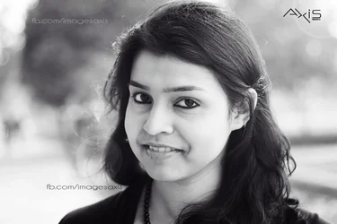
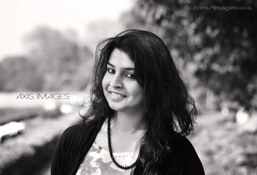
can anyone help me with their feedback and criticism and how I can improve? what techniques can be used to improve


$IMG_9705-Recovered.webp

$IMG_9704.webp
 
I don't think there's really all that much to improve here...
 
They both look good to me. Lovely model and a good conversion to b&w. The only thing that I see would be the lack of catch-lights in her eyes, but that is really nit-picky.
 
I don't think there's really all that much to improve here...

Well,do these pics qualify to be as professional?

They both look good to me. Lovely model and a good conversion to b&w. The only thing that I see would be the lack of catch-lights in her eyes, but that is really nit-picky.

Didnt wanna overdo her eyes!and I always try to keep PP as minimal as possible,also it saves a lot of time
 
Like the shots...but what's up with three text strings on one photo??!!
 
C&C per req:

1. A nice enough shot, but two things strike me: One is that the shadows on her left side are a little too deep, and detail is lost in both her hair and the black sweater. The other is that the background, while nicely OOF, is still rather busy and distracting. Remember that the eye is attracted to light over dark, and given how her dark hair and sweather, I think dropping the background exposure as a whoel, by at least 1.5 stops would have helped a lot.

2. I like the natural hairlight here, and the background is much less obnoxious in this image. Have you considered a square crop?

Just my $00.02 worth - your mileage may vary.

~John

 
Yes, the shadows are overly dense and detail-less. Not sure that the fake lens flare effect on #2 is really all that needed. As to the question, do these look professional? No, not really. The horizontal composition on a head shot does not look professional; the background on the first shot has some very ugly, distracting "stuff" clearly visible in the field to the left of her, and her broad, square-to-the-camera look is not that flattering. That bright white thing in the first shot, right on the left edge of the frame? That is utterly distracting.
 
" Professional" is overrated these days. Do they look nice? Mostly yes. Id rather see how you handled them in color though, since BW is my portrait go to when I don't feel like dealing with color casts.
 
" Professional" is overrated these days...

:scratch:
He seems stuck on "is it professional". To me, professional is soooo much more than one or two images. Its an odd question to ask when asking for CC of an image.

Not saying it is the case here, but usually when a person wants to know if an image or two looks professional, they want the answer to be "YES!"
 
The NUMBER ONE RULE in portraiture of women is.....Don't put WEIGHT on them!!

The top image is FAR BETTER because you have some shadowing on the near side of her face--ANY TIME YOU CAN GET CLOSE TO SHORT LIGHTING IT WILL SLIM THE FACE.

And that's why the bottom image DOES NOT FLATTER HER--because it's lighting is just the opposite--it's BROAD lighting. Her face has become very round and BROAD!!

This is a common mistake made by photographers that FILL all their portraits thinking shadows are to be avoided.

Shadows create the THIRD DIMENSION in art. Without them we are producing cartoons.

And, yes my fellow forum responders were correct about the background. In my portraiture I BUILD THE PORTRAIT FROM THE BACKGROUND--FORWARD to ADD to the overall image--not creating any distractions like light traps and such.

I think you're on the right track!!
 
Like the shots...but what's up with three text strings on one photo??!!

Well,photos get stolen,so to prevent them.I know that I shouldnt upload these if I dont want them to be stolen.Still!

C&C per req:

1. A nice enough shot, but two things strike me: One is that the shadows on her left side are a little too deep, and detail is lost in both her hair and the black sweater. The other is that the background, while nicely OOF, is still rather busy and distracting. Remember that the eye is attracted to light over dark, and given how her dark hair and sweather, I think dropping the background exposure as a whoel, by at least 1.5 stops would have helped a lot.

2. I like the natural hairlight here, and the background is much less obnoxious in this image. Have you considered a square crop?

Just my $00.02 worth - your mileage may vary.

~John
#1 Thanks for your advice I really didnt think about it,I lost those details maybe because she was facing the sun and the bright thing on the right might be the result of that.
Any help on how to drop the background exposure?

#2 Not really,didnt think about cropping it square.

Yes, the shadows are overly dense and detail-less. Not sure that the fake lens flare effect on #2 is really all that needed. As to the question, do these look professional? No, not really. The horizontal composition on a head shot does not look professional; the background on the first shot has some very ugly, distracting "stuff" clearly visible in the field to the left of her, and her broad, square-to-the-camera look is not that flattering. That bright white thing in the first shot, right on the left edge of the frame? That is utterly distracting.

Thanks,I got that.
I really didnt see it the first time I uploaded.

:scratch:
He seems stuck on "is it professional". To me, professional is soooo much more than one or two images. Its an odd question to ask when asking for CC of an image.

Not saying it is the case here, but usually when a person wants to know if an image or two looks professional, they want the answer to be "YES!"

:D well,not exactly.
I will be delivering these photos to her and she will be paying a lil fees.So just wanted to know. :)

The NUMBER ONE RULE in portraiture of women is.....Don't put WEIGHT on them!!

The top image is FAR BETTER because you have some shadowing on the near side of her face--ANY TIME YOU CAN GET CLOSE TO SHORT LIGHTING IT WILL SLIM THE FACE.

And that's why the bottom image DOES NOT FLATTER HER--because it's lighting is just the opposite--it's BROAD lighting. Her face has become very round and BROAD!!

This is a common mistake made by photographers that FILL all their portraits thinking shadows are to be avoided.

Shadows create the THIRD DIMENSION in art. Without them we are producing cartoons.

And, yes my fellow forum responders were correct about the background. In my portraiture I BUILD THE PORTRAIT FROM THE BACKGROUND--FORWARD to ADD to the overall image--not creating any distractions like light traps and such.

I think you're on the right track!!

Thanks,I will learn about short lighting.
Will keep that in mind


Thanks all for your CC
 

Create an account or login to comment

You must be a member in order to leave a comment

Create account

Create an account on our community. It's easy!

Log in

Already have an account? Log in here.

New Topics

Back
Top Bottom