C&C per request:
Shot 1) I do think the rain is a bit cheesy here, mostly because I think the effect could be better executed. There are a couple things that bother me about the "rain" here. One is that it appears to be coming almost straight down (that is, if you didn't have the tilt to the shot, the rain streaks would be pretty darn vertical). Rain only appears to come straight down if there is negligible wind or if the wind is directly in your face or at your back. Rain of the magnitude shown here is closer to "storm" than "gentle rain", so I would expect to see some angle to it relative to the couple. The other thing that seems off is that the rain effect is consistent across the frame. In reality you would be seeing different amounts of rain relative to the distance between the camera and the object in that part of the frame. There would be much more rain visible between you and the trees in the distance than between you and the couple. By using a consistent effect (coupled with the rain being more visible against her dark hair, his dark jacket, and the darker squares of the underside of the umbrella) it appears to me that there is actually more rain under the umbrella than outside of it.
On a non-rain related note, I'm not a fan of the severe tilt in this shot. I assume that you were trying to balance the height of the couple (vertical lines) with the width of the umbrella, but the result here makes the couple too small a portion of the frame and amputates them at their waists. I think I would have preferred a portrait orientation for this shot with a slighter tilt (if you felt the need for a tilt).
Shot 2) You picked a great shooting angle to capture this nice moment between the couple. You've gotten enough of his face to include him as a person of interest in the shot, but you got more of her face. And let's face it (no pun intended), shots like this - be they engagement, wedding, or whatnot - are more for her than for him. You used a nice amount of vignette to center the eye without being obvious.
On the other hand, I feel this shot is too contrasty. You may be able to get away with that treatment if the rest of the color shots in your set have the same contrast (it becomes your style rather than standing out as being off). You also have a skin tone issue. One final nitpick is that the shot would have been improved had his collar not been turned up and obscuring the lower part of his face, particularly where it leaves just a thin sliver of his chin showing. It works as it, I just think that little attention to detail might have made it stronger.
Shot 3) Another very nice moment captured; she has a great, genuine smile. I like the composition, the portion of the frame covered by the couple versus what is left as background. I do with you had left a little more of his lower body, rather than cutting him off around the waist, to give him a better foundation for carrying her. I like the tonal range in the shot, and I don't even mind the blown areas of the water in the background as the loss of detail is in an area you don't want people paying attention to (and there is enough brightness in the couple that the blown water doesn't pull the eye away from them). I do wish there was a bit of detail in her pants rather than there being such a relatively large black hole in the bottom right corner. I also with your shutter had been fast enough to freeze her hands along with the rest of their bodies.
Shot 4) I really like this one. Despite the limitations you described I think you nailed it. You've composed the reflection well, including everything from the umbrella to enough of their legs (particularly hers) to provide that foundation. I like that you've included the non-reflected feet, to get the details of the shoes which are the only things really missing from the reflected view. I also think this would work well if you cropped from the top and only had the reflection and none of the real couple. I really like the processing, it suits the mood of the photo perfectly. (Though it's not at all in line with the processing of shot 2, which is why I made the style comment there.)
Nice set, thanks for sharing!


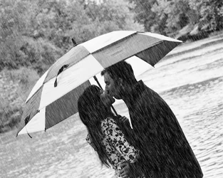 Fake rain.... wanted real rain, but it quit raining when they showed up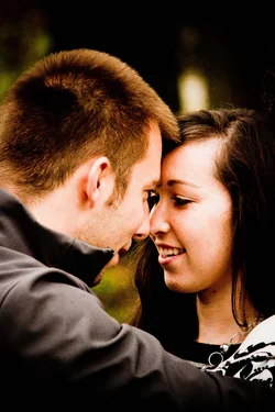
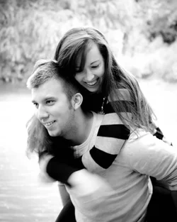
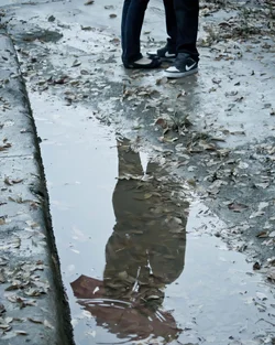 Had Limited space to try to get this shot right... we were actually on rocks in a river. I am standing on one foot on a rock... so this was an attempt. Next time I would like to set it up a little better.