What's new

Christiening

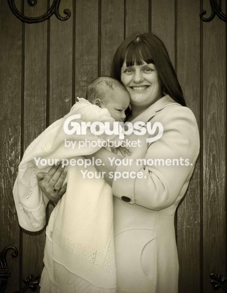
I was merely being more firm with you to make the point that your choices, while they may be to your personal taste, are not what is commonly considered "good photography" these days. What's more is that since you had so many other issues with your imagies, that it made it appear as though you were trying to compensate for marginal photography with effects and processing, which is VERY common. (even though I don't think that's actually what you were doing)

I was giving you some guidance. Was I a bit pointed about it? Sure. I'm not here to coddle people.

If you think my guidance is crap, and you are more than welcome to assume that it is, then just ignore me. No biggie.
 
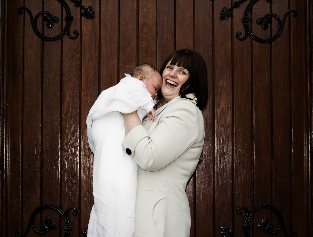
I agree with Manaheim. the vignetting does nothing to enhance this image, the subject is just centered, which is fine, but boring. the DOF seems off here, and the color (or lack thereof) seems off as well. not sure if you were trying to desaturate, or selectively color, but its very very flat and does not make for an appealing image. the decorative iron pieces ALMOST makes this picture worth taking in landscape....but not quite given all the other issues.

that being said.. I would be interested to know your processing on this, and what equipment was used. I would also like to see the original. obviously you dont have to if you dont want too, but people might understand your end result better if they knew the process behind it.
 
I do understand that completely, i just had the problem where manaheim had an opinion and that was fine then i gave my opinion apparently my opinion was wrong, and basically i have bad taste and im covering up for poor photography.. when i give my opinion and they dont agree, fine say you dont agree or that you think differently but dont say that im wrong with my opinion, because thats not true, and anyone who had an opinion and someone said that its wrong would put the person in their place,
And this is where the experience comes in. If you'd said, "I've done it because I like it." That would have been fine, and the end of the discussion, but you tried to defend it based on artistic principles, which hundreds of years of art history do indeed say are wrong.

Well i didnt think it necessary, I wouldnt have done the effect if i didnt like it.. so the person can say i dont like that effect and whatever else they think and say but you obiously do or you wouldnt have done it.. and then i say that its your opinion i suppose thats should have bin the end of it, not to tell me that im wrong and all the other crap that im covering up for bad photography.. so think everything manaheim said was fine nothing wrong with it at all?
 
What's with the cheesy processing? Get rid of that vignette, nasty sepia tone, and desaturation.
haha, No but really, If you ever want to progress in photography you HAVE to listen to others feedback. Everyones. Experienced or not. Photographer or not. Friend or not. Not everyones feedback will be 'correct', but there will be a reason for them saying it.
I know people who have been shooting for twenty plus years and they still look like they just started because they never had their work critiqued by someone more experienced. They kept their work hidden and between them and the client.
I've been shooting for a little over a year and I can honestly, confidently say I've progressed A LOT because of I've listened to what others told me.
Don't get sore when people say they don't like your work, ask how you can improve it and practice that next time.
You said others have complimented your work? That's probably because they were your friend or weren't bold enough to say it to your face. Online there's no filters, We say what we really believe because we can.

The composition is poor. Move in close for shots like this because there isn't much going on in the background so why's it need to be in there? Fill the frame with the subject and anything that draws attention TOWARDS the subject.

The highlights look a little hot and are a bit distracting.

Move the subject further from the wall so she's in stronger focus and the wall is a bit more blurred.
I would have shot this a bit higher, especially for an older woman like her, To hide under her chin a little and to have her eyes open a bit more. It makes her appear a bit younger which I'm sure she would appreciate.
 
I agree with Manaheim. the vignetting does nothing to enhance this image, the subject is just centered, which is fine, but boring. the DOF seems off here, and the color (or lack thereof) seems off as well. not sure if you were trying to desaturate, or selectively color, but its very very flat and does not make for an appealing image. the decorative iron pieces ALMOST makes this picture worth taking in landscape....but not quite given all the other issues.

that being said.. I would be interested to know your processing on this, and what equipment was used. I would also like to see the original. obviously you dont have to if you dont want too, but people might understand your end result better if they knew the process behind it.

I dont have the origional of that image but i have another one was edited obviously but shows it without the effect, yes the image is flat i was using canon60d 50mm1.8 with pop up flash as i did not have a speedlite at the time.. just bought one, and ill look for the video on youtube thats where i did the editing and turned out just as i wanted it..
1.

done29 by Allenc873, on Flickr
 
That one is much better. It looks much more natural.^

Still A LOT of room for improvement though.
 
What's with the cheesy processing? Get rid of that vignette, nasty sepia tone, and desaturation.
haha, No but really, If you ever want to progress in photography you HAVE to listen to others feedback. Everyones. Experienced or not. Photographer or not. Friend or not. Not everyones feedback will be 'correct', but there will be a reason for them saying it.
I know people who have been shooting for twenty plus years and they still look like they just started because they never had their work critiqued by someone more experienced. They kept their work hidden and between them and the client.
I've been shooting for a little over a year and I can honestly, confidently say I've progressed A LOT because of I've listened to what others told me.
Don't get sore when people say they don't like your work, ask how you can improve it and practice that next time.
You said others have complimented your work? That's probably because they were your friend or weren't bold enough to say it to your face. Online there's no filters, We say what we really believe because we can.

The composition is poor. Move in close for shots like this because there isn't much going on in the background so why's it need to be in there? Fill the frame with the subject and anything that draws attention TOWARDS the subject.

The highlights look a little hot and are a bit distracting.

Move the subject further from the wall so she's in stronger focus and the wall is a bit more blurred.
I would have shot this a bit higher, especially for an older woman like her, To hide under her chin a little and to have her eyes open a bit more. It makes her appear a bit younger which I'm sure she would appreciate.

i shot it there beacause i wanted the backround of the wooden chruch door.. and no it wasnt someone i know its on another forum
 
I'm not saying get rid of the background completely, I'm saying make it a little less apparent. For portraiture the general rule is the person should be the strong subject, not a door.
Getting her away from the wall would have probably also minimized that giant distracting glare from your popup flash
 
I actually think the door looks really nice in the 2nd shot. The textures and colours of the wood came out really nice. The subject could do with separate processing.
 
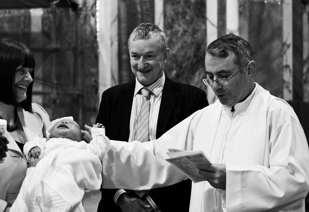
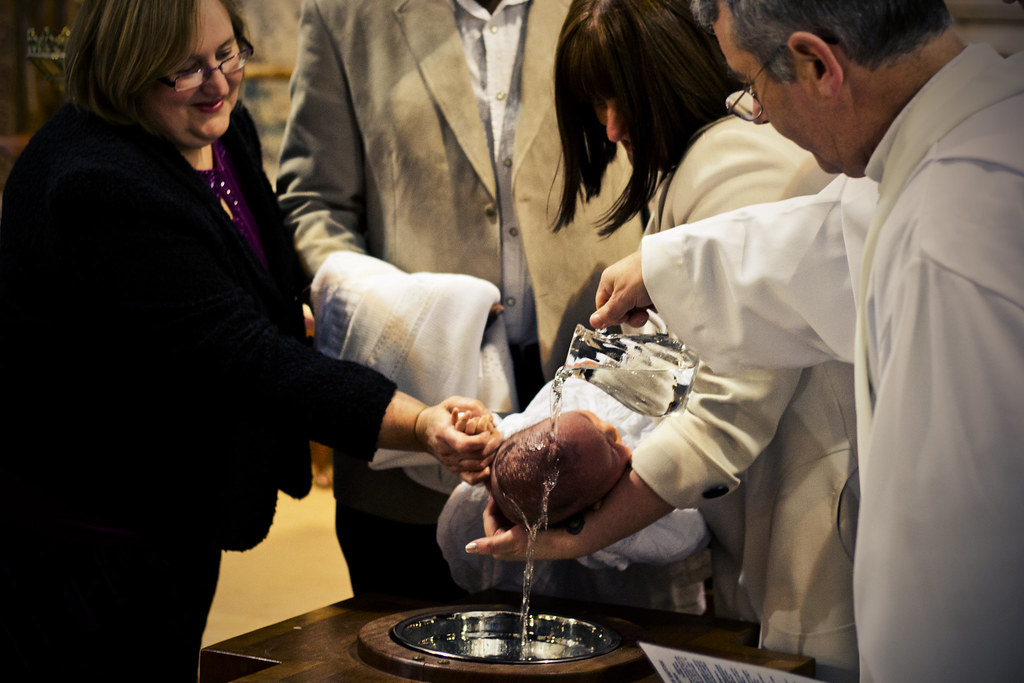
thanks, ya it is more natural but myself i still prefer the 1st lol obviously just me but anyway im sure ill get better overtime.. but i got this in the church i know its not great and that Ronnie on the left isnt in the frame, but i just like the capture of that moment and also the moment of the second image aswell.. both natural light because was in the church, and focus isnt great either

1.

ronnie1 by Allenc873, on Flickr

2.

ronnie2 by Allenc873, on Flickr
 
I would really like both of them if it wasn't for the chopping. The B&W I think would be a great candid if the mother hadn't been cut in half, same applies to the second if there wasn't the headless horseman centre frame. Both I like more than the posed shots though, just a pity on the composition.

(I suck btw, so take what I say with a big patient smile).
 
I would really like both of them if it wasn't for the chopping. The B&W I think would be a great candid if the mother hadn't been cut in half, same applies to the second if there wasn't the headless horseman centre frame. Both I like more than the posed shots though, just a pity on the composition.

(I suck btw, so take what I say with a big patient smile).

no your right, but it wasnt exactly posed shot the headless guy was very tall and couldnt get further back, only have 1 lens at the mo, and the first image she was cut off because if i had more of her i would of had half the guys face in the way lol
 
I didn't read the other comments so this may be redundant.

You have an enormous amount of wall in teh first that doesn't do anything so you are covering it up with vignette that actually attracts attention.
The baby's bottom is the brightest thing in the picture so it pulls the eye from the mother and baby face combination.

I suggest you crop it in a portrait crop (that's why it's called that) and burn in the bottom of the baby.
I've lifted them up in the frame so they share the power point and moved the iron on the walls.

8561381956_fcdca6fabe_kllll.jpg
 

Create an account or login to comment

You must be a member in order to leave a comment

Create account

Create an account on our community. It's easy!

Log in

Already have an account? Log in here.

New Topics

Back
Top Bottom