
tdz16
TPF Noob!
- Joined
- Jul 20, 2009
- Messages
- 84
- Reaction score
- 0
- Location
- N. Merrick, NY
- Can others edit my Photos
- Photos NOT OK to edit
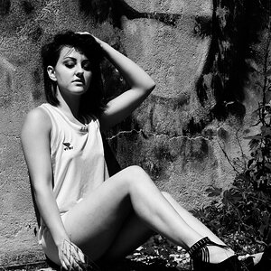
Though there are still some things to work on, I definitely felt some forward progress in my lighting and control/meaningful manipulation of my camera's settings. This girl was great to work with and was so patient with myself and a friend trying all sorts of different setups. The usual posting spots are giving me the "wow, great job" comments so I figured I'd post here since I know I'll get some thorough critique. Thanks in advance.
~Tom


~Tom
") . Also, you have to watch out for bare arms in a shot like this. So much pale flesh becomes a bright spot in the image, and thus distracts attention away from the face, where it should be.
. Also, you have to watch out for bare arms in a shot like this. So much pale flesh becomes a bright spot in the image, and thus distracts attention away from the face, where it should be. 
![[No title]](/data/xfmg/thumbnail/31/31752-fcbc5aa4a94154b9c273592aa37b8b1e.jpg?1619734991)


![[No title]](/data/xfmg/thumbnail/32/32805-61ca9a4fb87d37c0ef4f991ac1705e1f.jpg?1619735667)
![[No title]](/data/xfmg/thumbnail/42/42327-560f11a37bb209e9091c0fc9e1028cdc.jpg?1619740128)
![[No title]](/data/xfmg/thumbnail/37/37627-c3d3ca879cdfbdb9e35acdcc7fcd4b3e.jpg?1619738154)
