You are using an out of date browser. It may not display this or other websites correctly.
You should upgrade or use an alternative browser.
You should upgrade or use an alternative browser.
City Photography (How did I do?)
- Thread Starter JoshKbosh
- Start date

ronlane
What's next?
- Joined
- Aug 3, 2012
- Messages
- 10,224
- Reaction score
- 4,962
- Location
- Mustang Oklahoma
- Can others edit my Photos
- Photos OK to edit
Hey Josh, I went to the gallery and looked at them. You probably would get better response actually posting the photos in this thread and numbering them.
To me the last one (sunset photo) was the best. The others were underexposed to me.
One other thing I noticed is that it looks like you have some dust on your sensor that needs to be cleaned of or fix it in post.
To me the last one (sunset photo) was the best. The others were underexposed to me.
One other thing I noticed is that it looks like you have some dust on your sensor that needs to be cleaned of or fix it in post.
soufiej
No longer a newbie, moving up!
- Joined
- Jan 3, 2015
- Messages
- 714
- Reaction score
- 113
- Can others edit my Photos
- Photos NOT OK to edit
Hey everyone,
These are my first "field shots", the only other pictures I've taken with my DSLR were fireworks (The last post I made to the forum). I had the chance to go boating over the weekend, so I brought my camera with me and tried to get some good photos. I took around 200 the first night (These five) and about 300 the next day (I will post five more of the best shots after I go through them).
Located in this gallery
Since I was on a boat, I couldn't use a tripod and my camera was in a dry bag (Somewhat of a cheesy one, it left a smudge on all of my photos). I might not use the bag next time, seeing as the water was much calmer by the city. Hopefully they turn out better without it.
Please leave feedback! If I did something right, or if I did something wrong please let me know! I want to learn!
Edit: Also, I'll be checking out guides on editing. Currently I have Photoshop CS6 installed, so If you have any tips for these, please let me know. Thanks!
EDIT
Photos:
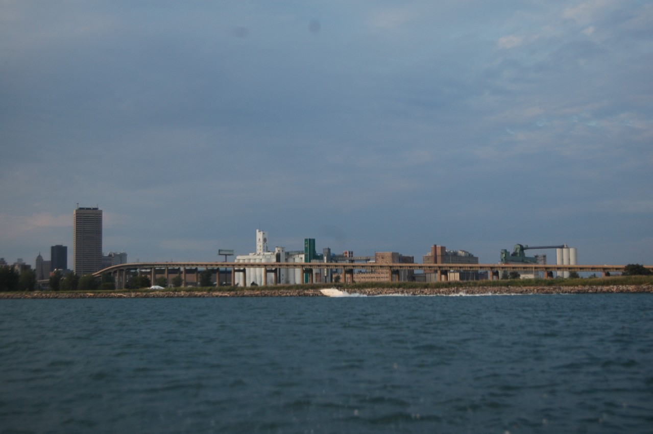
1.)
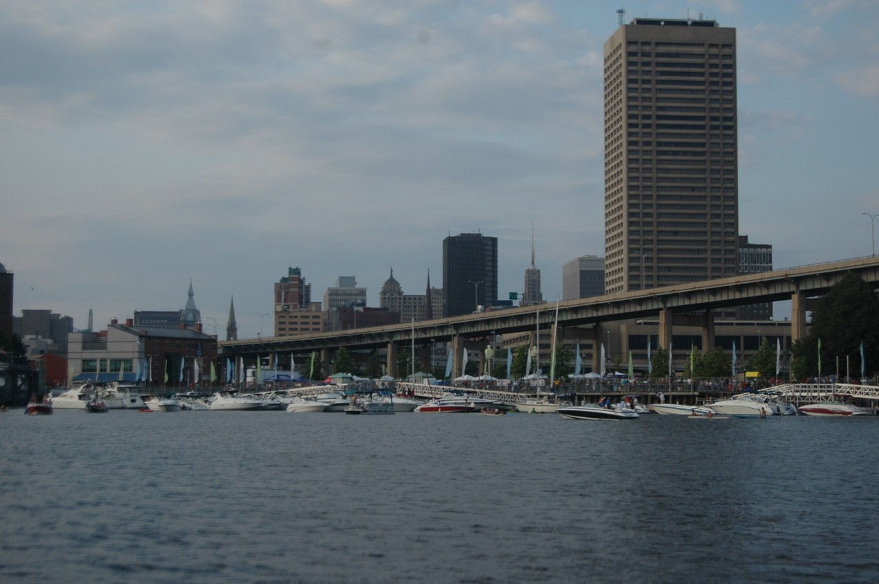
2.)
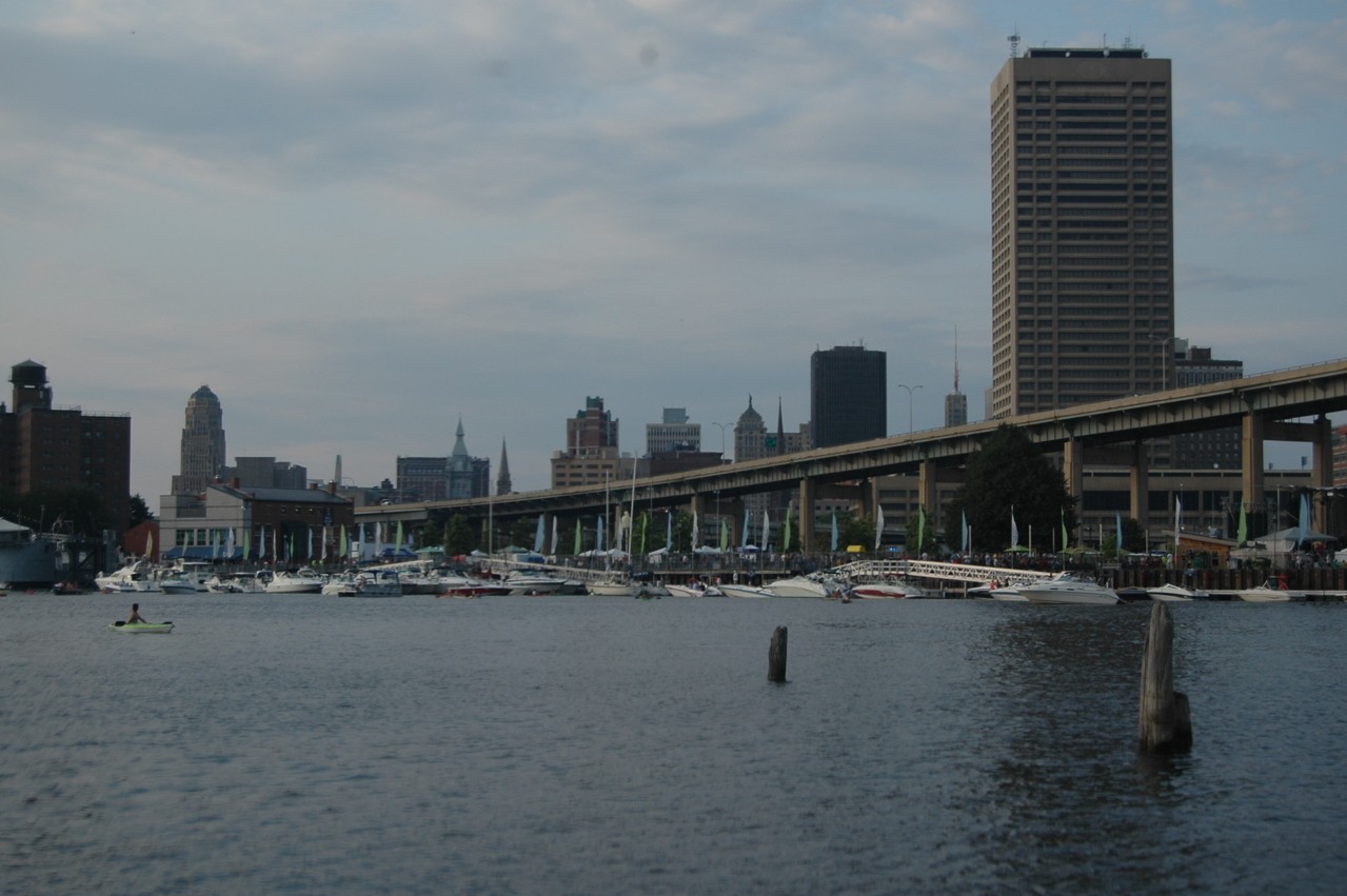
3.)
4.)
5.)
They do appear underexposed but, more than anything, they appear pretty bland. Not much dynamic contrast in any of them. More or less a thin strip of "city" existing in the center horizontal of the frame and surrounded top and bottom by a fairly consistent midtone value.
There's nothing that really catches my eye as far as your cityscapes. The city itself is largely the same value as the rest of the image. As a remembrance of your time on the boast, they serve as snapshots of a time. Otherwise, the compositions and subject matter just don't do much.
You could possibly "create" something in Photoshop but, kinda, why? Your subject matter just isn't interesting.
Photography 101 The Quality of Light The Daily Post
Last edited:

dennybeall
No longer a newbie, moving up!
- Joined
- May 13, 2014
- Messages
- 2,308
- Reaction score
- 441
- Location
- OTOW - Ocala, Florida
- Can others edit my Photos
- Photos OK to edit
The most interesting part is the city and the least interesting is the water. Based on that I would crop the first ones differently.
The dirty sensor or lens is very obvious in the middle of the very top part. You can see the same smudges on all. Cleaning is not that hard if you use the correct tools. Buy an inexpensive cleaning kit and work carefully and you should not have any trouble. I cleaned a D80 a couple times with no troubles.
The dirty sensor or lens is very obvious in the middle of the very top part. You can see the same smudges on all. Cleaning is not that hard if you use the correct tools. Buy an inexpensive cleaning kit and work carefully and you should not have any trouble. I cleaned a D80 a couple times with no troubles.

- Joined
- Nov 27, 2011
- Messages
- 7,716
- Reaction score
- 4,577
- Location
- St. Louis
- Can others edit my Photos
- Photos OK to edit
Hi Josh. Is that the lake shore? I hear the snow finally melted up there about two weeks ago.
You note that you have CS6 installed. How did you prep these photos to post here? I ask because their EXIF data is stripped off as well as their ICC profiles. Got to get that figured out and fixed.
You have the NOT OK to Edit flag set on your account here. Consider changing that and I'll show you some editing adjustments that will help these photos and we can examine what happened to make them necessary.
Joe
You note that you have CS6 installed. How did you prep these photos to post here? I ask because their EXIF data is stripped off as well as their ICC profiles. Got to get that figured out and fixed.
You have the NOT OK to Edit flag set on your account here. Consider changing that and I'll show you some editing adjustments that will help these photos and we can examine what happened to make them necessary.
Joe

- Joined
- Mar 8, 2011
- Messages
- 25,393
- Reaction score
- 9,148
- Location
- Iowa
- Can others edit my Photos
- Photos NOT OK to edit
They need to have the black & white points set, and you need to clean your sensor. Except for the sunset, they appear to be snapshots.

- Joined
- Nov 27, 2011
- Messages
- 7,716
- Reaction score
- 4,577
- Location
- St. Louis
- Can others edit my Photos
- Photos OK to edit
Hi Josh. Is that the lake shore? I hear the snow finally melted up there about two weeks ago.
You note that you have CS6 installed. How did you prep these photos to post here? I ask because their EXIF data is stripped off as well as their ICC profiles. Got to get that figured out and fixed.
You have the NOT OK to Edit flag set on your account here. Consider changing that and I'll show you some editing adjustments that will help these photos and we can examine what happened to make them necessary.
Joe
It's Buffalo, NY. Fortunately the snow melted a while ago here. (I'm not a big snow person, but It could make for some interesting shots this winter. Especially if we get a big storm like we do every year).
I didn't do any prepping yet, I didn't want to do anything wrong. These are the JPG files straight from my camera. I have the NEF files on my computer, But I wasn't able to upload them to forum's gallery page. Perhaps it's the way the camera saved them? (I have a Nikon D70?) I didn't alter anything on them.
I'll change the flag now. Thanks so much for helping me! I really appreciate it!
im no help, but your sensor is dirty.
So I've been told, Haha.
Hi Josh,
Lots of different issues going here.
ONE: don't shoot through plastic bags. Dropping your camera in the lake is a great way to get an equipment upgrade.
TWO: here's one of your photos with some adjustments.
Download this and open it in Photoshop along with your version and from the Window menu select Histogram. Compare the two photo's histograms. Note where Sparky above in the thread said you needed white and black points set. The left corner of the histogram is black and the right corner is white. See how the version of the photo I edited spans the entire range corner to corner and your camera version doesn't. That's one of the major problems with these photo; we can eventually explore why the problem is present here. In part your camera exposure is likely responsible and just from looking at the image it's fair to assume the camera meter reduced exposure to allow for the bright sky and all the light reflecting from the water.
You're saving NEF files and have the capacity to process those. If you're at all serious about pursuing this then your attention should shift in that direction. It would be useful if you can eventually put the NEF files on the internet. They're big and not directly viewable so you can't upload them to hosting sites like TPF -- consider setting up a DropBox account. If you do that and get me the NEF of the above image I can give you much more information.
I figured out the problem with the missing EXIF data and the dropped ICC profile. That's the TPF Gallery doing that. I'm not entirely sure how it works but I suspect you uploaded your original camera JPEG however the Gallery software is embedding a re-sized and mangled version of your JPEG when you insert it into a post. That's a low profile issue at this point.
Joe
soufiej
No longer a newbie, moving up!
- Joined
- Jan 3, 2015
- Messages
- 714
- Reaction score
- 113
- Can others edit my Photos
- Photos NOT OK to edit
Is it the way I took the photos or is it the city in general that isn't interesting? Buffalo isn't the biggest city (or the most interesting) by any stretch, but It's the closest to me. If it's me, I'm willing to try something different to achieve better results.
I haven't done any edits yet, but I can do that. How much water should I leave in (if any) would you say? The smudges are from the dry bag I use, I believe, so when I go out next time I'll take shots without it on. If they still show, I'll pick up a cleaning kit. Thanks for the advice!
I'm unfamiliar with that term (Sorry I'm still really new, Although I've been reading up as much as I can). How would I set those on a D70? I'll change the settings next time too, so hopefully they don't turn out so plain.
IMO a lack of interest within any image is a matter of the photographer not seeking something interesting to photograph. I wasn't there so I can't say with certainty with your shots but I will say many student photographers have a very difficult time coming to grips with what is or can be of interest in a photo. The fact you were on a boat with a camera and had a view of the city does not make the view interesting in a photo.
You say you took almost 500 photos over two days time. While I'm never a fan of taking one shot and thinking you nailed it, 500 shots???!!!
Why?
That seems to me to be not much more than pointing your camera in a general direction and snapping the shutter. If that is how you believe a photographer works, I would strongly disagree. If these five are your "best" results, I would suggest these are your proof you should be more thoughtful in your approach. There is no way to teach a student photographer to really see what they are shooting but that is what is lacking in your photos, the idea you had a scene in your mind before you pointed the camera.
As I said on my initial post, the main issue I have with the photos is the highly restricted dynamic range. Whether it is in speech, musical performance or image making, dynamics are what bring life to the work. Your shots are equivalent to a speaker who has a monotonic delivery. No matter the actual subject matter, a monotone will make the result lack interest. There are no highs and no lows, just more of the same.
At this time of year, I'm not taking many shots in the high sun of Texas in July. The lighting is terrible for most of the day.
Did you look at the link I added to my post? It discusses the "value" of light. It's a fairly easy and consistent rule in photography to avoid midday sun when there are no clouds to even out the glare of the sun and the reflected light. Midday sun is dynamically flat - as seen in your photos.
Here, "midday" covers most of the hours in a day. Research "golden hour photography". Outside of a few hours of the day when the sun sits very low in the sky and tends to add high dynamic range to your shots, most photos taken during this "midday" lighting will be as yours are, dynamically flat. There are some ways to get around this, but your shots indicate you are not yet at the point where you are prepared to take them on. So let's discuss only what you've shown us and not try to give a complete tutorial in photography in one forum post.
If there is a lesson to be taken beyond realizing the true value of light to a photographer, it is that a student photographer should not assume just because you are there you should begin taking 500 photos. Light and shadow comprise your primary tools of composition when you are photographing a subject. The mere presence of light or shadow will not be sufficient to create an interesting image. It is the photographer's responsibility to make the light and shadow interesting. In these five shots you've failed, IMO, to do so.
If we take your composition into account, it too lacks dynamics. Your central subject is the cityscape yet you place it in a very trite and very "student like" manner which does not lead the viewer's eye to any rewarding goal. We look at the shot expecting a pay off of sorts and find none.
Placing horizons and leading lines in the middle of an image is, ... well, ... boring. Your compositions which place a mostly grey-ish, mid-tone value line dissecting the middle of a mid-value sky and water scene is providing the viewer with nothing of real interest. If you were to look at the histogram for each shot, my guess is you would see a large lump in the middle and virtually nothing to either side. If you are unfamiliar with the concept of using a histogram to guide your exposure and your composition, do some research on the subject. Simply place "histogram" in any search engine.
Your shot with the bridge creating a diagonal across the image still lacks any point where the viewer can find a pay off subject of interest. The city skyline at large is taken in as too small to be of interest when the values all blend into a mid-tone sameness. When it all blends into one monotone value.
Cityscapes are best, IMO, when you show us highs and lows of shapes, lines, colors and lighting. When there is diversity to view. Your shots show us none of those values.
The tallest building you show us (placed to the sides of your shots) doesn't conform to a rule of thirds composition use and wouldn't really be of great interest even if it did. While the skyline of this city may be less than great, why show us that it is?
Once again, just because you are there, there is no reason to think a photo of "there" will be of interest. A photographer must seek out subjects which are interesting to the viewer. A photographer many times must create the interest in any subject by showing the viewer something they weren't expecting to see. Unfortunately, your shots are pretty much the sort of snapshots we'd expect to see from anyone on a trip with a camera. They are, at best, simply snapshots.
Even a dynamic skyline such as the St. Louis Arch can be made boring if you feel, as a photographer, all you need to do is get a shape in your viewfinder.
There's more to discuss but this forum isn't meant to be a place where someone holds your hand. There is a mentor process to this forum which can assist student photographers. Possibly you would want to explore that option.
The shots you've shown us really have nothing to commend them as the work of a photographer. They come across as merely someone with a camera.
If you didn't take these shots with the camera on full auto mode, you could have. Depending on the metering mode of the camera used for these shots, full auto mode might given this same exposure value. The aperture selected is essentially "infinity", the permanent setting for an inexpensive point and shoot. You could have done this by placing the camera on the little landscape icon of your camera. Not that a smaller aperture would necessarily be wrong for these shots but you've not shown any indication you have given any thought to why you would use a small aperture to control the camera.
If these photos were a meal, they would be overcooked, undersalted pasta served with a room temperature sauce from a jar and "cheese" mixed with the cellulose pulp that is shaken from a green paper can.
There's not much to discuss when that's the presentation. Particularly, when we have no idea how the camera was set for these shots, they could have been taken with a $35 dollar point and shoot.
I'd prefer not to be negative about anyone's photography, but if the other 495 shots are of no greater interest than these five, then you need to take stock of what you have and have not learned in your studies of photographic rules and ideas.
What is your learning process?
How did you arrive at these shots?
Last edited:
- Joined
- Nov 27, 2011
- Messages
- 7,716
- Reaction score
- 4,577
- Location
- St. Louis
- Can others edit my Photos
- Photos OK to edit
Here is the link to the raw file on Dropbox
Wow, your edit really makes it look a lot better.
I'm still really new to photography, and haven't learned how to read histograms yet. (Or should I say, what they tell me). This post made me realize that I still have ALOT to learn in general. (That's a good thing, I really needed that realization).
But yes, I do see how your edit spans across the histogram, whereas mine only has a couple ridges. I'm not exactly sure what that means though. Same thing with the black and white points. I'll go spend some time researching those.
Thank you!
Alright then -- you now have a way to share raw files.
Here's the analysis data we need from your raw file that tells us about the exposure:
It's another histogram that looks similar to the one in Photoshop but with some differences. A histogram is a graph of the data recorded by your camera. In Photoshop you saw histograms of the JPEG file the camera made and of the repair I made of that JPEG. Above is a histogram of the actual raw file. If you go to open the raw NEF file in Photoshop it will open in Adobe Camera Raw and you'll see still another histogram in the upper left corner -- they're all over the place so they must be telling you something.
Histograms: The left corner of the histogram is black and the right corner is white and in between you have all the shades of increasing dark to light. The histogram goes up to indicate how much of that particular tone is present. Reading a histogram helps us analyze what we recorded. We can apply some rough rules or expectations to your photos and use the histogram to verify. Again as Sparky noted, your photos needed black and white. The histogram of your JPEG for this photo get's close to the left corner (black) but not really solidly there. A scene like that should reach black -- one of those rough rules. Likewise the diffuse highlights in the photo should be very close to white and on that end your photo here is way off. The histogram of your camera JPEG indicates there's nothing remotely close to a highlight in that photo. So we use the histogram to analyze what we've got and also to guide us as we make adjustments.
The above paragraph applies to the histograms of RGB photos you see in Photoshop -- the histogram you see here is a special case used to analyze raw files. See the scale below each graph with numbers from 2 to 6400? That's a scale that extends beyond black and white in your photo -- not for you to be concerned with now. It's not even available in Photoshop (maybe for later).
You're learning and there's lots to learn and it won't all get done overnight but little by little you'll get it put together. Right now what the above graph tells me is that your camera exposure was at least 1 stop under what it should have been. The graphs above should extend to at least between 2000 and 3000. You needed more exposure to the camera sensor. With the raw file I also now have the full EXIF data set for the photo. I know you had the camera set to an auto or semi-auto mode and the meter set to matrix mode. You took the photo at the meter's indicated exposure and the WB was set to manual/sunny.
So here's the most important thing we know now that you need to understand and address: The photo is a stop underexposed. You need to understand how and why that happened and what you're going to do next time to prevent that. So now you're off to read about how camera light meters work: Understanding Camera Metering and Exposure After you've read that can you make the assessment as to why your camera underexposed this photo?
With the raw file you can do a better job processing the photo than the camera software, however you never want to fall into the trap of using the raw file to pull your butt out the fire when you've screwed up which is the case here. Many people fall into that trap. Here's a version of the photo processed in Photoshop (ACR) directly from the raw file:
Still not great, but then you did take the photo through a plastic bag
 .
.Absorb as much info as you can from this and get back with an answer to my question after you read the metering tutorial and then it'll be time to move on and take more photos. P.S. please forgive my pedanticism but 35 years in the classroom and it's become a hard habit to break.
Joe
soufiej
No longer a newbie, moving up!
- Joined
- Jan 3, 2015
- Messages
- 714
- Reaction score
- 113
- Can others edit my Photos
- Photos NOT OK to edit
Describe your lesson plan. You say you've relied on web based lessons. Tell us about how you've studied, what you've studied and how you have applied your knowledge.
There are numerous threads in the forum archives regarding how to learn photography. Have you researched any of these threads? Lesson "plans" are called that because they are planned out and not simply willy nilly articles and videos taken in without context.
There are numerous threads in the forum archives regarding how to learn photography. Have you researched any of these threads? Lesson "plans" are called that because they are planned out and not simply willy nilly articles and videos taken in without context.
Similar threads


- Replies
- 11
- Views
- 828


- Replies
- 17
- Views
- 657
- Replies
- 5
- Views
- 311

- Replies
- 0
- Views
- 170

![[No title]](/data/xfmg/thumbnail/30/30881-c36788e79b12973b7bf57c94b46961e9.jpg?1734158883)
![[No title]](/data/xfmg/thumbnail/30/30882-ce388519574371448d7493784524607a.jpg?1734158883)