What's new

Classic Still Life: C&C most welcome

Rick58

Been spending a lot of time on here!
Joined
Jun 23, 2012
Messages
4,227
Reaction score
1,473
Location
Reading, Pa
Can others edit my Photos
Photos OK to edit
View attachment 30714

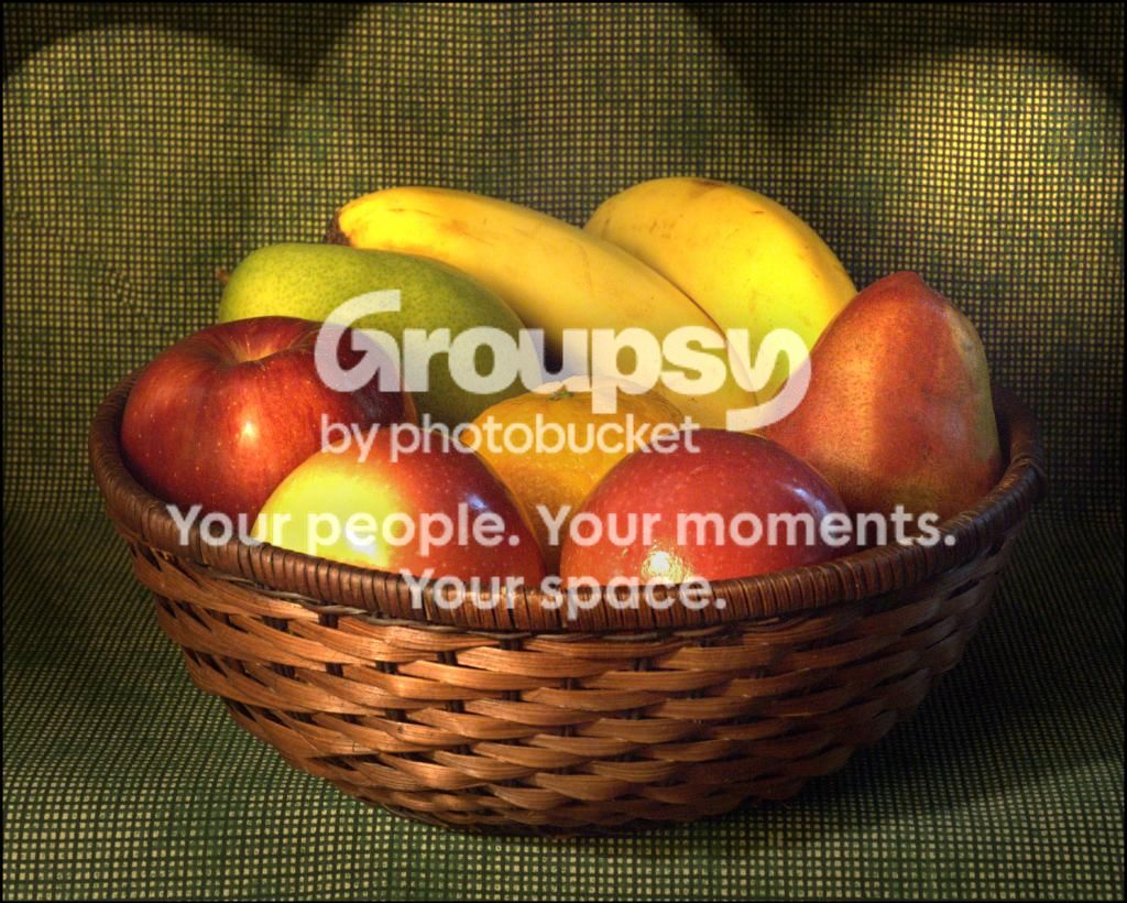
I was bored this morning and thought I would try something completely off the beaten track for me. I raided the wife's kitchen and put together this. Your thoughts are most welcome. Thanks in advance.
 
I like it ...suggestion don't let the fabric drape over the table let it come straight out then it will not have a distracting highlight on it....the background soften the curve at the table level so that it takes on a bigger curve. I would put some paper or cloth under the orange to lift it up a little...not a lot just enough to see. Overall it is a little dark.....nice for first time ...still lives can be fun.
 
I agree with Mully.. it is a little dark. But nicely done!
 
The arrangement of the fruits in the basket is just perfect – not as artificial as a Mac Salad photo but not a mess either.

I would try some dramatic lighting, probably from the right to avoid unwanted shadows on the bananas.
 
I think some additional height variety on the fruits would help tremendously...there needs to be more height differential between the tops of the various fruits. This is not that far off. Just needs a more-styled arrangement of the fruit. I'm not an expert in still lifes of fruit or flowers, but one fellow whose book on still life shooting I read happens to be an expert, and he stated that one of his "keys" is to almost always, strive to build a composition that has an ODD-number of fruits or flowers. And I'll be darned, but somehow it seems that on these smallish quantities, an odd number of items DOES seem to "feel" more...well...better! Anyway...mound that fruit up! I sense about a 50/50 basket/fruit "presence" in this photo.With the camera height exactly where it is, the BASKET feels a bit too much like a center of interest...I think the basket is too strong...by elevating and making the fruit a bit more-varied in height, it will show more fruits, and will make the fruit a bit more-dominant than the basket. EXACT camera height and lens vantage point is critical in these kinda shots.
 
Nice to see you venturing out, tackling something new!

I'm going to add, that your background should be different from your foreground. Going with a " seamless " gives a nod to product photography, rather than artistic still life.

You are on the right track for sure though! Keep tweaking and nail the final version!
 
I'd push the background out of focus and use more dramatic light on the fruit. This feels like you're going for a painterly look? A richer fabric, like a dark medium/large patterned upholstery fabric, pushed well out of focus and quite dimly lit, should get closer to the look of a classic painting. Well, the look of SOME classic paintings, anyways! Maybe not the ones you're thinking of, though!
 
This will give you an idea of how dark the photo is:

SL2_zps0aa06a95.jpg
 
I agree with Mully.. it is a little dark. But nicely done!

Thanks Charlie. About the exposure, Amolitor nailed it. I was thinking of the classic still life paintings. I made some properly exposed shots, and they just looked like a photo of a basket of fruit, and lost all the mood. Maybe I need to go somewhere between. Several others mentioned the exposure so it obviously needs work. thanks again.

The arrangement of the fruits in the basket is just perfect – not as artificial as a Mac Salad photo but not a mess either.

I would try some dramatic lighting, probably from the right to avoid unwanted shadows on the bananas.

Thanks, Hmmm... Dramatic lighting? My set up consisted of a single table lamp with a cocked shade. I never had any interest in artifical lighting photography so I don't have any official lighting...yet. I was thinking of the lighting and shadows of the classic still life paintings so I went with a single side light with no attempt to provide fill lighting. I'd be very interested in hearing other opinions on this for my next attempt. Thanks again.

I think some additional height variety on the fruits would help tremendously...there needs to be more height differential between the tops of the various fruits. This is not that far off. Just needs a more-styled arrangement of the fruit. I'm not an expert in still lifes of fruit or flowers, but one fellow whose book on still life shooting I read happens to be an expert, and he stated that one of his "keys" is to almost always, strive to build a composition that has an ODD-number of fruits or flowers. And I'll be darned, but somehow it seems that on these smallish quantities, an odd number of items DOES seem to "feel" more...well...better! Anyway...mound that fruit up! I sense about a 50/50 basket/fruit "presence" in this photo.With the camera height exactly where it is, the BASKET feels a bit too much like a center of interest...I think the basket is too strong...by elevating and making the fruit a bit more-varied in height, it will show more fruits, and will make the fruit a bit more-dominant than the basket. EXACT camera height and lens vantage point is critical in these kinda shots.
Thanks for your insight Derrel, I've been searching thift shops and second hand shops for a low sided wooden bowl with no luck. I saw this dark colored cane bowl and thought the dark wood should tie in nicely with the fruits and green backdrop. The traditional light colored basket would have completely ruined my preconceived idea. I agree. Less bowl and more fruit would be better. I'll be sure to keep your tips in mind with the next attempt. Thanks again.

Nice to see you venturing out, tackling something new!

I'm going to add, that your background should be different from your foreground. Going with a " seamless " gives a nod to product photography, rather than artistic still life.

You are on the right track for sure though! Keep tweaking and nail the final version!

Thanks Bitter. I see what you mean about the backdrop. I'll have to create a separate "wall" and "table" next time. Thanks again.

I'd push the background out of focus and use more dramatic light on the fruit. This feels like you're going for a painterly look? A richer fabric, like a dark medium/large patterned upholstery fabric, pushed well out of focus and quite dimly lit, should get closer to the look of a classic painting. Well, the look of SOME classic paintings, anyways! Maybe not the ones you're thinking of, though!
Thanks Amolitor. You picked up on my "painting" effort. I need to get a wider table top next time to throw that background further OOF. Combined with Bitters comments, maybe some type of victorian pattern? As you say, dark and way out of focus might work. Next attempt.
Thanks for your input.
 
Last edited:
This will give you an idea of how dark the photo is:

SL2_zps0aa06a95.jpg

Thanks Keith. I definitely see what you mean. Like I said, I made some properly exposed shots, but I thought they lost the classic painting feel, but I now think I over did it the low key, single light affect. Thanks. I really need to try this again. I have to replace the red pear first though. It didn't survive the disassembly... :oops:
 
Rick keep it deep just work with the light and still keep the mood ....look up a photographer named Phil Marco and look at his lighting for simple objects
 
I personally like the dark look of it. Reminds me of the dark look of the old masters type paintings. Not too crazy about the forward-facing specular highlights on the apples though.

Looking at the full sized photo, it looks like you've got quite a few burned pixels too.
 
I personally like the dark look of it. Reminds me of the dark look of the old masters type paintings. Not too crazy about the forward-facing specular highlights on the apples though.

Looking at the full sized photo, it looks like you've got quite a few burned pixels too.

Thanks. Wow..you're right. I've never noticed the pixel issue. That really sucks. I might be out of the digital photography business as quick as I got into it. I never noticed them before, but I just went back and looked closer at the photo I posted a few weeks ago called "depression" and sure enough, they are there! I guess for now, I'll be pulling out the 'ol paint brush and coloring the dots. Well, that just ruined my day BIG TIME!
Thanks anyway for the feedback Buckster.
 
I personally like the dark look of it. Reminds me of the dark look of the old masters type paintings. Not too crazy about the forward-facing specular highlights on the apples though.

Looking at the full sized photo, it looks like you've got quite a few burned pixels too.

Thanks. Wow..you're right. I've never noticed the pixel issue. That really sucks. I might be out of the digital photography business as quick as I got into it. I never noticed them before, but I just went back and looked closer at the photo I posted a few weeks ago called "depression" and sure enough, they are there! I guess for now, I'll be pulling out the 'ol paint brush and coloring the dots. Well, that just ruined my day BIG TIME!
Thanks anyway for the feedback Buckster.
If you shoot Nikon, read this thread, in particular the posts by users "traveler" and "pr4photos". The tricks might or might not work with Sony cameras as well, since they share some sensors with Nikon. In my case, pr4photos' trick got rid of most of the hot pixels.
 

Create an account or login to comment

You must be a member in order to leave a comment

Create account

Create an account on our community. It's easy!

Log in

Already have an account? Log in here.

Back
Top Bottom