Alexandra
TPF Noob!
...believe me, it WAS!
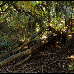
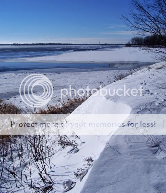
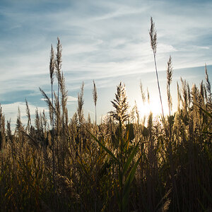
1. I think i've already posted a similar landscape earlier... but i'm so into these!!!

2.

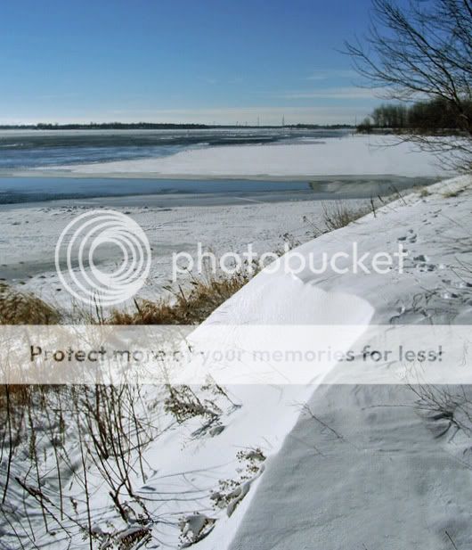
3. Tighter crop...

4.Tighter crop of the above with some color balance modifications:

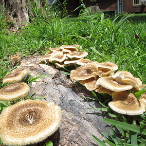
1. I think i've already posted a similar landscape earlier... but i'm so into these!!!
2.
3. Tighter crop...
4.Tighter crop of the above with some color balance modifications:
")


![[No title]](/data/xfmg/thumbnail/38/38743-ad854d502dddc7f41a927f1731a504cd.jpg?1619738704)