What's new

Commercial Style Self Portrait

Jeremy Cowart's work looks amazing! Reminds me a little of Joey L. - Homepage.

I think you may be seeing the results of compression for web. Although the file is actually three times the size of most of my other images, it's one of those annoying ones that really doesn't respond well to compression without looking terrible. It looks on at 100% crop.

Yeah, Joey L. is amazing. I've just never met him personally, and he doesn't live in town :lol: So when I think of commercial photographers, Jeremy and a few others are the first to come to mind, because that's what I'm most familiar with.

And also yes... compression is a possibility for sure. Other than what I wasn't *sure* was softness... I like what you've got going on in the image. I'd ALMOST like to see you bump up the contrast a little, and then maybe bring the blacks up a bit just to keep that sort of faded look you have going (or maybe just bump up the mid-tone contrast and leave everything else as is... I'd have to try it to really know which would be better), but other than that, I really dig it. And that's just a nitpick. :sillysmi:
 
I think you have done a great job at composing the shot!!!
A few words on lighting please?
Thanks
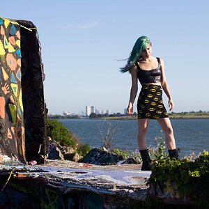
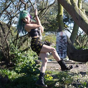
Completely natrual lighting, taken at around mid-day. I would have liked to use a fill light for the shadows on the left, but I didn't take a light stand with me :(

Part of the reason it looks so flat is the midday lighting and lack of shadows. Everything looks "flat" and utterly dimensionless. This is flat, dull, boring lighting. You can crank up the saturation and the contrast and the vibrance all you can, all the ay to MAX, and it will not improve the lighting's lack of shadowing, shaping, shading, and dimension-creation. Not trying to rain on your parade, but this lighting lacks any kind of drama whatsoever. It's shot at just about the worst possible time of day, and under what looks to be overcast/diffused mid-day lighting conditions. The "incoming storm" you mentioned is nowhere in sight from anything I see, but it might have been in your mind when you shot it.

You need some shadows! It's not a lack of fill that's the issue. It's not that the contrast in the processing is low--it's that the quality and the lighting's direction, and the quality (highly diffused and omni-directional) are both very uninteresting. This might have looked decent if you'd set up an actual main light, one with some direction, and thus created shadows that SHOW SHAPE. This scene is filled with things that should have shadowing...like the ferns that dominate a huge portion of the central area...but they look shapeless, formless, and flat. When I wrote "flat", I was not referring to the low-contrast processing, but the flatness and the lack of dimension in the whole scene.

Commercial photographers generally take light stands and lights with them.
 
Part of the reason it looks so flat is the midday lighting and lack of shadows. Everything looks "flat" and utterly dimensionless. This is flat, dull, boring lighting. You can crank up the saturation and the contrast and the vibrance all you can, all the ay to MAX, and it will not improve the lighting's lack of shadowing, shaping, shading, and dimension-creation. Not trying to rain on your parade, but this lighting lacks any kind of drama whatsoever. It's shot at just about the worst possible time of day, and under what looks to be overcast/diffused mid-day lighting conditions. The "incoming storm" you mentioned is nowhere in sight from anything I see, but it might have been in your mind when you shot it.

You need some shadows! It's not a lack of fill that's the issue. It's not that the contrast in the processing is low--it's that the quality and the lighting's direction, and the quality (highly diffused and omni-directional) are both very uninteresting. This might have looked decent if you'd set up an actual main light, one with some direction, and thus created shadows that SHOW SHAPE. This scene is filled with things that should have shadowing...like the ferns that dominate a huge portion of the central area...but they look shapeless, formless, and flat. When I wrote "flat", I was not referring to the low-contrast processing, but the flatness and the lack of dimension in the whole scene.

Commercial photographers generally take light stands and lights with them.
Taken on board. There's a pretty good example of using inspired lighting to create shadows here, I do see what you mean. And trust me I would have all the equipment that I might possibly need if it was actually a commercial shoot!
 
I'm viewing this on a freshly calibrated screen, and it doesn't look flat to me at all. That said, like I mentioned previously I think a curves adjustment could be used to add some contrast.
 
If you need to ADD contrast in post with a curves adjustment, and the image doesn't look flat at all, then WHY pray tell, add contrast through a curves bump? Could it be because the lighting was flat?

Maybe there's some misunderstanding about what flat lighting actually is, and what's being pointed out here by me, and KmH, and maybe others, which is that the quality, and the direction of the light used here at midday is what has, for decades, been called "flat lighting", easily found world-over when it's overcast.

So, what exactly is mean by the terms flat light or flat lighting?

If the shadow areas underneath a stump hold visible detail where there should be blackness--it's probably flat lighting. If there are no really distinct shadows in a daytime shot, made from sunup to noon, or indeed, until until sundown, the lighting is probably flat.

When the foliage at midday has no shadows, the lighting is flat. You can crank up the contrast all you want, but the flatness mean lacking in revealing three-dimensionality or clues that show depth. Flat, not as in low in overall contrast. Flat, not meaning low in local contrast, but using the word flat, as in lighting that makes the picture appear lacking in dimensionality, lacking in visual depth clues. This was shot in flat, diffused, omni-directional lighting conditions. The kind that looks best for copystand work, where the light appears to come from nowhere in particular, and is shadowless and even, so the document looks utterly flat.

The name Joey L is being thrown around above. He's a guy that uses tons of lights,plural, to add accents and depth clues to what would otherwise be mundane, dull, flat-lighted scenes if allowed to be exposed JUST by the light that was present. He brings lights out to locations, to create dimensionality and dimensional clues, to make scenes that are not rendered as flat. Look at his shot of himself with the tiny Lincoln/J.W. Booth figurines, and the tiny softbox and small LED clamp light...https://www.learnfromjoeyl.com/#
 
Last edited:
Photos a photographer produces are generally going to get edited by the advertising agency that uses them for a commercial purpose.

A few commercial images will work best by being somewhat dark and desaturated.

Looking at the images used for commercial purposes in general gives a better understanding of what most commercial users want than looking at what just 1 or 2 photographers produce before an ad agency AD (Art Director) tweaks them for final use.
 

Create an account or login to comment

You must be a member in order to leave a comment

Create account

Create an account on our community. It's easy!

Log in

Already have an account? Log in here.

New Topics

Back
Top Bottom