Composite photo. C&C

FITBMX

Been spending a lot of time on here!
Joined
May 11, 2014
Messages
3,860
Reaction score
1,423
Location
Burns, KS, USA
Can others edit my Photos
Photos OK to edit
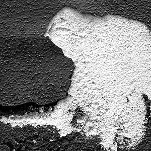
I started this photo by taking photos of a cardboard box with holes in the bottom, and built it up from there. I would like to hear some good C&C on this. :)

IMG_1398 (3-24-16).jpg
 
I'm not sure I can offer you good cc but here's what I think

Idea is nice but it needs more work. I's not believable and composition could be better
 
I'm not sure I can offer you good cc but here's what I think

Idea is nice but it needs more work. I's not believable and composition could be better

Any ideas on what could help? It feels like it needs to be blended together better to me, but I'm not sure how to pull that off.
 
I think is a great, great idea and I think that it can be made even better.

First: that copyright notice is so bright as to pull my eye away from anything.
Second, those 'darts' around the bird are really annoying and look fake.
Third, keeping the entire 'window' brings attention to the 'window' and the top and pulling it from the figure.
I suggest:
  • cropping differently
  • removing the 'darts'
  • making the copyright notice smaller, in grey, embossed and somewhere else.
  • making the bird brighter and the man's face lit a bit more.

upload_2016-4-6_10-21-51.png
 
Have you watched this?


I think the part at the end where he adds the "fog" might help to blend it better.
 
I like the concept, but I find it a little too dark for me. Just my 2 cents.
 
I like the concept, but I find it a little too dark for me. Just my 2 cents.

I wanted it to be dark, so thanks! ;)

I think is a great, great idea and I think that it can be made even better.

First: that copyright notice is so bright as to pull my eye away from anything.
Second, those 'darts' around the bird are really annoying and look fake.
Third, keeping the entire 'window' brings attention to the 'window' and the top and pulling it from the figure.
I suggest:
  • cropping differently
  • removing the 'darts'
  • making the copyright notice smaller, in grey, embossed and somewhere else.
  • making the bird brighter and the man's face lit a bit more.
I was going to lower the opacity of the watermark and forgot.
I tried the bird without the "light rays" and the bird drew no attention, it felt like the bird had no reason for being there. But you are right the "light rays" are a little too fakey, I will work with it some more.
I liked the taller window, but the lower crop you used does look really good, I hadn't thought of doing that.
Thanks for the great feedback! :)
 
Have you watched this?


I think the part at the end where he adds the "fog" might help to blend it better.


I have seen a few of the Phlearn videos, but hadn't seen that one, and it is a really good video!
Everytime I think I am starting to get PS figured out, I realize how little I know about PS! LOL
I used light ray brushes for this, and they work rather well. But I love how they did this on the video. :) Thanks.
 

Most reactions

New Topics

Back
Top