Composition Critiques please

Chodie

TPF Noob!
Joined
Jan 27, 2011
Messages
60
Reaction score
6
Location
Lawrence, KS
Can others edit my Photos
Photos NOT OK to edit
I'm about 2 months into this photography game... Last weekend I went to some botanical garden with several gorgeous views. I didn't get to go at sunrise/set because they closed at 5 so the color wasn't exactly perfect. Anyway, I'd like to ask for some C&C on my compositions please.

Having never been to a photography class, your comments will be extremely helpful as I continue to get better at this!

1.

Botanical Gardens by Chodie89, on Flickr
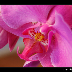
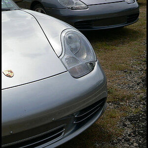
2.

Nothing Great by Chodie89, on Flickr
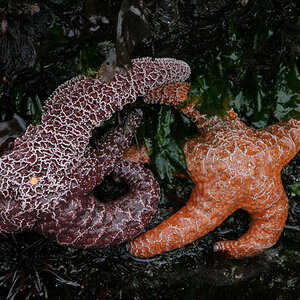
3.

Stones by Chodie89, on Flickr

4.

Loomd by Chodie89, on Flickr
I wish I could have moved the camera down an inch here
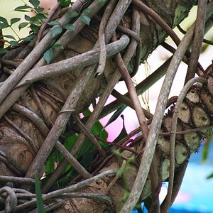
5.

Hut by Chodie89, on Flickr
^I'm debating on whether or not to cut off about 1/5th of the image from the left side.
 
Last edited:
I'm not qualified enough to give good critiques on this. But I absolutely love number 2. I'd like to have it framed and hung on my wall. ^-^
 
For two months in these are really good.
That being said, putting up a bunch of pictures and asking for C?C generally means that the comments will be spread around and you won't get anything specific on the weak one.
Also, if you want basic C/C, save your files so the exif stays embedded so that will aid the commenter.
________________________________________________________________________________

Quick comments all IMO
2. Include the back of the house. You have lots of room and yet its clipped off - and looks it

3 - the sun burst is OK considering the subject. The main compositional point is the stones with the fish and greenery as counterpoints. You don't need all that greenery. Crop it down and vignette the corners to keep the eyes in.

fish5639000175c1745e412.jpg


4. you are right. If that lower bridge had been caught it would make a great balance to the trunks - might be good in bw

5.I agree about trimming off the left but, even so, its a picture of a building and a walkway to it with nothing special.

1. IMO, #1 is really special yet poses a problem. There are two centers of interest. The far end of the waterway and the red bush to the right. Both attract the eye yet they aren't connected. Because they are both in powerful positions in the picture, my eye skips back and forth. I would try cropping some off the right to make the red bush less important and let it just be an added piece of color. Vignette the corners to keep the eyes in. This would also help the off-balance issue where the tree on the right is very close to the lens and the left side is far away.
red5639274731aa4a7c8915.jpg


Last, except for some few places, these are just not sharp. Either they are extreme crops or you are using the lousy f stop on your lens. (the exif will give a hint of that)
 
BTW. I think #1 is a terrific example of the 'rule of thirds' - how things at the thirds seem more powerful. Just by cropping the picture the red bush draws the eye less and becomes just an accent rather than a center of interest..
 

Most reactions

Back
Top