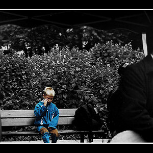
Personally I like the original version too. She's a beautiful little girl and the surroundings are so uniform so you don't really notice them anyway. Your attention is drawn straight to her pretty little face. I'm sure her parents will love it no matter how you present it to them.
I like the first image the best. I really do not care about having the subject in the centre. If anything I would take a little off the right (half inch) to put her in the right third of the image. I do like the b/w and think it is a great shot. I love candids much more then posed images.
Ditto on the original. Placement is good. Since she is looking toward the right of the frame, it needs just a bit of additional room to appear visulally balanced. You've got it just right, IMO.
And... why crop in? Why take her out of this wonderful setting?
I like the original as well. The subject is framed really well as is. If you must crop, I would recommend cropping to an aspect ratio the same as a vertical version as the original, like so:
Ditto on the original. Placement is good. Since she is looking toward the right of the frame, it needs just a bit of additional room to appear visulally balanced. You've got it just right, IMO.
I agree completely. The first one is great, a little extra room on the right would have been nice, but I think it's a strong image as it is. Excellent tones on the black and white conversion, that's not easy to do!

")