Here's my thoughts.
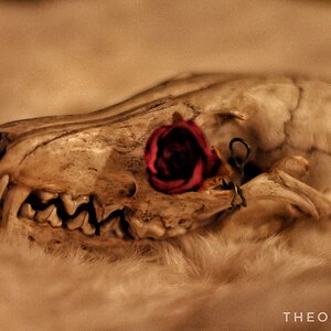
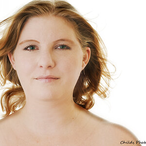
1. Lighting is way too even for me causing...not necessarily a flat look, but I don't know how else to describe it. I like to see some shadows (not harsh shadows, but lighter, smoother shadows) to give depth to the image. I guess flat is the word because there is just no depth to the photo due to the lighting.
2. As said, it's just way too soft for me. I'm also not loving the vignette issues going on here...don't know if it was shot like that or done in post, but three of the corners have a dark vignette while the upper right seems to have none (or a white vignette)...I'm just not loving the processing. I'd also like to see some more space on the right of the frame (model's left) to give an idea of where she is looking.
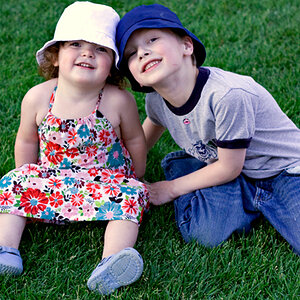
3. Definitely a great image. I like the processing, posing, etc... I would have preferred not having the tip of the front of the bike cutoff, but it is still a great image regardless.



![[No title]](/data/xfmg/thumbnail/40/40288-4d5d7a8aa74ddfceb5fb82062d9b21be.jpg?1734174702)
![[No title]](/data/xfmg/thumbnail/37/37280-a7e70a01ccd331918e71645cd4c1f16e.jpg?1734170137)
![[No title]](/data/xfmg/thumbnail/37/37115-e2d49d984453c62a2a20cf741e3d6679.jpg?1734169831)