Couples shoot from the weekend

willis_927

No longer a newbie, moving up!
Joined
Dec 19, 2010
Messages
624
Reaction score
82
Location
Winnipeg
Can others edit my Photos
Photos OK to edit
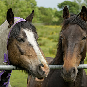
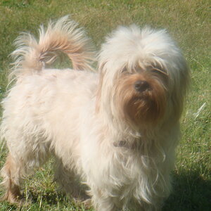
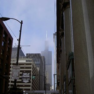
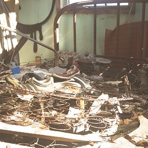
Heres a few from a shoot I did this past weekend. Thanks for looking!

1)
IMG_6748.jpg


2)
IMG_67455.jpg


3)
IMG_6680.jpg


4)
IMG_6665.jpg


5)
IMG_664222.jpg


6)
IMG_6645.jpg


I know this is a bit more than I should have posted for C&C, but please comment as you wish! Thanks again for looking
 
They all need sharpening, the lighting isn't great, and the exposure is all over the place. Just saw that there were 40 views and 0 replies to this thread...figured you might want to know why.
 
I like them, I like number 1 and the last one best - number one quite nice and seems candid but the patterns on the clothes make it a bit busy perhaps - Still like it how ever
Last ones nice, they dont look so purposly posed or somthing, Shes very pretty too :)
 
Really, you couldn't see the pocket of her shorts was showing below the hemline or the work zone orange tape in the background?

With her very light skin, she is far more appealing with her shoulders covered up. They detract too much from her face.

Nicely done, but those things stuck out the most.
 
I look at #1 and think perhaps a little fill flash up front may be helpful?
 
I am NOT a professional so take my comments w/ many, many grains of salt! :) I like them, except for #2, his face is too washed out. I didn't notice the orange tape in the background & as for her shorts, that's just a fad now days... I think it looks very candid like Eventer said. These may not be the best photos as far as the pros are concerned, but I think they're good, from a layman's point of view. :)
 
They all need sharpening, the lighting isn't great, and the exposure is all over the place. Just saw that there were 40 views and 0 replies to this thread...figured you might want to know why.

Huh...I was thinking much the same things. The exposures and/or final image processing is erratic. Washed out looking,mostly. The first picture is the best lighting, but it needs more "Snap!", from a precisely-adjusted tone curve. When you shoot into backlighting like that, the shadowed side is awfully "flat" and lacking contrast, so to bring out contrast in post, you need to set a custom tone curve, and really carefully place the darkest shadow tones, and then adjust the mid-tones so that there is as much differentiation in the lower tonal values as you can get. So, ya' gotta set the black point first. I would say that you have not got the black point low enough; the darkest shadows are NOT dark and dense enough. Also, the paver stones are kind of hot, so a little bit of movement of the upper end of the tone curve could help tame the highlights a little tiny bit.

The remaining color images are also the same: washed-out looking. Not deep enough blacks, her skin looks white and pasty, and the green grass is lacking in saturation. They need to be re-processed, striving for richer color and deeper shadow tones, and a consistent "look". Skin tones on the woman need particular attention.
 
They all need sharpening, the lighting isn't great, and the exposure is all over the place. Just saw that there were 40 views and 0 replies to this thread...figured you might want to know why.

Looks like "Full Auto" shooting!
 
I think that #3 is the strongest of the group. Theres some wierd halo-ish thing going on above the dudes head in the b&w shot....#4 would be cool too if it wasnt so over exposed and the color was better and really popped
 
First thing that popped out to me was the WB in #4. Way too cool for this shot in particular, and needs correction. Also, this shoot is lacking consistency in post-processing. For sessions like this, I'd aim to have a similar PP style for the shots taken. Just my two cents. Good luck!
 
It seems like most people are saying that the PP needs the most work. I would appreciate if someone did and edit to show me how they would do the PP to make them pop more. Thanks
 
In number 4 it looks as if the guy has a set of unfocused horns coming out of his head and that detracted from the photo for me. I think that shot in particular could have used a little different point of view. Either from lower down with the branch just out of view and a little sky in the back or from higher up with the lower part of the bushes and the grass evening the tones out in the background. I am VERY new but that is all I could say about that one particular picture.

Number 1 could stand with a little more cropping. The empty space to the left pulls your eyes away looking for something else. And as everyone said the colors need a little more to "pop" and the white balance could stand to be a little better. The skin tones come out looking a little too milky even for a blonde. In reading Bryan Peterson's "Understanding Exposure" he said he almost always leaves his White Balance on "Cloudy" to help his colors pop. I have been trying that when outdoors and I am liking my colors a LOT more now. You might try that.

Other than that I think they are all nice and taking into account what others said here I think you can only get better =) From a beginners point of view, one of the most important things I have read and learned so far is to change your perspective when shooting. Take several shots from standing, several from kneeling and several from a laying flat position. I am assuming you are using digital so it wont cost you anything to just delete the ones you/your client don't like but by doing this you may just get a really "WOW" shot! Good luck and have fun shooting!
 

Most reactions

Back
Top