Crayons. C/C please! (:

PerfectlyFlawed

TPF Noob!
Joined
Feb 2, 2010
Messages
2,408
Reaction score
19
Location
Tempe, Arizona
Website
www.feliciakelsayphotography.com
Can others edit my Photos
Photos OK to edit
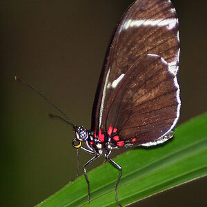
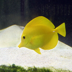
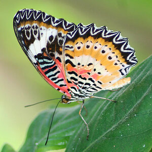
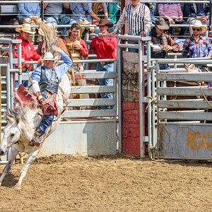
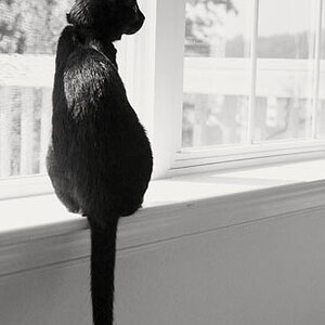
It has been a while since ive posted anything new... and after moving twice in the last two months.. as well as being over 105+ degrees out I have had NO motivation to get out and shoot lately.
So I got a little creative with house held items... ( stole my kiddos crayons) LOL..
I used manual ( P*) Mode.. and settings were like 200 ISO, f 5.6 1/60..

Let me know what your thoughts are..
Compositions. DoF etc.. thank you!

1.)
CrayolaWheel_FeliciaGerard_2010.jpg


2.)
CrayolaWriting_FeliciaGerard_2010.jpg


3.)
CrayolaHeart_FeliciaGerard_2010.jpg
CrayolaWheel3_FeliciaGerard_2010.jpg


4.)
CrayolaLineup_FeliciaGerard_2010.jpg


5.)
CrayolaHeart_FeliciaGerard_2010.jpg

( was trying to re-create something i had seen along these lines.. can you even tell what it is??)

Sorry so many pictures... I dont have internet connection right now.. So posting them up from a friends and have to upload them all.

Thanks for lookin!

EDIT: ONE MORE ;-/ Dont kill me LOL I know 6 is WAY too many for C/C... so your not obligated to do anything...C/C if you wish. (its always appreciated in trying to excel) Thanks in advance.
6.)
Crayola_Colorwheel_FeliciaGerard_2010.jpg
 
Last edited:
I say +1 for creativity,

only thing i notice is that on #5 the left is OOF and the right is sharp... is this intentional?
 
I like the composition on just about all of them. I cant wait to get my SX120IS so I can do shots like these! I really like #3.. #2 may have been better if you widened your DoF by one more stop. I'm seeing a tilt on 4 for some reason. #5, I believe I see a heart :)
 
Not bright enough. I hope you are not offended but this is the only thing I feel that can make your photos framed quality.

crayon2.jpg


crayon.jpg
 
I like these. Are they on the same surface in each shot 'cause the surface color varies across shots so you may have a wb problem. Probably the only thing I would change is to modify the lighting to get rid of the shadows. The last one doesn't seem to be in focus anywhere in the shot.
 
Nice creativity in my opinion. Were the shots taken on tripod? I would like to see them a little more focused except the last one, it's focus lot great to me. I really liked the heart concept too.

5 and 6 were my favorites I think.

Driven by the fast approaching back to school days by any chance?

Thanks for sharing PF :)
 
#6 is my favorite!

creative idea. love the symmetry and use of colors here.
 
These are really fun! I love the clarity on the last shot. Normally I'm crazy for shallow DoF, but for some reason the nice sharp one is more visually appealing in this set.
 
All of the ones where they're arranged in a circle seem a little underexposed to me... Not the last one so much, but definitely the other ones.

There are a couple things bugging me about the last one... Now, I'm probably being extremely picky, but being able to see the seams of the paper (on the crayons) bothers me, and the arrangement seems a little sloppy. An empty film canister (if you have any of those) looks like it would be the perfect size to set in the middle and push them all up to it - so you get a nice, perfect circle in the middle. Obviously, remove the canister before you take the picture.

The heart one is a cool idea, but it looks really soft. It looks like a combination of missed focus and very shallow DOF.


Your white balance is kind of all over the place... Were you using two different types of lighting? The last one seems to have at least two different color temperature lights on it.

Except for the last one, they all could use more DOF to me...


Anyway, just my opinion... And, some of that was VERY picky, so don't think I'm just trying to be mean, lol.
 
White balance seems off on most of them.

Saw this in a photo mag not too long ago - so gave it a try myself, not to take over your thread, just thought I'd throw it out there ... but I went the cheap route and bought the generic crayons - kinda takes away from the shot imo!
crayons.jpg
 
#1 Underexposed, losing detail in the wax portion of the crayons. Could benefit from a bit MORE DoF, so that the focus point is a bit more obvious. Also, WB issues. It looks like you're mixing daylight/natural light with indoor tungsten light, as though there was a window nearby that's messing with the colors.

#2 Underexposed, losing detail in the wax portion of the crayons. I like the use of shallow DoF, but change the angle of the shot so you see a bit more of the lines drawn and less of the paper portion of the crayon, then change the focus point somewhere in the middle more, instead of the first (& shortest) crayon. Kind of draw the eye into the shot a bit more than putting it right in his face. Again, WB issues, the green crayon paper looks pure yellow, and the white surface has a yellow/orange tint.

#3 Underexposed, losing detail in the wax portion of the crayons. WB issues again. But the composition and DoF looks appealing, work with this one!

#4 Underexposed, losing detail in the wax portion of the crayons. WB issues again (I see a theme here lol). But IMO, this shot is what #2 should have been with the DoF and focus point. Rotate the camera right a wee bit and it's a winner.

#5 Meh, scrap it. OOF, Underexposed, WB issues, etc. Try the heart thing again, but instead of using the whole ROYGBIV...single out the more feminine colors, pinks/reds/purples. Give that a shot, it might make the "heart" a bit more obvious without overdoing it.

#6 I agree with Josh, sloppy composition. OOF and WB issues as usual. It looks like natural light in the top right corner and tungsten in the bottom left corner.

Good idea with being creative though, re-shoot it and post up the shots! Can't wait!
 
This idea has been done a million times, I wouldn't exactly call it creative. crayons - Flickr: Search

But still, good on you for doing something instead of just making excuses.
 
#1 Like the composition, but all crayons look OOF.
#2 I'd prefer focus on the second or third crayon, like you did in #4.
#3 Nice. The OCD in me is seeing that not all crayons are meeting at the same points.
#4 I like this one more than #2, but I'd prefer to see the crayola more in focus than it currently is
#5, I'm seeing a heart, but its all slightly OOF, like #1
#6 I like this one the most. Again, the OCD in me is seeing that there was a bit of a missed opportunity to play with angles and make this a very well composed shot. As this shot seems mostly centered above the crayons, I would have liked to see the crayons that are placed at the 4 corners of the picture to be situated such that they seem to be coming in directly from the corners. As it is now, only the purple crayon in the top left corner is close to intersecting.

Just my thoughts.
 
i want to do this and frame it in my classroom! I love school supplies! I am first a mom, then a teacher, and then i take pics for a hobby lol!
 

Most reactions

New Topics

Back
Top