Judge Sharpe
TPF Noob!
- Joined
- Feb 13, 2008
- Messages
- 307
- Reaction score
- 0
- Location
- birmingham alabama usa
- Can others edit my Photos
- Photos OK to edit
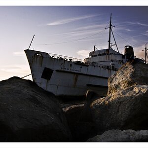
I like the picture. It is what is there. The Rock gives some perspective to the house. I don't really see the tangle of line mentioned above. If any thing I would play with exposute a little and lighted the dark face of the house about one stop.