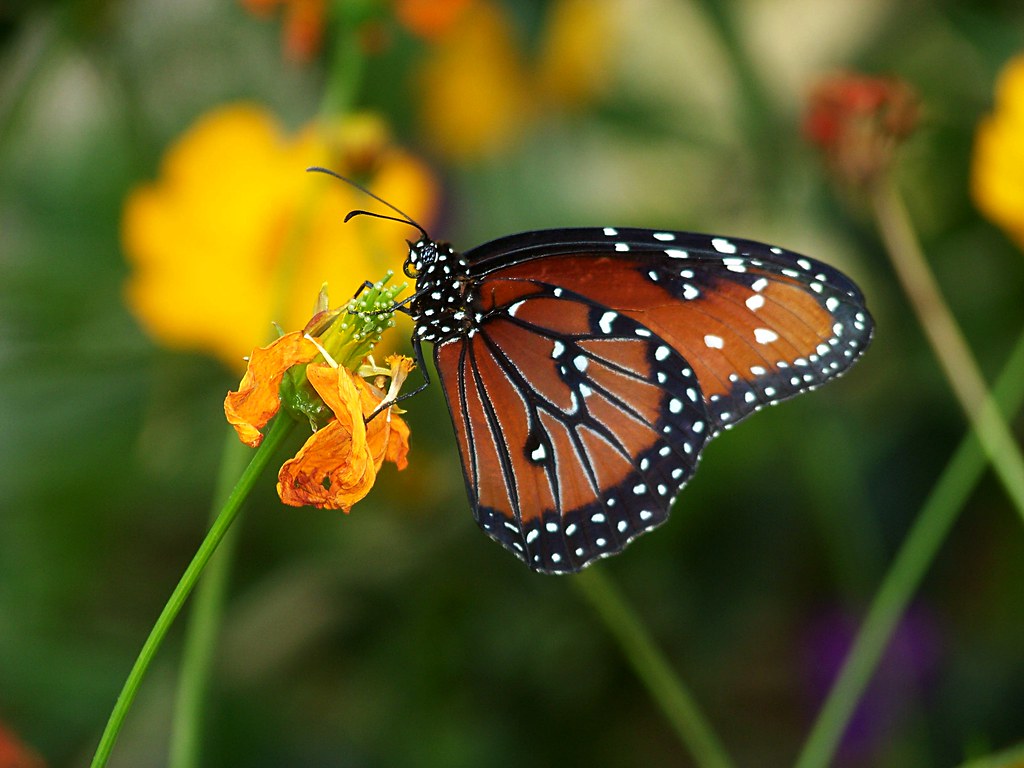
Critique and Suggestions Please

Status
Not open for further replies.
I have a DLSR and I've tried shooting butterflies and didn't get nearly as good result as you did. Great job!
 
Well, if I ask a question, I expect to be fed answers.
Be assured some of the answers you will be fed will be dead wrong.

At some point you have to evaluate the validity of the answers. You can waste a ton of time going down blind alleys other wise.
 
Last edited:
5704219372_8b4250c7bf_b.jpg


Thanks for the reply. I cropped this in a little bit. I liked what you said about all the horizontal lines and the lighthous; I never even noticed that. I also did some dodging and burning to the picture and sharpened up the lighthouse a little. I think this looks much better but there are still some dark spots around the lighthouse...I'm very new to photoshop...I don't know how to mask out the background. I have limited internet connection at this point so I can't look into it right now, but I will as soon as I have a better connection!

Good start.

Any time you want an opinion or a little support in PS just PM me.

Lew
 
I'll keep working on that one!

Here's my brief run through of #1.

5693558838_9bbf5fcd35_b.jpg

ISO 64 f/4.8 1/100

This photo, I'll admit, doesn't really invoke any emotion or feelings for the average person. I took this while my girlfriend and I were at the zoo for our 2 year anniversary, so that's really the only attatchment. I'm not sure what kind of emotions a picture like this could convey even...

My favorite part of this photo is sharpness of the butterfly and the flower. The sharpness really make the POI stand out from the background. I do wish the entire wing was in focus, however...

Compositionally, this photo could probably use some work. It being dead center weakens the image and takes away from the overall affect. Another flaw with the composition (and I've gotten mixed remarks on this in the past) is the purple flower in the lower right corner. For me, its distracting. I don't think it really fits with the rest of the background and once I noticed it, I can't get past it...What are your thoughts on this? Even with some flaws, I think it has its ups too. I strategically placed the antenna of the buttterfly against the yellow flower in the background so it wouldn't just blend in. I do love the bokeh of the background. Do you think if I shot at a lower f/stop, it would have a better affect? Also, I think the background is a little too busy. Thoughts?

Thanks for reading!
 
A larger aperture might take more of the butterfly out of focus (which I don't think you want). In that respect, I think you did the best you could have here.

The background isn't TOO too distracting, but a tighter crop might help (maybe get rid of a majority of the space to the left of the flower, and cropping closer to the butterfly all around would be beneficial).

Macro photography has its own set of rules to learn, but can be a lot of fun.
 
Well, if I ask a question, I expect to be fed answers.
Be assured some of the answers you will fed will be dead wrong.

At some point you have to evaluate the validity of the answers. You can waste a ton of time going down blind alleys other wise.

And thats where some common sense comes in. I have read many photography books, I try a lot and only when I don't get the resultst I want, is when I will start to ask questions.
And after a while you will start to get an idea where some members expertise lies and I will ask specific questions hoping for answers from specific persons.
 
5693558838_9bbf5fcd35_b.jpg

ISO 64 f/4.8 1/100

This photo, I'll admit, doesn't really invoke any emotion or feelings for the average person. I took this while my girlfriend and I were at the zoo for our 2 year anniversary, so that's really the only attatchment. I'm not sure what kind of emotions a picture like this could convey even...

My favorite part of this photo is sharpness of the butterfly and the flower. The sharpness really make the POI stand out from the background. I do wish the entire wing was in focus, however...

Compositionally, this photo could probably use some work. It being dead center weakens the image and takes away from the overall affect. Another flaw with the composition (and I've gotten mixed remarks on this in the past) is the purple flower in the lower right corner. For me, its distracting. I don't think it really fits with the rest of the background and once I noticed it, I can't get past it...What are your thoughts on this? Even with some flaws, I think it has its ups too. I strategically placed the antenna of the buttterfly against the yellow flower in the background so it wouldn't just blend in. I do love the bokeh of the background. Do you think if I shot at a lower f/stop, it would have a better affect? Also, I think the background is a little too busy. Thoughts?
I can't help but say that this kind of analysis represents a remarkable leap up.

This picture may not convey any emotions but it does convey impressions of delicacy and beauty and a little wonder that something so tiny can actually function.

What you said about the composition and the space is, imo, right dead on.
For the sake of argument, let's assume that this picture has all the detail we could want and so it can be cropped anywhere with a suitable image resulting.

As an example of different ways to frame this, what if the picture were framed like this below?
Instead of a bit of interest sort of adrift in a sea of green, the image is now lots of color. The yellow flower that frames the antenna so well becomes a strong background instead of a small distraction. The entire wing isn't really needed, the pattern can be seen. The interaction between the insect and plant is the center of interest and is much more prominent.

You may not like my preference for very tight framing; the only point I am trying to make is that a single image can be framed in different ways to give different impressions and that re-seeing something is OK.

Best regards,

Lew

butterfly56935588389bbf.jpg
 
I really like that close crop. It eliminates a lot of the problems with the composition and gets rid of the excess wasted space. I also like the way it makes the photo more colorful like you said.

Thanks again!
 
Well, if I ask a question, I expect to be fed answers. Then I would go out and try to put the advice into practice and see what happens.
If I dont wanne be fed the answers, I wouldn't ask the questions, right ?

Give a man a fish, he'll..... I think you know the rest lol

EDIT: Didn't realize how old the tread was LMAO
 
Status
Not open for further replies.

Most reactions

New Topics

Back
Top