What's new

Critique Please

RK.D

TPF Noob!
Joined
Jan 19, 2013
Messages
18
Reaction score
0
Location
San Jose
Can others edit my Photos
Photos OK to edit
Hello,

I am an amateur photographer. I am trying to take some portraits. Please kindly advice:

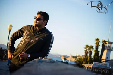
$8426258440_a39ecd3416_h.webp
 
First things first: Lose the tilt. It severely harms the photograph and looks like a mistake more than anything.

Secondly, you've placed the gentleman in the left hand side of the frame, on one of the RoT lines. Normally, that would be a good thing, however you have him facing towards the near side of the frame which creates tension compositionally. It just doesn't look "right." The sun reflections on the glasses are also kind of off putting, as they give him the appearance of having laser eyes. Lastly, this probably could have benefitted from being shot in portrait orientation.

Here's a similar quick snap I shot of my girlfriend that I took whilst we were on a walk. Granted, there's a tree growing out of her head, which is generally a no-no (so that's an example of what not to do), but I wasn't trying to win any awards. I also had the sun behind her, and not directly shining on her face. As you can see, I positioned her on the right side of the frame, looking left, and shot in portrait orientation.

jb2J3gtJeeecKq.jpg
 
You might want to tone down that watermark a bit...
 
You might want to tone down that watermark a bit...

lol. i love charlies comments.

Hey.. If that thing gets loose, it could be dangerous! Look at all those sharp points... ;)

If beginners spent as much effort on learning, as they do their fancy A$$ watermarks.... they would progress much faster!
 
I'm not digging the light pole that's right by his arm. It's just too close for comfort in my opinion.

I just...don't really like where he is in the frame at all. It seems unbalanced or too chaotic because his gaze outside of the frame like that leaves the right side completely barren of meaningful detail. Well, I guess that building in the background helps to weigh it out a liiitttllleee bit because it gives a little context, but it doesn't have enough "meaning" in my opinion to even out the left.


And the tilt towards the right doesn't help either. It feels like all of the elements are about to slide out of right side of the frame even though the left side feels heavy, so it creates a very chaotic feeling. I don't know if that's what you were going for, but it doesn't work for me in this particular photo.
 
Last edited:
You might want to tone down that watermark a bit...

lol. i love charlies comments.

Hey.. If that thing gets loose, it could be dangerous! Look at all those sharp points... ;)

If beginners spent as much effort on learning, as they do their fancy A$$ watermarks.... they would progress much faster!


Charlie, quit jabbing me with that comment, I quit putting a watermark on them (that way no one knows who took those bad photos):lmao:
 
Yeah I don't mind the tilt so much, but I do agree that he's looking off to nowhere. But the exposure is good and the composition isnt terrible.
 
I hope this makes sense, to me this doesn't seem to be a portrait but more of a picture. I think a portrait should have some details of the person, something you can hang on your wall.
I'm below an amateur in my opinion, but this is more of a cd cover to me. I agree with the others on the tilt, it may have worked if he wasn't in a lean position. It is a nice photo though, and I think with the information you gather from others here will make the next one better.

Good luck

 
Im thankful I decided to stay away from using a watermark haha
 

Create an account or login to comment

You must be a member in order to leave a comment

Create account

Create an account on our community. It's easy!

Log in

Already have an account? Log in here.

New Topics

Back
Top Bottom