What's new

Critique please

FreestyleOutdoors

TPF Noob!
Joined
May 19, 2013
Messages
32
Reaction score
7
Location
Toledo, OH
Can others edit my Photos
Photos OK to edit
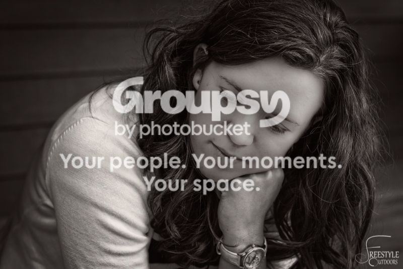
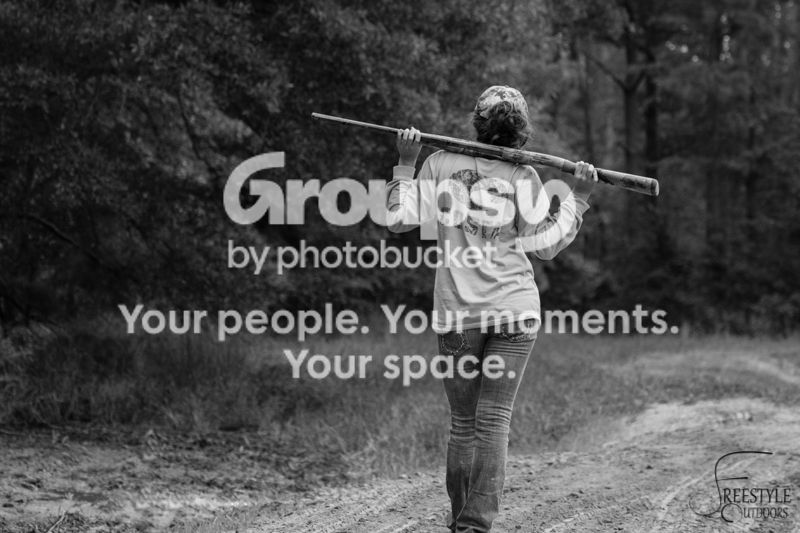
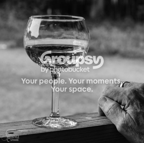
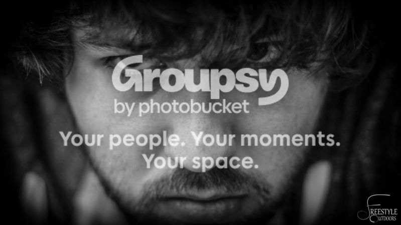
B&W is very new to me so please, let me have it on these shots as I know they are far from perfect. Always wanting to better myself

BTW these are my first photo posts here. So hello all, and thanks in advance for any advice
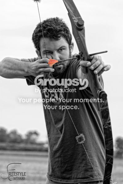


Not a fan of the selective coloring, but other than that I'd say well done - the wine glass especially.
 
The selective coloring adds nothing to the first photo. The look of prey in the last photo is the strongest of the series.
 
I guess the selective coloring on the first photo was kind of out of context. I had several images together on that shoot(if you can call it that) where orange was the only color done. Without the other photos it is definitely out of place and I agree, adds absolutely nothing
 
overall great, but perhaps boost the contrast a little and maybe even play with the Levels in photoshop.
 
Very nice collection. Not a fan of the selective coloring either
 
#1, #2, #5 are framed too tightly for my taste, but I like #2 anyways.

#1 is probably interesting in context, but out of context it's not, to me.

#2, #3, and #4 all have real virtue, there's a hint of personality and/or storytelling in all of them. For some reason I love #3.

These are all, as mentioned, somewhat lower in contrast than is traditional with b&w. I'm not sure that a traditional "full range of tonal values" treatment would serve all of these particularly well, but it's worth trying out. The modern "full range of tonal values, and then destroy the ones in the middle" look serves almost nothing well, and would certainly ruin these. Well, maybe the first one could handle it, it's graphical enough with the bow and so on. Maybe.
 
#1, #2, #5 are framed too tightly for my taste, but I like #2 anyways.

#1 is probably interesting in context, but out of context it's not, to me.

#2, #3, and #4 all have real virtue, there's a hint of personality and/or storytelling in all of them. For some reason I love #3.

These are all, as mentioned, somewhat lower in contrast than is traditional with b&w. I'm not sure that a traditional "full range of tonal values" treatment would serve all of these particularly well, but it's worth trying out. The modern "full range of tonal values, and then destroy the ones in the middle" look serves almost nothing well, and would certainly ruin these. Well, maybe the first one could handle it, it's graphical enough with the bow and so on. Maybe.
#1 was tough as as I have a crop sensor and 100-400 lens. Framing on a 3" LCD screen is tough to do from 20 feet away lol. I agree it isn't framed properly, I would have liked to have my elbow and arrow tip in the picture.

I will certainly try adding some more contrast to my next endeavors, I'm been trying to be cautious of plugging my shadows and blowing out my highlights so I have been doing less contrast, I will try a different process next time. Thank you for the advice
 

Create an account or login to comment

You must be a member in order to leave a comment

Create account

Create an account on our community. It's easy!

Log in

Already have an account? Log in here.

Back
Top Bottom