What's new

Critique wanted

stevengriffin

TPF Noob!
Joined
Mar 11, 2015
Messages
20
Reaction score
6
Can others edit my Photos
Photos OK to edit
image.webp image.webp image.webp image.webp image.webp image.webp image.webp Been shooting for about a year or less, uploaded before, just want critique on composition and suggestions of possibly techniques I could use.
 
Mostly, just keep working on it.
 
Well, too many photos posted here to give good C&C on them--best to limit yourself to one or two per thread.

But I'll give a very brief rundown of what I see, good and bad:
1. You caught the moment, but not the composition. This is just a missed shot, really. As someone who does a LOT of bird photography, I understand the excitement of having caught the moment--but the birds are almost out of the frame, there is WAY too much empty space on the left side of the photo; it just has no impact, and LOOKS very much like an "almost caught this" shot. You MIGHT be able to save it by cropping it to a portrait orientation and having the birds fill more of the frame. But probably not.
Still, on the plus side, you got nice focus on the gull coming off the sand toward the gull in flight.
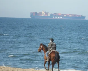
2. The water is all gonna leak out of that photo. :winksexy: Watch your horizons and make sure they are level. Not sure I'm loving the composition here either but I see what attracted you to the scene. A little more shore might have been nice--and a wider view.
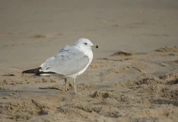
3. This is your best shot of those posted, imo. Good focus on the gull, good lighting and a good angle--looks like you did a decent job of getting down on the birds level. Also has a good strong composition with the bird on the left third "line" of the photo, looking INTO the empty space on the right side.
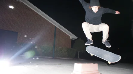
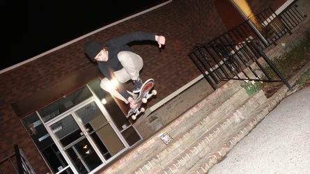
4. No. This one just doesn't work for me. At all. Missed focus on the skateboarder, horrible harsh lighting, and composition issues.
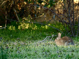
5. Bunnies are cute. But this one doesn't fill enough of the frame, would be BETTER if you'd waited until it turned slightly and you got it more facing the camera. Sometimes, a small subject in a large photo works, but not here, because the the rest of the photo is not that visually interesting and the bunny just gets lost in the jumble.
6. I'm not a skateboarder or a skateboarder photographer, so take that into account. But this is at least slightly better in that the boarder is more in focus, and more in the frame. But the light is still really harsh, that glare across him just KILLS it for me…and what on earth is the point of the Grand Theft Auto game box on the stairs?
7. I see what you did here. :D
I'm not sure it works that well for ME, but it's creative.

 
Numbers make it way easier for people to comment about a specific photo.

All the negative space to the left of the birds does not help the photo.
The horizon line should be level so the ocean doesn't drain out the right side of the frame.
Composition and exposure are OK. Subject matter has been done to death.
Very harsh un-modified light and the subject is over exposed.
Poor composition - the main subject is buried in the corner of the frame, is not sharply focused, and the background is busy and distracting.
The Dutch tilt does not add anything to the photo and as above the light is very harsh but the exposure is better.
Best of the bunch. For me the blurred upper and lower part of the frame says, "I made a mistake shooting the photo in the vertical format and should have turned the camera to horizontal to make the photo."
If the blur was on all 4 sides it would work better.

For future reference, this is:
A forum for those who need information on the challenges and rewards of going professional or who have recently turned pro! . . . Discuss equipment needs, developing business plans and more!

For C&C of photos use - Photo Galleries - which is for photos submitted by members for general display or critique.

There are no hard and fast rules for good composition, but there are guidelines, like the Rule of Thirds, that have been developed over a couple of thousand years of people doing visual art that work pretty good.

Here are some resources:
The Photographer's Eye: Composition and Design for Better Digital Photos
The Photographer's Mind: Creative Thinking for Better Digital Photos
Michael Freeman's Photo School Fundamentals: Exposure, Light & Lighting, Composition
Light Science & Magic: An Introduction to Photographic Lighting


Online:
Composition and the Elements of Visual Design
10 Top Photography Composition Rules Photography Mad
Advanced Composition -- Part I
Strobist Lighting 101
 
Pretty much agree with @sm4him. I think #3 (gull looking right) is probably the best of the lot. The skateboarding ones are intriguing. Getting the subject in focus, reducing the harsh light a bit, and keeping the skateboarder in the frame would all make these much stronger.

and what on earth is the point of the Grand Theft Auto game box on the stairs?

Haha! I didn't notice until you pointed it out ... :icon_scratch:
 
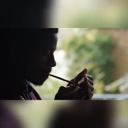
Keep at it, just keep working at it. Your lens looks pretty average...I see some "aquarium glass" quality to some of the shots. My favorites are the first skateboarder shot (and honestly, I'm, not a fan of skateboarding or photos of it) which has a good low angle camera placement, and the next shot, the guy lighting up the cigarette in interesting, dramatic lighting conditions. From a classical point of view, the guy lighting the cigarette is the best image. The gulls, the rabbit, the boarders, not nearly the same classical photographic, illustrative style. The horse and container ship is a good juxtaposition...only the Dutch tilt is hurting it a lot, but the idea of contrasting earth versus sea, and small transportation vs huge transportation, now that's a good basis for a photo!
 
Numbers make it way easier for people to comment about a specific photo.

All the negative space to the left of the birds does not help the photo.
The horizon line should be level so the ocean doesn't drain out the right side of the frame.
Composition and exposure are OK. Subject matter has been done to death.
Very harsh un-modified light and the subject is over exposed.
Poor composition - the main subject is buried in the corner of the frame, is not sharply focused, and the background is busy and distracting.
The Dutch tilt does not add anything to the photo and as above the light is very harsh but the exposure is better.
Best of the bunch. For me the blurred upper and lower part of the frame says, "I made a mistake shooting the photo in the vertical format and should have turned the camera to horizontal to make the photo."
If the blur was on all 4 sides it would work better.

For future reference, this is:
A forum for those who need information on the challenges and rewards of going professional or who have recently turned pro! . . . Discuss equipment needs, developing business plans and more!

For C&C of photos use - Photo Galleries - which is for photos submitted by members for general display or critique.

There are no hard and fast rules for good composition, but there are guidelines, like the Rule of Thirds, that have been developed over a couple of thousand years of people doing visual art that work pretty good.

Here are some resources:
The Photographer's Eye: Composition and Design for Better Digital Photos
The Photographer's Mind: Creative Thinking for Better Digital Photos
Michael Freeman's Photo School Fundamentals: Exposure, Light & Lighting, Composition
Light Science & Magic: An Introduction to Photographic Lighting


Online:
Composition and the Elements of Visual Design
10 Top Photography Composition Rules Photography Mad
Advanced Composition -- Part I
Strobist Lighting 101
Thank you for all the critique, I agree with almost everything you said. Also thank you for the sources.
The first skateboarding photo came out exactly as I had liked besides the poor composition resulting in his arm getting chopped. Normally it would bother me that he's overexposed but the incorporation of the flash to the bottom left made it feel fitting to me. The last image was simply a boarder used to upload to Instagram. I know it's better to shoot vertically for portraits to capture more of the subject and less of the surroundings but I think it came out okay. For the second skateboarding photo I used a combination of a slow shutter speed and flash to try and create and blurred/distorted look which caused the harsh lighting.
 
I know it's better to shoot vertically for portraits to capture more of the subject and less of the surroundings but I think it came out okay.

Some people actually prefer landscape in certain portraits. It really depends on subject, scene, and personal preference.
 
…and what on earth is the point of the Grand Theft Auto game box on the stairs
Haha we had just bought the game and he wanted to show it off haha.
 

Create an account or login to comment

You must be a member in order to leave a comment

Create account

Create an account on our community. It's easy!

Log in

Already have an account? Log in here.

New Topics

Back
Top Bottom