Too many shots to give detailed feed back but here's a few of my thoughts:
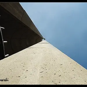
1. Cool shot, monocrome works well, nice sky and decent composition. Works well I think.
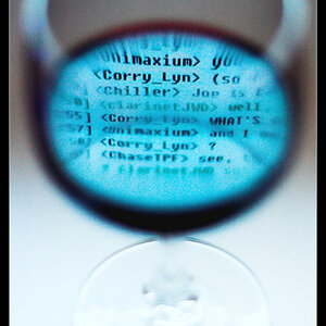
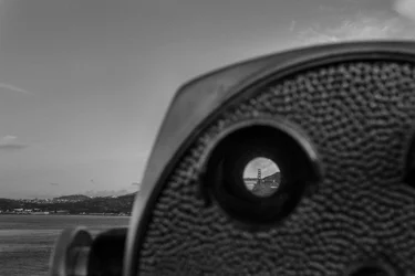
2. Solid concept, the viewer is a bit too big in the overall image for me but it works.
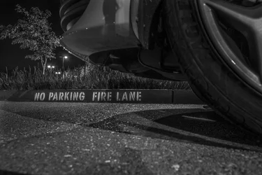
3. Not sure what to say about this one, looks good enough technically, nice angle but a bit meh on the subject.
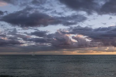
4. Boat is lost in the image, you could loose a chunk off the bottom that adds nothing to the image. I'd be tempted to crop this to a 2x1 or 3x1 myself. Make it about the boat and the sky.
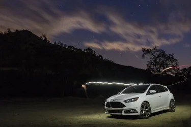
5. Nice car BTW. There's a bit of light spill as theres a guy in that shot. I'd get rid of the light trails too as they look accidental. Looks like a little distortion on the car too.
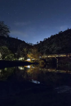
6. The bottom of the image is a bit dark and noiseyamd doesn't really add anything to the image. I'd crop it out but nice enough otherwise.
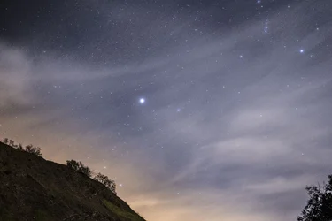
7. I'd loose the tree in the bottom right corner to make it look a bit other worldy. Wasn't sure about this at first but kinda like it now.



 Supra
Supra Supra beginnings