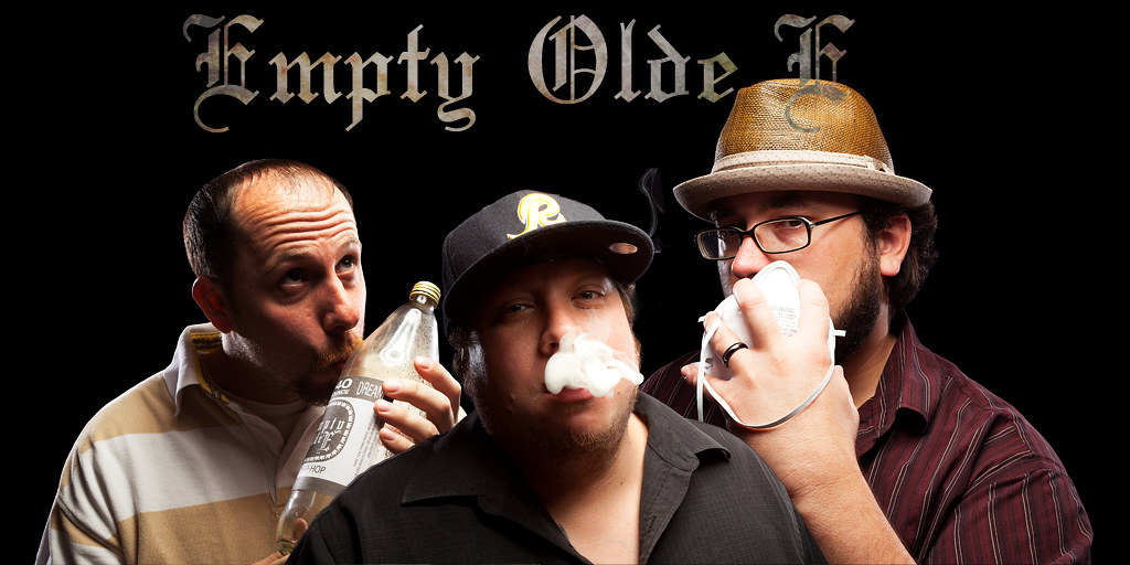
The writing overlapping the dude's hat is no good. Either pick a color that will show up against the background AND the hat, or move it (when you change the font).
The smoke in front of center-guy's mouth is too dense. It looks like a gob of plastic or something, it could be anything. Can't make out what the guy on the right is holding.
I'm pretty sure the shiny sticker on the hat bill is necessary -- keeping the stickers on there, pristine, is a "thing".
Dramatic lighting and poses, with the silly hats and thug-life references but with the white boys in ordinary street clothes is supposed to be a joke, right? Cuz it sure comes across like one. A tired old hipster joke that's been beaten savagely to death, but if that's what the band wants (and they probably do) you gave it to 'em. The customer's always right, no?




![[No title]](/data/xfmg/thumbnail/35/35947-ab35bfc67d8e12ce65dda301d3bf2b66.jpg?1734167744)
![[No title]](/data/xfmg/thumbnail/37/37523-291af5748bb3a98408cc748fb81bb365.jpg?1734170683)




![[No title]](/data/xfmg/thumbnail/32/32930-09414fc020c2a60a456ff59a05c5ef8f.jpg?1734162706)
![[No title]](/data/xfmg/thumbnail/37/37524-6c51828efbc2361f9cfed53f63f28aa2.jpg?1734170684)
![[No title]](/data/xfmg/thumbnail/35/35948-700e0d840da0ca73727b1bd6d99b4142.jpg?1734167751)