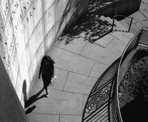
Shades of HCB's cyclist shot here.
Very nice design, I honestly don't think the tonal placement even matters here, apart from getting nice punchy blacks. This is so graphical and such a strong design it's going to be good regardless.
I would be loathe to open up the blacks to bring out detail in the woman, however. To my eye, this is really about the three shadows: railing, trees, woman, and rendering the model in more detail seems to me like it would distract from the real point of the thing. We can see it's a woman and that's all that matters here.






![[No title]](/data/xfmg/thumbnail/34/34693-68d7ff80dc154cec1604c718d5434ecd.jpg?1734165700)