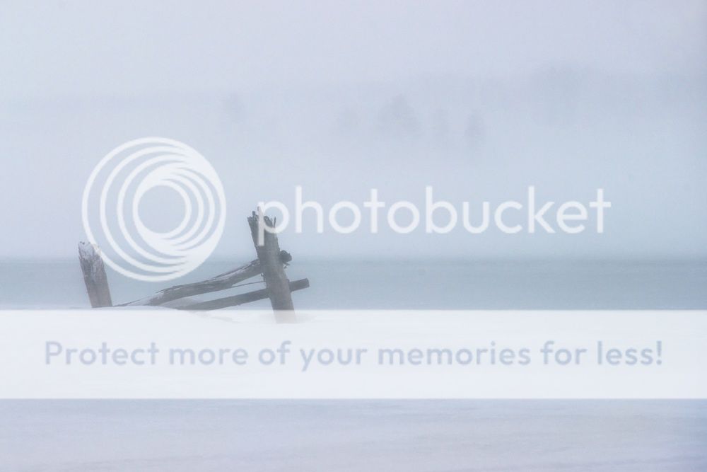
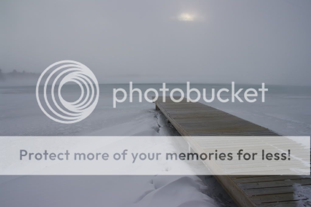
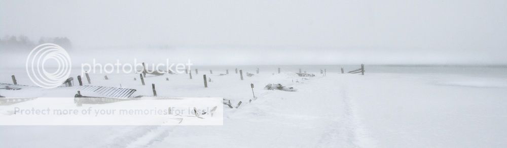
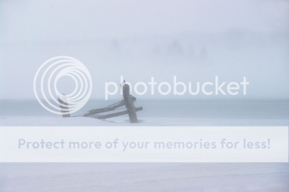
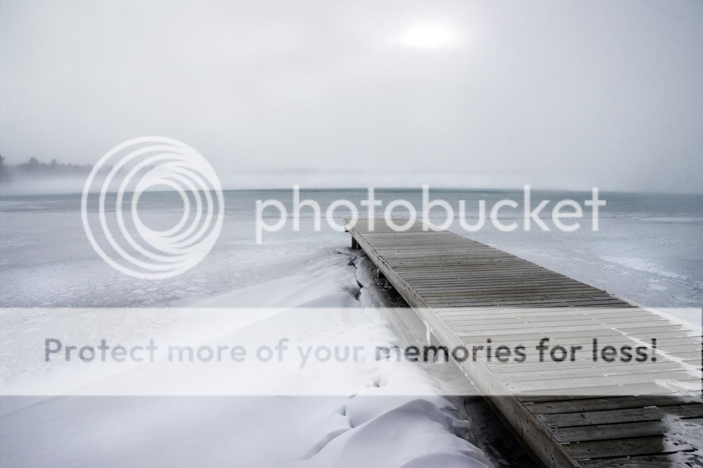
This was the last blast of winter for us. -12C and 90km/h winds. i had to look over my shoulder, think about what i wanted to shoot, do a spin and quickdraw my camera out of my coat, snap a shot off and turn and hide again. in th time it took me to compose something in the viewfinder i could feel my skin freezing. Brrrr.
Cold indeed... why were you even out?! #1 is interesting, but I think the haze from the snow gives it too much of a hazy feeling. #2 is pretty nice. I like the contrast of the dock with all of the white snow and ice -- plus the big band of blowing snow out on the lake.
no.2 is GREAT!!!, the position of the dock is great, the contrast as well 100% perfect if you get in a contest with this it would be definitely a winner!
2 is very cool. If you would forgive my transgression a bit, I thought I'd take a crack at a bit of editing. Let me know what you think. What I did... 1. Boosted the contrast 20 points. 2. Boosted blue saturation by quite a bit (50 points or so) 3. Boosted the red saturation a bit (30 points or so) 4. Sharpened it (smart sharpen, 70%, 1.2 pixel radius) 5. Cropped out some of the sky. It's not perfect the way I have it, either, but I like where I was going with it. EDIT: Actually, now that I look again, I think I really like it. I'll take a print.
I like both; I think they succeed in conveying a feeling of complete desolation. In #1 I like that you can see the shapes of the trees in the background, albeit barely... I'd probably crop it differently (chopping some of the left side and bottom), but that's just me. Number 2 has great lines; I think the sun actually adds to the general feeling of desolation, but the fact that it's completely white is a tad distracting. Great use of muted colours to create the mood in both. I also dig manaheim's edit, it's more immediately pleasing to the eye... but the mood of the image changes completely... so much that what I perceive is not desolation anymore. A different animal than the original photo. By the way, those pictures look like spring to me! (Then again, I live in Winnipeg... )
i think i like the sun spot in it if it's left uncropped. i like manaheim's crop, but i think i prefer the desaturation (interesting manaheim, you brought the colours back to a less edited version of the shot, as i desaturated it in my processing). a sfar as the first one goes, i like the idea of the crop i think i'll try that. but i like the level of contrast it's at right now, the haze of the snow. i should post the original of the second one for you to play with, manaheim, as the sun spot in the unedited version has the potential to creat a very different shot.