
©AnderGraph
TPF Noob!
- Joined
- Jun 10, 2005
- Messages
- 120
- Reaction score
- 2
- Location
- Hampshire, England
- Website
- www.prophotographyforum.com
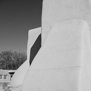
Canon 20D
ISO 100
f4
17-40L@26mm
Just wondering what you thought? i've got mixed opinions about this, i like the warm tone but i wasn't sure if the brick door frame being on a slant annoyed anyone? the main reason i didn't fix it was because it sent the sign all wonky. i also like the many angles.
thanks for looking
")

![[No title]](/data/xfmg/thumbnail/33/33360-ff0b69685c94740bde3f53b6d7aa9af1.jpg?1619735924)


![[No title]](/data/xfmg/thumbnail/38/38266-292dc43125dad0d89dbd806503618171.jpg?1619738549)
![[No title]](/data/xfmg/thumbnail/41/41759-f0f73c457ebcb6dabcbddc7a3c000487.jpg?1619739884)