
adamhiram
No longer a newbie, moving up!
- Joined
- Feb 6, 2015
- Messages
- 858
- Reaction score
- 576
- Can others edit my Photos
- Photos OK to edit
I thought I would try taking my own family photos this year, myself included. This involved some interesting challenges, including using a tripod and wireless remote/timer, pre-focusing while trying to get a somewhat shallow depth of field with a rambunctious 3 year old in the mix, and in some cases dealing with less than ideal lighting. I opted to use natural light, as carrying additional lighting gear while hiking to various locations seemed a bit much.
It was a fun challenge, and I am looking for some honest feedback on what I did well, and what could have been done better.
I felt this first shot was my strongest, taken at 85mm at f/2.8 from around 25-30' away. I shot a bit wide and cropped in post to give some room for error, and stopped it down a little to give enough depth of field for a fast-moving toddler.
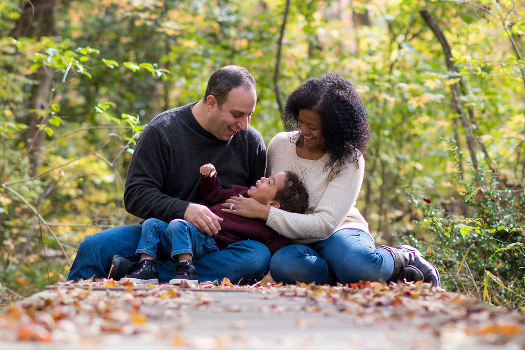 20171104-DSC_4547a by adamhiram, on Flickr
(Nikon D500, 85mm f/1.8 @ f/2.8, 1/200s, ISO 100)
With this next one, the idea was to have a nice rustic background and keep it a little more in focus. The lighting was a little flat, but I think it still works. My main complaint here is the lack of sharpness in the subjects - I'm not sure if I missed focus at f/2.8, or if this lens is really that soft at the long end, wide open (Nikon 17-55 f/2.8 @ 48mm).
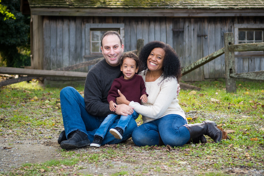 20171104-DSC_4591a by adamhiram, on Flickr
(Nikon D500, 17-55mm f/2.8 @ 48mm, f/2.8, 1/200s, ISO 100)
Lastly, I really liked this location but think I just need to come back at a better time of day when there isn't direct sunlight overhead. I had to process the hell out of this one to crush the highlights and bring back some of the harsh shadows, so I'm not really thrilled with the end result. It was challenging enough getting a toddler to hike .3mi through the woods each way, let alone get there at the right time of day, but apparently 11am wasn't it... Same lens here (17-55 @ 50mm) but stopped down to f/4 seems to be a bit sharper.
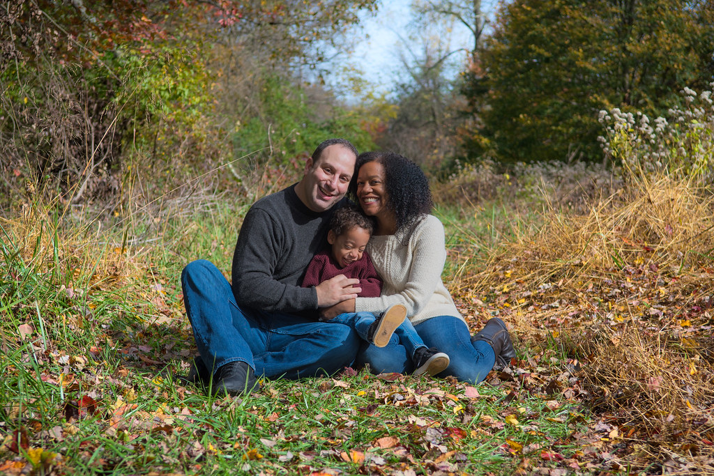 20171104-DSC_4499a by adamhiram, on Flickr
(Nikon D500, 17-55mm f/2.8 @ 50mm, f/4, 1/1000s, ISO 100)
It was a fun challenge, and I am looking for some honest feedback on what I did well, and what could have been done better.
I felt this first shot was my strongest, taken at 85mm at f/2.8 from around 25-30' away. I shot a bit wide and cropped in post to give some room for error, and stopped it down a little to give enough depth of field for a fast-moving toddler.
20171104-DSC_4547a by adamhiram, on Flickr(Nikon D500, 85mm f/1.8 @ f/2.8, 1/200s, ISO 100)
With this next one, the idea was to have a nice rustic background and keep it a little more in focus. The lighting was a little flat, but I think it still works. My main complaint here is the lack of sharpness in the subjects - I'm not sure if I missed focus at f/2.8, or if this lens is really that soft at the long end, wide open (Nikon 17-55 f/2.8 @ 48mm).
20171104-DSC_4591a by adamhiram, on Flickr(Nikon D500, 17-55mm f/2.8 @ 48mm, f/2.8, 1/200s, ISO 100)
Lastly, I really liked this location but think I just need to come back at a better time of day when there isn't direct sunlight overhead. I had to process the hell out of this one to crush the highlights and bring back some of the harsh shadows, so I'm not really thrilled with the end result. It was challenging enough getting a toddler to hike .3mi through the woods each way, let alone get there at the right time of day, but apparently 11am wasn't it... Same lens here (17-55 @ 50mm) but stopped down to f/4 seems to be a bit sharper.
20171104-DSC_4499a by adamhiram, on Flickr(Nikon D500, 17-55mm f/2.8 @ 50mm, f/4, 1/1000s, ISO 100)
")
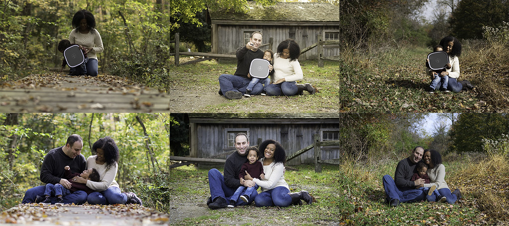 wb
wb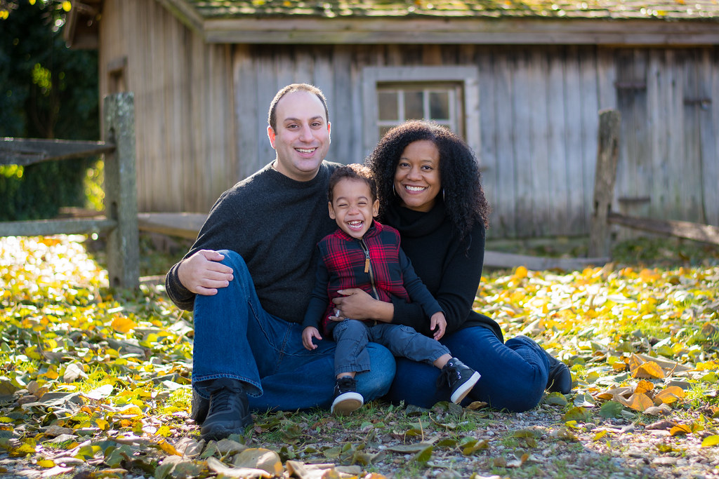 20171111-DSC_4745a
![[No title]](/data/xfmg/thumbnail/37/37121-fda7b1957cb0d0be7bab1ddd3ec87847.jpg?1619737883)

![[No title]](/data/xfmg/thumbnail/37/37122-e7c1a36f5447b051c769eb1c990f8b41.jpg?1619737883)

