LiveinColor
TPF Noob!
- Joined
- Mar 16, 2013
- Messages
- 23
- Reaction score
- 11
- Location
- Utah Valley
- Can others edit my Photos
- Photos NOT OK to edit
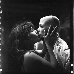
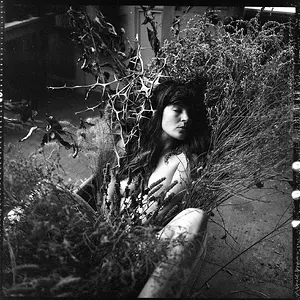
I had this image featured on DarkBeautyMag.com! So, so happy.
Photographer: Jesca Cluff : Live in Color Photography
Model: Jessica Ayn Lee
MUAH: Bianca Marie : Bianca Marie Makeup Artistry
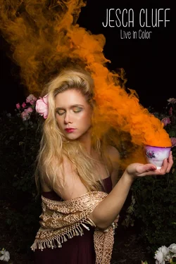
Photographer: Jesca Cluff : Live in Color Photography
Model: Jessica Ayn Lee
MUAH: Bianca Marie : Bianca Marie Makeup Artistry




![[No title]](/data/xfmg/thumbnail/35/35264-5ade32b7036391926536661aeb7491c3.jpg?1734166921)
![[No title]](/data/xfmg/thumbnail/40/40305-2fbdc00adce4fac5e62dccb3f6f9c633.jpg?1734174713)