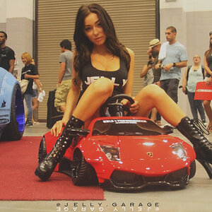
I'm with kierukei here: the second appeals to me instantly for its abstractness and play with graphic elements only. The bit of stone floor (?) in the upper righthand corner takes away from its overall impression of being graphic-only, abstract and dark, though (I feel).
To my mind, the first is too wide (too much empty space) behind and below the person, and the person might wish for a smidge more "outline". Cool idea, though!!! Things like that somehow never occur to me, and when I see photos such as yours I go
and
and "Why aren't you imaginative or creative enough of ever think up something like this yourself!?!?!?!?" Hmph. Well, I am not :cry:


")


![[No title]](/data/xfmg/thumbnail/40/40287-4f839095000f74d779b90ed75df9dc62.jpg?1619739408)
![[No title]](/data/xfmg/thumbnail/36/36652-145f66f617fee0f81baca6f8db8b4eb2.jpg?1619737673)


![[No title]](/data/xfmg/thumbnail/40/40288-4d5d7a8aa74ddfceb5fb82062d9b21be.jpg?1619739409)
![[No title]](/data/xfmg/thumbnail/34/34556-60d61b1903f6554f7373cddfe5823280.jpg?1619736550)
![[No title]](/data/xfmg/thumbnail/41/41798-aacfc8368463d919cba743fe318706b6.jpg?1619739897)
![[No title]](/data/xfmg/thumbnail/36/36654-55e621bd8f3203cdd106e3764c553c4d.jpg?1619737673)
![[No title]](/data/xfmg/thumbnail/41/41795-6bc3a19e590a6be6bd169ab2acaee30d.jpg?1619739896)