Deteriorating Structure - CC

SwissJ

TPF Noob!
Joined
Mar 29, 2010
Messages
243
Reaction score
1
Location
Brooklyn, NY
Can others edit my Photos
Photos OK to edit
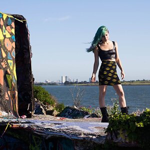
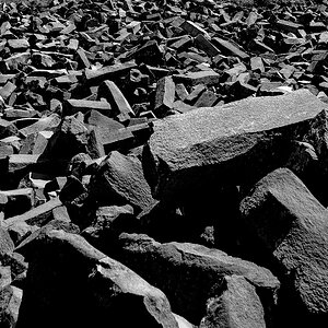
Hi forum. Here are 3 images of an old structure on the waterfront. I tried to set a different mood with each.

Looking for critique. Thanks.

#1
4622660744_9278396133_o.jpg


#2
4622660582_bbfa860aa0_o.jpg


#3
4622054773_f7ea0a13c3_o.jpg
 
#1 Pretty decent. Love that you decided to go B&W.
#2 The background is way too blown out.
#3 Absolutely adore silhouettes! I would crop out the tree and a little off the bottom, and maybe have him face towards the structure.
 
Last edited:
3. is good . I like him looking away as the mood like he lost the farm
2. does nothing for me.
1. is ok. needs something but dont know what. i like the old / new look tho in BW.
 
Thanks for the comments.

For #2 I was going for a barren desolate mood. Since the actual sky and the skyline was so uninteresting, I thought it would be ok to sacrifice it's clarity.

In #1, if something looks like it's missing, it's probably the sky. The windows do not even reflect any sky making them look strange...
...But, I think it works in this image because the lack of detail and texture in the modern towers juxtapose sharply against a more detailed and textured older structure.

Anyone else have any comments?
 
I like the juxtaposition in #1, but it is muddy. And maybe shoot it again when the sky is more interesting.
 
I agree with white ^. I think I'd also like to see #1 with some foundation... literally. I kind of feel unstable or lost. Perhaps seeing where the old structure meets the ground would give it more place and stability.

#2 would be ok in better light or HDR. It looks pretty appalling to me with the sky blown out.

#3 - Well composed, but still not really doing anything for me.
 
hmm, I can see how #1 is muddy. There's no white really other than in the sky. And I'd like to see more detail in the old tower.

Thanks for the comments.
 
Hello Swissj

#1. I like this shot. I would crop some of the bottom out of this photo. I would also like to see what it looks like if you change either the sky or modern buildings to be a shade darker.

#2. is a snapshot, but I understand you probably felt something when you were there taking the shot.

#3. I like this photo as well, and agree the bottom and tree cropped out would strenthen the photo.
 
Thanks for the feedback. Time for a re-shoot. I really wanna try #1 with various exposures and compositions.

Thanks again
 

Most reactions

Back
Top