What's new

Different processing for me

LCLimages

No longer a newbie, moving up!
Joined
Mar 27, 2014
Messages
354
Reaction score
311
Location
Missouri
Can others edit my Photos
Photos OK to edit
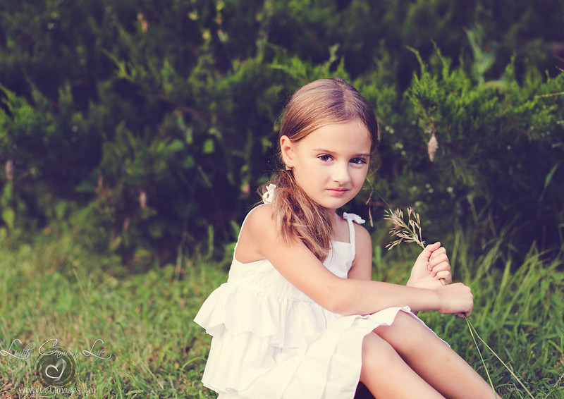
I was going for a "feel" here and not sure if I got it, or got it consistently. But I sure had it in my head.

1.

2.

3.

Edit: I wish I had her feet. But she refused to take off her bright pink flip flops because "the ground was too poky."
 
And then because every little girl dreams of being a fairy...

 
One I like is Matt K's Lightoom Killer tips "Hawaii 5-O" look. I've started to like this type of desaturated, more muted look as time goes by. I've grown somewhat tired of "accurate color" over the years...I'll starting to sense a swing back toward a softer, more desaturated color palette being accepted widely. I like your first shot, but on images that have a lot of darks or black tones, having the black tones have that obvious "fog" looks a bit, well, not sure what the right word is, except that a preponderance of dark tones with that light veiling layed on looks, shall we say a bit gauche? Just a little bit.

Like the fairy wing sconcept.
 
Thanks Derrel - I had the same debate on the shots with the dark tones. Really waffled on the "hazy" effect on them, but ended up liking the overall feel of the atmosphere...

Anyways, I agree on your insights about color processing these days. And I myself have grown a bit weary of accurate color. Usually I'm "WB/heal that zit/recrop if needed/boost contrast and sharpen and go." Earlier this year when I did the girl in the woods, I did a fairy edit on one of her shots and did a gradient layer that gave the whole image kind of a pinky-dreamy-haze and ended up loving it. So I went outside my box a bit on these too.

The fairy wings have been a hit with the girls for sure :)
 
I like the processing, and there is a matte paper that ProDpi carries that would just make this dreamy. But, and I know you already know this, I cant take the lack of feet. Especially in #2. The third one is the most acceptable as far as crop goes. So yes, while the light and processing is dreamy, the crop kills it for a display piece.

PS: I love the fair wings. I assume thats photoshopped. Did you make or buy that??
 
Love prodpi Deep matte paper!

I love the 2nd image, mainly because the dark background really makes her pop. I'm not fond of the crop...maybe take a little more off the left + bottom...cropping out the little triangle of space below her knee
 
I like the softness of these.. Very pretty. I'm weird about feet being cut off, so I make sure I crop above the knee or at her dress.
 
Yes the non-feet kill me :( I was begging "pleeeeease take the shoes off!!" in the sweetest impatient voice I could muster. But this is my daughter so I had no one to turn to but me for an authority boost :lol: She took them off once but her face was "I'm pissed, mom" so I couldn't keep any of those :(

Fairy wings are photoshopped. I googled "photoshop fairy wing brushes" once and stumbled across 2 sets of beautiful brushes for free but I can't remember for the life of me where I found them.
 
Love prodpi Deep matte paper!

I love the 2nd image, mainly because the dark background really makes her pop. I'm not fond of the crop...maybe take a little more off the left + bottom...cropping out the little triangle of space below her knee

I will try that :)
 
I would have been very tempted to shoot most of these as talls, with the pink flip-flops on, and then later worked on desaturating the color, or--just leaving them on and shooting to include them as part of who she is at this young age. I mean in 2012 grown celebrity and entertainment-industry women wore bright,neon chartreuse shoes and accessories, then in 2013 that color made it to the bottoms of the shoe soles on athletic wear for kids and teens...in 2005 Crocs were red-hot for little kids, and for three years my son would not wear ANY footwear--except Orange crocs. lol. I really like to see feet on the ground in standing poses. Even if the shoes seem weird now, today, they will someday be viewed as a quirky kid fashion choice or reflective of that era. Remember those cheap clear plastic shoes little girls wore in the 1990's? Were they called gellies or something like that? Those were clearly "of an era".
 
Yes, jellies! I was a tween when jellies were big and oh, I was a jelly fan. I had pink jellies, white jellies, blue jellies. I even begged for some clear jellies with big square jelly heels. Because that's really safe. Can we spell blisters?
 
Yes, jellies! I was a tween when jellies were big and oh, I was a jelly fan. I had pink jellies, white jellies, blue jellies. I even begged for some clear jellies with big square jelly heels. Because that's really safe. Can we spell blisters?

Yeah, see, I was being sneaky there...I figured you were of that era...that's why I chose that shoe style to make my point (my eldest niece seems about your age, and she and her sister were certified jellies NUTS!!!!!!!) about how kids footwear really makes a sort of "time" or "era" commentary in a photo. Which is a good thing usually, but can be a bad thing too if the desired effect is timelessness or the suggestion of a bygone era, like say with an old-timey dress,etc.

But back to the processing: I am really enjoying these more desaturated looks these days. I've been watching my pBase page hit counts very closely, and the general public seems to like these softer, more-muted images quite a lot. One of Matt K's LR presets is New York Style, which is a weird almost B&W color removal, with some color left remaining...people click on those a LOT...same with Hawaii 5-0 shots and some of Matt's other desaturated looks.'

I hold a kind of a Romantic-era (capital R, meaning the late 1700's to mid-1800's era) ideal with regard to photos of little girls: I like the overgrown gardens, the natural scenes with messy plants, and overgrown grass and hay, and wildflowers, and gauzy, dreamy processing, not-so-super-sharp lenses, maybe some shallowish DOF, you know, a more Romantic-era ideal of nature, naturalness, a bit of chaos, and that's which I like some of the new shooters like Erica M. and the way she shoots her kids and friends' kids in sort of an overgrown outdoor world that's "real", and frommrstomommie (Bonnie) and that unkempt Arizona outdoors vibe, and that's sort of why I love paigew's work with her kids and other peoples' kids; her style is Romantic, not hyper-formalized, and she likes this type of fogged blacks processing, probably does it better than anybody on TPF. So, yeah, I think this kind of outdoor, simple kid portraiture works really well with a light, airy, who cares about accurate color kinda processing look.

I grew up in the era of the MacBeth Color Checker being included in every magazine article abiout each new film, and then some. Please, let's move on! I say keep moving in this direction, especially if you can see your click-counts show that this look is now becoming desired by people,and that they click on these desaturated, airy type pics more than accurate-color shots.

 
Yes, jellies! I was a tween when jellies were big and oh, I was a jelly fan. I had pink jellies, white jellies, blue jellies. I even begged for some clear jellies with big square jelly heels. Because that's really safe. Can we spell blisters?


I hold a kind of a Romantic-era (capital R, meaning the late 1700's to mid-1800's era) ideal with regard to photos of little girls: I like the overgrown gardens, the natural scenes with messy plants, and overgrown grass and hay, and wildflowers, and gauzy, dreamy processing, not-so-super-sharp lenses, maybe some shallowish DOF, you know, a more Romantic-era ideal of nature, naturalness, a bit of chaos, and that's which I like some of the new shooters like Erica M. and the way she shoots her kids and friends' kids in sort of an overgrown outdoor world that's "real", and frommrstomommie (Bonnie) and that unkempt Arizona outdoors vibe, and that's sort of why I love paigew's work with her kids and other peoples' kids; her style is Romantic, not hyper-formalized, and she likes this type of fogged blacks processing, probably does it better than anybody on TPF. So, yeah, I think this kind of outdoor, simple kid portraiture works really well with a light, airy, who cares about accurate color kinda processing look.

I am 30. And yes yes yes to this! I love this look and it's something I want to move towards more frequently. And I have a fantastic setting around here for that, with lots of land and timber to work with. I had a lot of fun playing with these images trying to create that kind of feel. As far as B&W processing goes I still tend to favor a true B&W with blacks and whites and I don't see that changing any time soon. Midtone-heavy foggy B&W shots don't grab my attention. But if I'm leaving it in color and it's a child, especially a little girl, I see this kind of processing growing in popularity. Which is good, since I love it and am happy to give it a go. I have a lot of ideas floating around in my head that revolve around gauzy flowy dresses and wildflowers and overgrown grass and so on.
 
Yes, jellies! I was a tween when jellies were big and oh, I was a jelly fan. I had pink jellies, white jellies, blue jellies. I even begged for some clear jellies with big square jelly heels. Because that's really safe. Can we spell blisters?

Yeah, see, I was being sneaky there...I figured you were of that era...that's why I chose that shoe style to make my point (my eldest niece seems about your age, and she and her sister were certified jellies NUTS!!!!!!!) about how kids footwear really makes a sort of "time" or "era" commentary in a photo. Which is a good thing usually, but can be a bad thing too if the desired effect is timelessness or the suggestion of a bygone era, like say with an old-timey dress,etc.

But back to the processing: I am really enjoying these more desaturated looks these days. I've been watching my pBase page hit counts very closely, and the general public seems to like these softer, more-muted images quite a lot. One of Matt K's LR presets is New York Style, which is a weird almost B&W color removal, with some color left remaining...people click on those a LOT...same with Hawaii 5-0 shots and some of Matt's other desaturated looks.'

I hold a kind of a Romantic-era (capital R, meaning the late 1700's to mid-1800's era) ideal with regard to photos of little girls: I like the overgrown gardens, the natural scenes with messy plants, and overgrown grass and hay, and wildflowers, and gauzy, dreamy processing, not-so-super-sharp lenses, maybe some shallowish DOF, you know, a more Romantic-era ideal of nature, naturalness, a bit of chaos, and that's which I like some of the new shooters like Erica M. and the way she shoots her kids and friends' kids in sort of an overgrown outdoor world that's "real", and frommrstomommie (Bonnie) and that unkempt Arizona outdoors vibe, and that's sort of why I love paigew's work with her kids and other peoples' kids; her style is Romantic, not hyper-formalized, and she likes this type of fogged blacks processing, probably does it better than anybody on TPF. So, yeah, I think this kind of outdoor, simple kid portraiture works really well with a light, airy, who cares about accurate color kinda processing look.

I grew up in the era of the MacBeth Color Checker being included in every magazine article abiout each new film, and then some. Please, let's move on! I say keep moving in this direction, especially if you can see your click-counts show that this look is now becoming desired by people,and that they click on these desaturated, airy type pics more than accurate-color shots.
why thank you derrel :hug::
 
I'm on this monitor that is absolutely cray cray in the color department. Everything is incredibly oversatured like a gaming computer would be, except its not even a gaming computer. I have no idea what happened to this thing and I don't edit on it so haven't bothered messing. lol But, I LOVE these. In fact, I'm gonna go flip on my other monitor so I can see these in proper color. The lack of feet, as mentioned kinda bugs me but I otherwise really really like these.
 

Create an account or login to comment

You must be a member in order to leave a comment

Create account

Create an account on our community. It's easy!

Log in

Already have an account? Log in here.

Back
Top Bottom