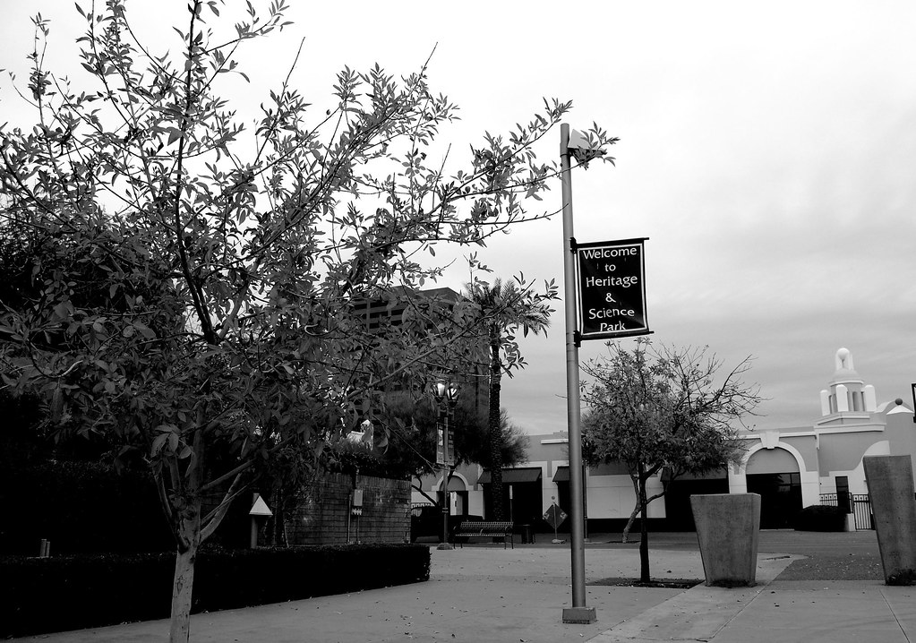
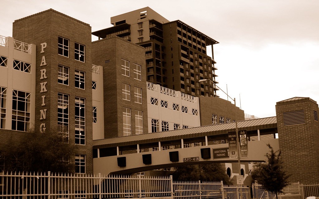
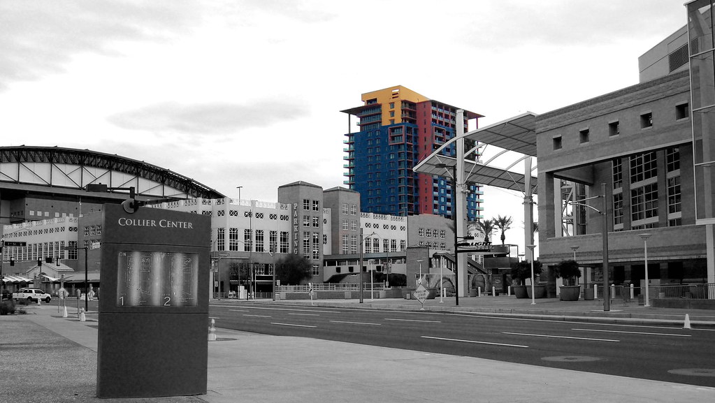
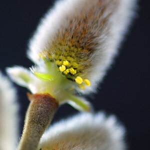
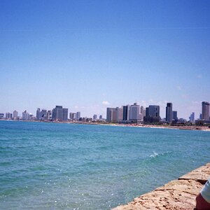
IMO, selective coloring is overdone and not appropriate for many images. Sorry, but I don't think it works here. Number 5 could be nice, but the added grain is too heavy in my opinion. I also think it could use more contrast. Remember, opinions are like a certain body part, everyone has one. Mine is no better or worse than the next.


![[No title]](/data/xfmg/thumbnail/30/30873-79f4c5bc298110a994e9eed027728db8.jpg?1619734490)
![[No title]](/data/xfmg/thumbnail/30/30874-7f3345ba7c76a7c5fa2570559598531b.jpg?1619734491)