thereyougo!
Been spending a lot of time on here!
- Joined
- Jun 1, 2010
- Messages
- 2,360
- Reaction score
- 2,180
- Location
- UK
- Can others edit my Photos
- Photos OK to edit
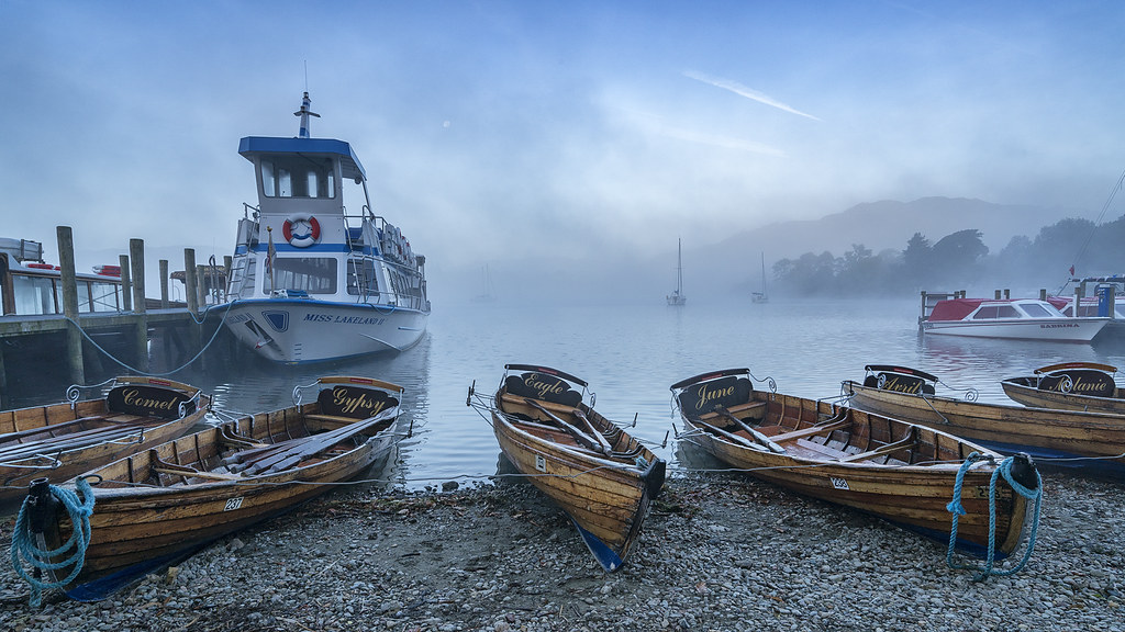
Waterhead, Ambleside at sunset
Sony A7R II Loxia Biogon 35 f/2 handheld
1. f/16 ISO 100 1 second exposure
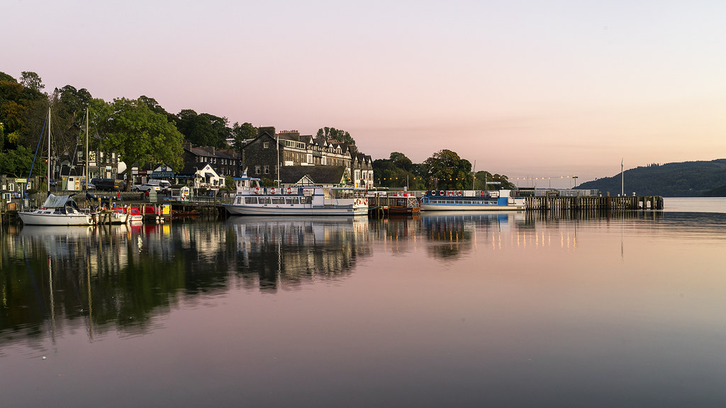 Waterhead sunset copy by singingsnapper, on Flickr
2. f/11 1/15 ISO 200
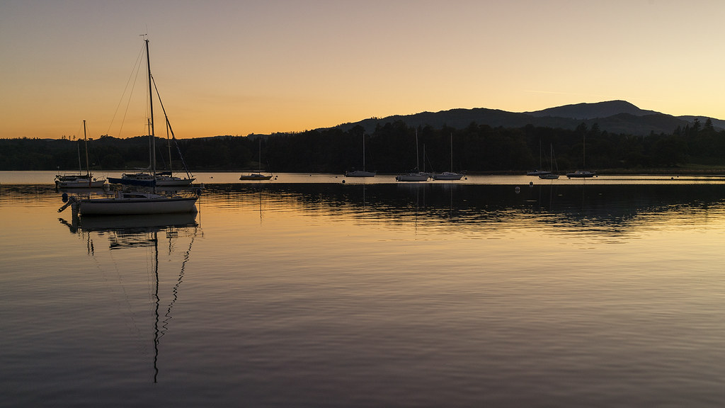 Waterhead sunset-2 copy by singingsnapper, on Flickr
3. f/8 1/30 ISO 200
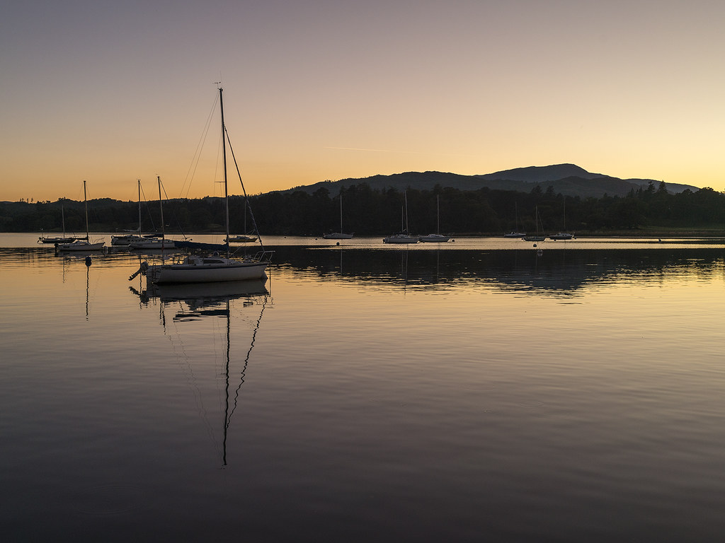 Waterhead sunset-3 copy by singingsnapper, on Flickr
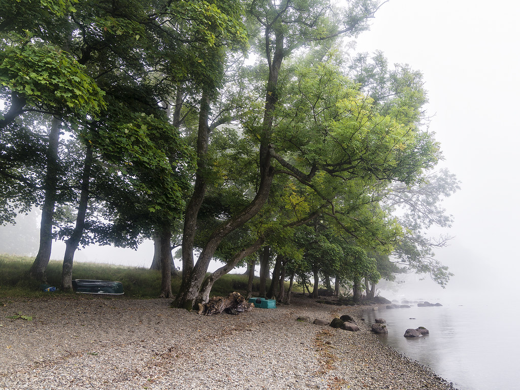
A few days ago after dawn:
Sony/Zeiss 16 - 35 f/4
4.
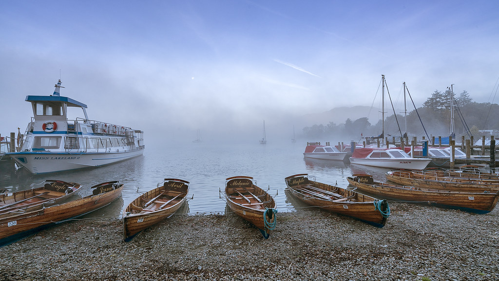 MIsty Waterhead copy by singingsnapper, on Flickr
5.
 Misty Waterhead-2 copy by singingsnapper, on Flickr
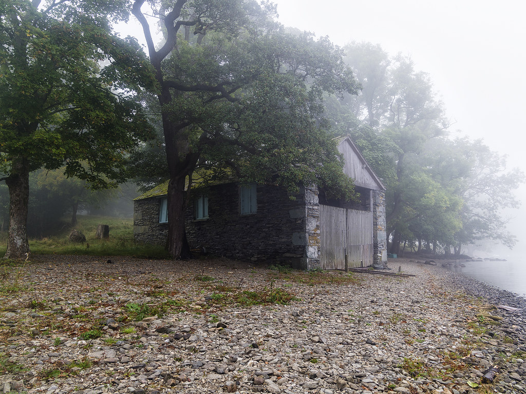
This morning at dawn:
Grabbed one shot before the mist descended...
Pentax 645Z FA 33 - 55
6.
 Waterhead dawn copy by singingsnapper, on Flickr
7.
 Waterhead dawn-3 copy by singingsnapper, on Flickr
8. BW
 bw Waterhead dawn-3 copy by singingsnapper, on Flickr
9.
 Waterhead dawn-2 copy by singingsnapper, on Flickr
Sony A7R II Loxia Biogon 35 f/2 handheld
1. f/16 ISO 100 1 second exposure
Waterhead sunset copy by singingsnapper, on Flickr2. f/11 1/15 ISO 200
Waterhead sunset-2 copy by singingsnapper, on Flickr3. f/8 1/30 ISO 200
Waterhead sunset-3 copy by singingsnapper, on FlickrA few days ago after dawn:
Sony/Zeiss 16 - 35 f/4
4.
MIsty Waterhead copy by singingsnapper, on Flickr5.
Misty Waterhead-2 copy by singingsnapper, on FlickrThis morning at dawn:
Grabbed one shot before the mist descended...
Pentax 645Z FA 33 - 55
6.
Waterhead dawn copy by singingsnapper, on Flickr7.
Waterhead dawn-3 copy by singingsnapper, on Flickr8. BW
bw Waterhead dawn-3 copy by singingsnapper, on Flickr9.
Waterhead dawn-2 copy by singingsnapper, on Flickr


![[No title]](/data/xfmg/thumbnail/35/35947-ab35bfc67d8e12ce65dda301d3bf2b66.jpg?1734167744)
![[No title]](/data/xfmg/thumbnail/35/35946-771bfce9b2727c9126587d96c471da80.jpg?1734167737)


![[No title]](/data/xfmg/thumbnail/38/38729-27329be54dcb93a3723bad97259e6428.jpg?1734172599)
![[No title]](/data/xfmg/thumbnail/36/36302-6ee4929dfdf80290ffd73704693e860f.jpg?1734168631)

