rmackenzie
TPF Noob!
- Joined
- Mar 2, 2009
- Messages
- 4
- Reaction score
- 0
- Location
- BOSTON MA
- Can others edit my Photos
- Photos OK to edit
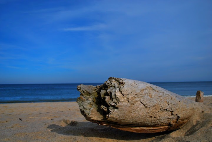
Here is some photographs me and my fiance took down in welfleet ma. Let me know what you think of the shots, how they were taking, and what I could do better. I'm extremely new to photography and I'm completely open for advice/criticism.
thanks everyone
Picasa Web Albums - Robert - welfleet beach
Picasa Web Albums - Robert - welfleet beach
Picasa Web Albums - Robert - welfleet beach
Picasa Web Albums - Robert - welfleet beach
Picasa Web Albums - Robert - welfleet beach
thanks everyone
Picasa Web Albums - Robert - welfleet beach
Picasa Web Albums - Robert - welfleet beach
Picasa Web Albums - Robert - welfleet beach
Picasa Web Albums - Robert - welfleet beach
Picasa Web Albums - Robert - welfleet beach


![[No title]](/data/xfmg/thumbnail/39/39474-4ba9b46daa507ab0506d70b86d8622ee.jpg?1734173567)


