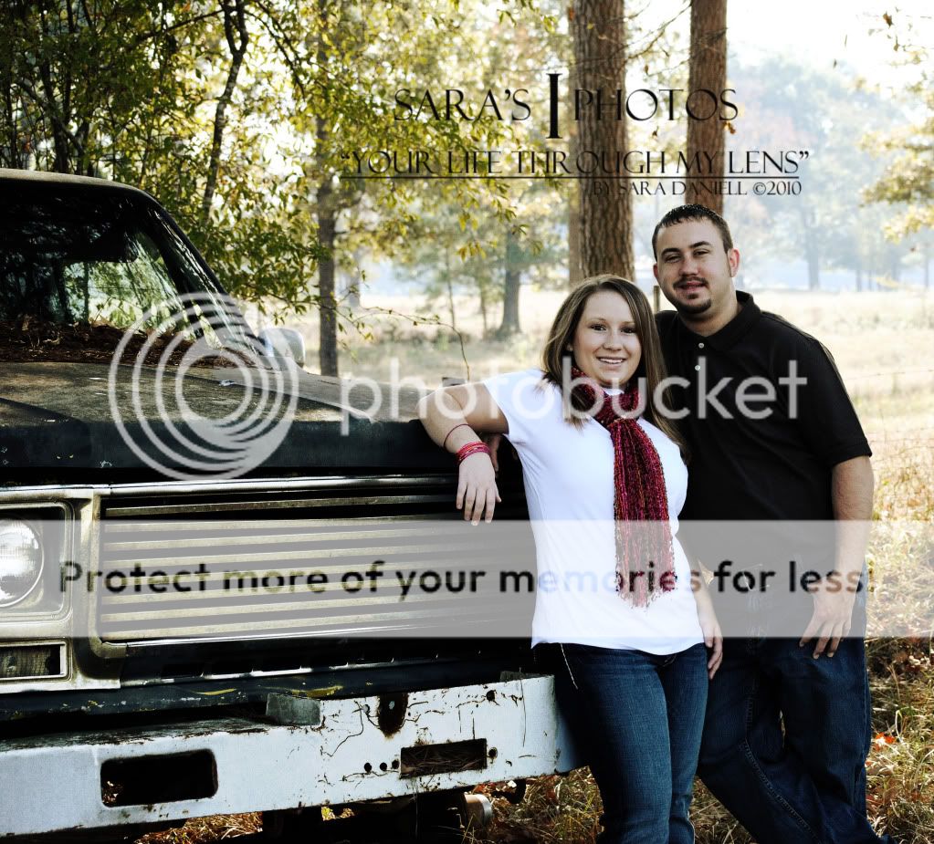
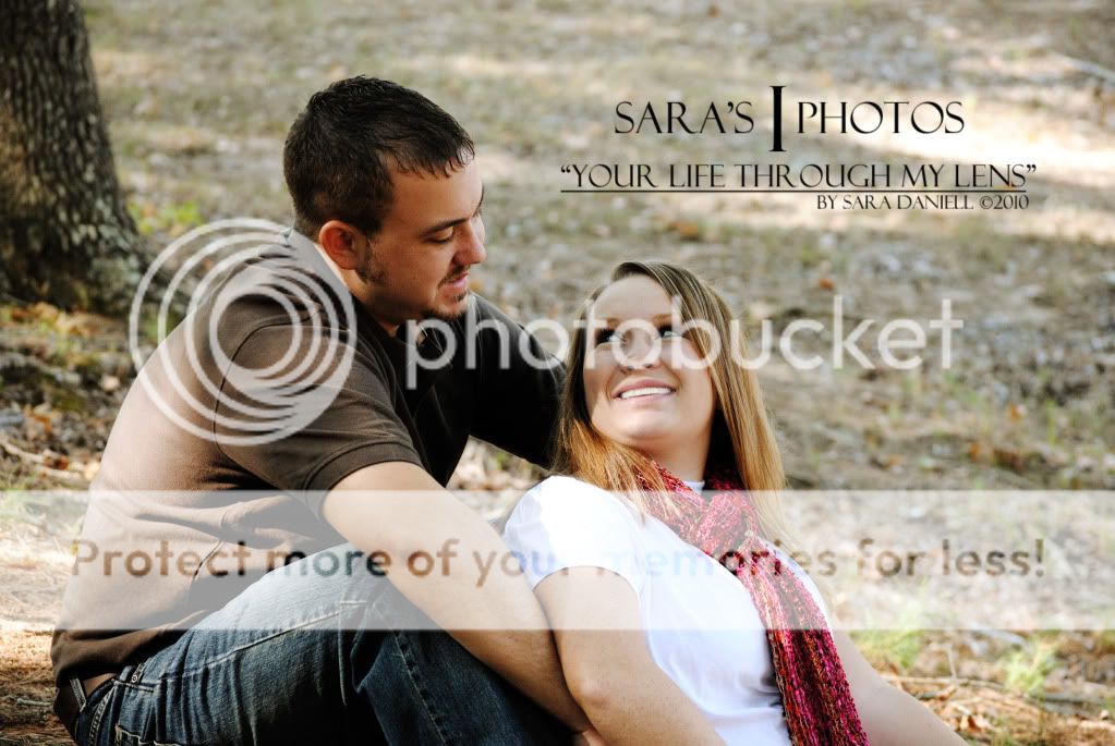
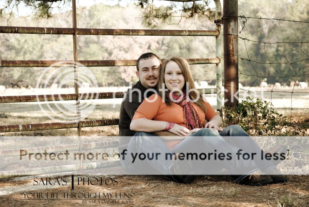
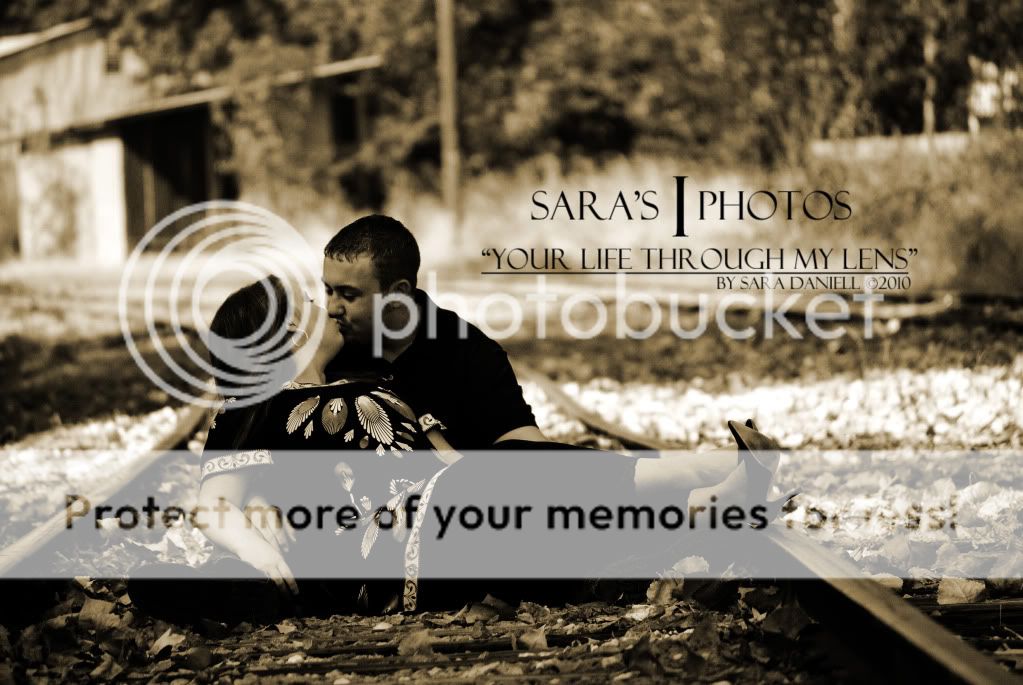
White shirt + black shirt = camera death. Try to avoid it at all costs. We'll just let that be automatic C&C for the first 4, so I don't have to keep saying it.
#1 - I like the idea, but I wish they were looking at the viewer instead of each other. I would be a more inviting image that way.
#2 - They both have trees growing out of their heads, and the guys look is pretty goofy. I wish the background wasn't so bright.
#3 - His posture is pretty hunched over, which I don't like. But he also strikes me as the kind of guy that lacks the ability to articulate his femurs/hip/lumbar spine independently. With people that are not physically capable of having good posture, try to avoid poses that highlight that.
I also don't like the stray bit of light hitting her face.
#4 - That pose looks more to me like something I would see in the UFC, going for the rear naked choke tap out. Again, this is partly because of his poor hip flexibility, which causes him to crumple up into a ball when attempting to fold at the waist. The pose needs some more space in it, instead of her wearing him like a backpack.
Also again, stray light on the faces.
#5 - I find this image to be too dark overall. The blacks have absolutely no detail and al just bleed together. Also, the bright stripe that rune behind their heads across the photo is stealing attention from them.


")


![[No title]](/data/xfmg/thumbnail/39/39498-362f11d9bfd0d9e222faa85b38801745.jpg?1734173616)


![[No title]](/data/xfmg/thumbnail/30/30872-cd51e29bb57fff318ae9841cb002aa5b.jpg?1734158857)